
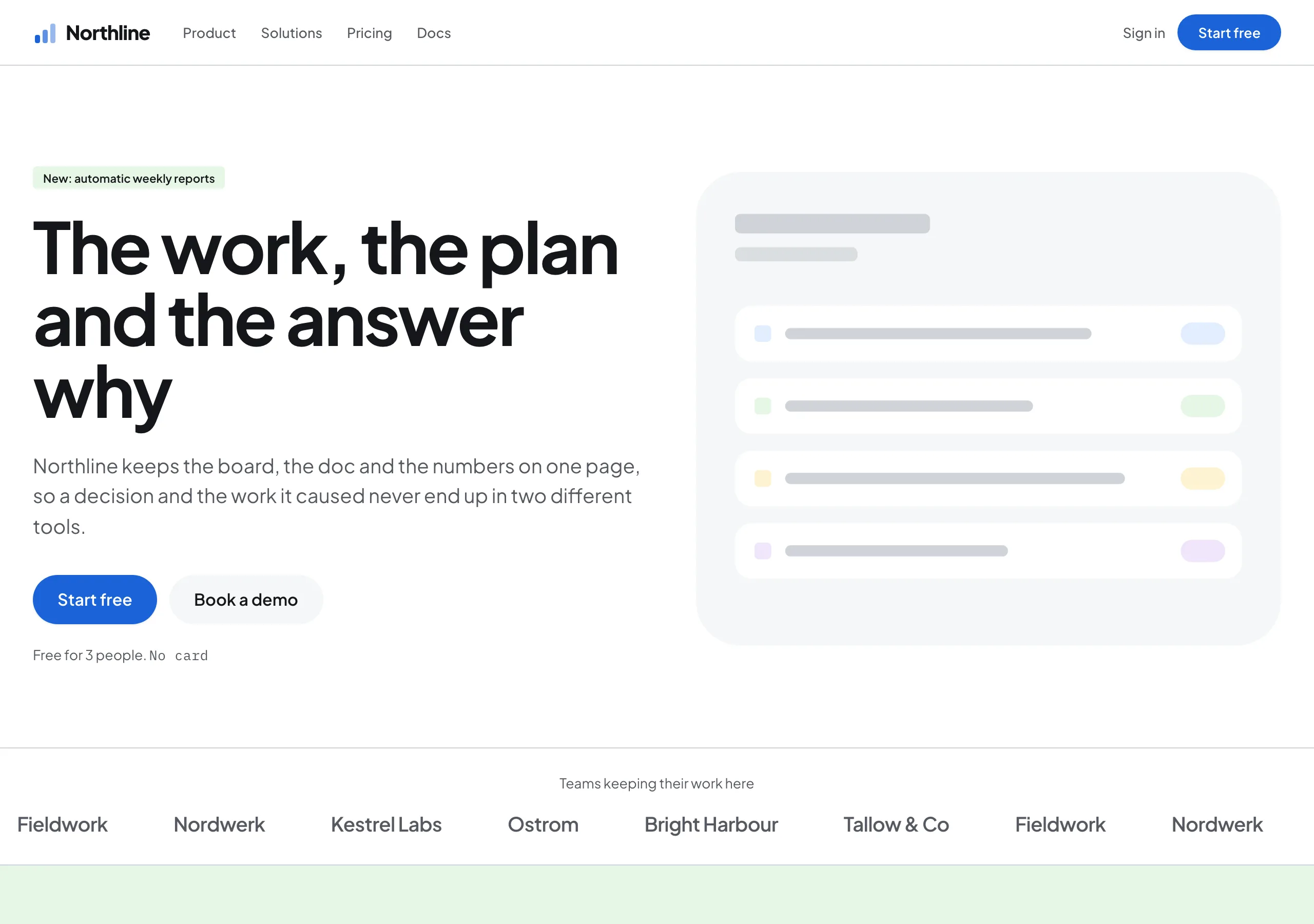
Bright Atrium
a bright office atrium at ten in the morning
White page, pale tint blocks and one working blue. Cards are softly rounded and lifted by a single diffuse shadow, chips stay square at 4px, and a friendly display face carries the headline with a light negative tracking.
Install
npx styles-md add bright-atrium Palette
Type
Aa Bb Cc 0123 The quick brown fox
"Plus Jakarta Sans", "Helvetica Neue", Arial, sans-serif const total = 1 + lI0O;
"IBM Plex Mono", ui-monospace, "SFMono-Regular", Menlo, monospace 16px base · 1.2 ratio · body 400 / heading 700 · heading tracking -0.03em. Fonts are not bundled. Install the first family in each stack, or the specimens below fall back to the next one your device has.
The quick brown fox jumps
The quick brown fox jumps
The quick brown fox jumps
The quick brown fox jumps
The quick brown fox jumps
The quick brown fox jumps
The quick brown fox jumps
The quick brown fox jumps
Licensing
No font files are redistributed here. Every family this style asks for by name is free for commercial use, and CI rejects a style that names one which is not.
- Plus Jakarta Sans sans SIL Open Font License 1.1 Humanist with open counters. Reads as friendly at 14px UI and stays sturdy at 96px.
- IBM Plex Mono mono SIL Open Font License 1.1 Plan codes, counts and keyboard shortcuts.
Fallbacks: Helvetica Neue, Arial, sans-serif, ui-monospace, SFMono-Regular, Menlo, monospace. These are CSS generics and fonts the reader's OS already ships, referenced by name only, so nothing is licensed or downloaded.
The spec itself, and everything generated from it, is CC-BY-4.0. Attribution is the comment at the top of each generated file; keep it and you have complied.
Shape, space & motion
- stroke
- 1px
- radius
- 4px · 20px · 32px
- spacing unit
- 4px
- gutter
- 24px
- section gap
- 96px
- max width
- 1280px
- motion
- 250ms cubic-bezier(0.4, 0, 0, 1)
Bright Atrium
A product page with the lights on. The ground is white, colour arrives as whole blocks of pale tint, and one blue does every action on the screen. Cards are round and lifted just enough to look picked up, and the writing is plain, because the page is selling a tool rather than a mood.
Principles
- White is the page. Colour arrives as a tinted block that runs the width of a section.
- One blue does actions. Every filled button, link and active state uses it and nothing else does.
- Cards are
radius-mdwithshadow-mdand no border. Chips and inputs stay square atradius-sm. - Two roundnesses only: soft on cards and panels, tight on the small things inside them.
- Headings run at -0.03em. Body copy is left at normal tracking and never goes above 20px.
- Illustration is flat, built from the tint cast, and drawn with no outline and no gradient.
Typography
One humanist sans does the whole page. Headings are weight 700 with tracking pulled to -0.03em, so a 96px line holds together while a 24px subhead still reads as a sentence. Body sits at weight 400 between 14 and 20px, which is the working range of the style: anything above 20px is a heading and should be marked up as one. Mono is small and appears in three places only, on plan codes, counts and keyboard shortcuts.
Colour
White ground, ink #14161a at 18.11:1, and muted grey for supporting copy at 7.12:1. accent
blue clears AA both ways: white on it at 5.5:1 and as link text on white at the same ratio.
surface is the neutral card ground. The tint cast is mint #e6f6e4, sky #e2eefe, butter
#fdf3d2, lilac #f0e6fb and blush #fde6e6, and every one of them takes ink text above 15:1,
which is what lets a whole section change colour without a single contrast check failing.
Components
- Button (primary):
accentfill,accentFglabel,radius-full, 12px/24px, weight 600. - Button (subtle):
surfacefill,fglabel,radius-full, same metrics, no border. - Card:
surfaceor white,radius-md, 24px padding,shadow-md, no border. - Tint block: a full width section in one cast colour,
radius-lgwhen it floats inside the page. - Chip:
radius-sm, tint fill, 4px/10px, mono or 12px sans, used for status and category. - Nav: white, 1px
borderunderneath, links at 14px, one primary button on the right. - Input: white, 1px
border,radius-sm,accentring on focus. - Spot illustration: flat tint shapes, no outline, sitting inside a card or a tint block.
- Focus ring: 2px
accentat 2px offset.
Do / Don’t
- Do keep the page white and let the tint blocks carry the colour.
- Do give a section one tint. Two tints in one band turns the page into a swatch sheet.
- Do lift cards with the one soft shadow rather than with a border.
- Do keep body copy between 14 and 20px, and mark anything larger as a heading.
- Do use mono sparingly, on codes and counts, never on a sentence.
- Don’t use a second action colour. Green and red are for status text, not for buttons.
- Don’t outline an illustration or fill it with a gradient. The shapes are flat.
- Don’t put a card inside a card. One level of lift is all this style has.
- Don’t round a chip or an input. The tight radius is what keeps the page from going soft.
- Don’t set a heading without pulling the tracking in. At weight 700 it opens up and looks unset.
When to use
Team tools, project and issue tracking, internal platforms, and the marketing pages that sell them. A poor fit for luxury, nightlife and editorial fashion, where a white page with pastel blocks reads as a product tour rather than as a point of view.
# Bright Atrium

a bright office atrium at ten in the morning. White page, pale tint blocks and one working blue. Cards are softly rounded and lifted by a single diffuse shadow, chips stay square at 4px, and a friendly display face carries the headline with a light negative tracking.

## Tokens

```yaml
color:  { bg: "#ffffff", surface: "#f6f7f8", fg: "#14161a", muted: "#55585f",
          accent: "#1a63d8", accentFg: "#ffffff", border: "#d0d3d8" }
font:   { sans: "\"Plus Jakarta Sans\", \"Helvetica Neue\", Arial, sans-serif",
          mono: "\"IBM Plex Mono\", ui-monospace, \"SFMono-Regular\", Menlo, monospace",
          base: "16px", scale: 1.2,
          weightBody: 400, weightHeading: 700,
          headingTracking: "-0.03em" }
type:   { xs: "11.11px", sm: "13.33px", base: "16px", lg: "19.2px", xl: "23.04px", 2xl: "27.65px", 3xl: "33.18px", 4xl: "39.81px" }
space:  { unit: "4px", gutter: "24px",
          section: "96px", maxWidth: "1280px" }
shape:  { strokeWidth: "1px", radiusSm: "4px",
          radiusMd: "20px", radiusLg: "32px" }
motion: { duration: "250ms", easing: "cubic-bezier(0.4, 0, 0, 1)" }
```

## Principles

- White is the page. Colour arrives as a tinted block that runs the width of a section.
- One blue does actions. Every filled button, link and active state uses it and nothing else does.
- Cards are `radius-md` with `shadow-md` and no border. Chips and inputs stay square at `radius-sm`.
- Two roundnesses only: soft on cards and panels, tight on the small things inside them.
- Headings run at -0.03em. Body copy is left at normal tracking and never goes above 20px.
- Illustration is flat, built from the tint cast, and drawn with no outline and no gradient.

## Components

- Button (primary): `accent` fill, `accentFg` label, `radius-full`, 12px/24px, weight 600.
- Button (subtle): `surface` fill, `fg` label, `radius-full`, same metrics, no border.
- Card: `surface` or white, `radius-md`, 24px padding, `shadow-md`, no border.
- Tint block: a full width section in one cast colour, `radius-lg` when it floats inside the page.
- Chip: `radius-sm`, tint fill, 4px/10px, mono or 12px sans, used for status and category.
- Nav: white, 1px `border` underneath, links at 14px, one primary button on the right.
- Input: white, 1px `border`, `radius-sm`, `accent` ring on focus.
- Spot illustration: flat tint shapes, no outline, sitting inside a card or a tint block.
- Focus ring: 2px `accent` at 2px offset.

## Do / Don't

- Do keep the page white and let the tint blocks carry the colour.
- Do give a section one tint. Two tints in one band turns the page into a swatch sheet.
- Do lift cards with the one soft shadow rather than with a border.
- Do keep body copy between 14 and 20px, and mark anything larger as a heading.
- Do use mono sparingly, on codes and counts, never on a sentence.
- Don't use a second action colour. Green and red are for status text, not for buttons.
- Don't outline an illustration or fill it with a gradient. The shapes are flat.
- Don't put a card inside a card. One level of lift is all this style has.
- Don't round a chip or an input. The tight radius is what keeps the page from going soft.
- Don't set a heading without pulling the tracking in. At weight 700 it opens up and looks unset.

<!-- styles-md/bright-atrium@1.0.0, CC-BY-4.0. Full spec: DESIGN.md -->
/* Bright Atrium: Tailwind v4 theme. Import after `@import "tailwindcss";` */
@theme {
--color-bg: #ffffff;
--color-surface: #f6f7f8;
--color-fg: #14161a;
--color-muted: #55585f;
--color-accent: #1a63d8;
--color-accent-fg: #ffffff;
--color-border: #d0d3d8;
--color-success: #2f7d32;
--color-danger: #c0362c;
--font-sans: "Plus Jakarta Sans", "Helvetica Neue", Arial, sans-serif;
--font-mono: "IBM Plex Mono", ui-monospace, "SFMono-Regular", Menlo, monospace;
--font-display: "Plus Jakarta Sans", "Helvetica Neue", Arial, sans-serif;
--text-xs: 11.11px;
--text-sm: 13.33px;
--text-base: 16px;
--text-lg: 19.2px;
--text-xl: 23.04px;
--text-2xl: 27.65px;
--text-3xl: 33.18px;
--text-4xl: 39.81px;
--radius-sm: 4px;
--radius-md: 20px;
--radius-lg: 32px;
--radius-full: 9999px;
--spacing: 4px;
--ease-default: cubic-bezier(0.4, 0, 0, 1);
}/* Bright Atrium: a bright office atrium at ten in the morning
styles-md style "bright-atrium" v1.0.0, CC-BY-4.0 */
:root {
--sm-color-bg: #ffffff;
--sm-color-surface: #f6f7f8;
--sm-color-fg: #14161a;
--sm-color-muted: #55585f;
--sm-color-accent: #1a63d8;
--sm-color-accent-fg: #ffffff;
--sm-color-border: #d0d3d8;
--sm-color-success: #2f7d32;
--sm-color-danger: #c0362c;
--sm-font-sans: "Plus Jakarta Sans", "Helvetica Neue", Arial, sans-serif;
--sm-font-mono: "IBM Plex Mono", ui-monospace, "SFMono-Regular", Menlo, monospace;
--sm-font-display: "Plus Jakarta Sans", "Helvetica Neue", Arial, sans-serif;
--sm-font-weight-body: 400;
--sm-font-weight-heading: 700;
--sm-heading-tracking: -0.03em;
--sm-text-xs: 11.11px;
--sm-text-sm: 13.33px;
--sm-text-base: 16px;
--sm-text-lg: 19.2px;
--sm-text-xl: 23.04px;
--sm-text-2xl: 27.65px;
--sm-text-3xl: 33.18px;
--sm-text-4xl: 39.81px;
--sm-space-1: 4px;
--sm-space-2: 8px;
--sm-space-3: 12px;
--sm-space-4: 16px;
--sm-space-6: 24px;
--sm-space-8: 32px;
--sm-space-12: 48px;
--sm-space-16: 64px;
--sm-space-24: 96px;
--sm-gutter: 24px;
--sm-section: 96px;
--sm-max-width: 1280px;
--sm-stroke-width: 1px;
--sm-radius-sm: 4px;
--sm-radius-md: 20px;
--sm-radius-lg: 32px;
--sm-radius-full: 9999px;
--sm-duration: 250ms;
--sm-easing: cubic-bezier(0.4, 0, 0, 1);
--sm-shadow-sm: 0 1px 2px rgba(9, 30, 66, 0.08);
--sm-shadow-md: 0 5px 20px -5px rgba(9, 30, 66, 0.14);
--sm-shadow-lg: 0 16px 44px -10px rgba(9, 30, 66, 0.18);
}{
"id": "bright-atrium",
"name": "Bright Atrium",
"version": "1.0.0",
"license": "CC-BY-4.0",
"mood": "a bright office atrium at ten in the morning",
"tags": [
"light",
"bright",
"saas",
"product",
"friendly",
"pastel",
"marketing"
],
"fonts": [
{
"family": "Plus Jakarta Sans",
"role": "sans",
"license": "OFL-1.1",
"url": "https://fonts.google.com/specimen/Plus+Jakarta+Sans",
"note": "Humanist with open counters. Reads as friendly at 14px UI and stays sturdy at 96px."
},
{
"family": "IBM Plex Mono",
"role": "mono",
"license": "OFL-1.1",
"url": "https://github.com/IBM/plex",
"note": "Plan codes, counts and keyboard shortcuts."
}
],
"tokens": {
"color": {
"bg": "#ffffff",
"surface": "#f6f7f8",
"fg": "#14161a",
"muted": "#55585f",
"accent": "#1a63d8",
"accentFg": "#ffffff",
"border": "#d0d3d8",
"success": "#2f7d32",
"danger": "#c0362c"
},
"font": {
"sans": "\"Plus Jakarta Sans\", \"Helvetica Neue\", Arial, sans-serif",
"mono": "\"IBM Plex Mono\", ui-monospace, \"SFMono-Regular\", Menlo, monospace",
"display": "\"Plus Jakarta Sans\", \"Helvetica Neue\", Arial, sans-serif",
"scale": 1.2,
"baseSize": "16px",
"weightBody": 400,
"weightHeading": 700,
"headingTracking": -0.03
},
"space": {
"unit": "4px",
"gutter": "24px",
"section": "96px",
"maxWidth": "1280px"
},
"stroke": {
"width": "1px"
},
"radius": {
"sm": "4px",
"md": "20px",
"lg": "32px",
"full": "9999px"
},
"motion": {
"duration": "250ms",
"easing": "cubic-bezier(0.4, 0, 0, 1)"
},
"shadow": {
"sm": "0 1px 2px rgba(9, 30, 66, 0.08)",
"md": "0 5px 20px -5px rgba(9, 30, 66, 0.14)",
"lg": "0 16px 44px -10px rgba(9, 30, 66, 0.18)"
}
},
"derived": {
"type": [
{
"name": "xs",
"size": "11.11px"
},
{
"name": "sm",
"size": "13.33px"
},
{
"name": "base",
"size": "16px"
},
{
"name": "lg",
"size": "19.2px"
},
{
"name": "xl",
"size": "23.04px"
},
{
"name": "2xl",
"size": "27.65px"
},
{
"name": "3xl",
"size": "33.18px"
},
{
"name": "4xl",
"size": "39.81px"
}
],
"space": [
{
"step": 1,
"size": "4px"
},
{
"step": 2,
"size": "8px"
},
{
"step": 3,
"size": "12px"
},
{
"step": 4,
"size": "16px"
},
{
"step": 6,
"size": "24px"
},
{
"step": 8,
"size": "32px"
},
{
"step": 12,
"size": "48px"
},
{
"step": 16,
"size": "64px"
},
{
"step": 24,
"size": "96px"
}
]
},
"variables": {
"color-bg": "#ffffff",
"color-surface": "#f6f7f8",
"color-fg": "#14161a",
"color-muted": "#55585f",
"color-accent": "#1a63d8",
"color-accent-fg": "#ffffff",
"color-border": "#d0d3d8",
"color-success": "#2f7d32",
"color-danger": "#c0362c",
"font-sans": "\"Plus Jakarta Sans\", \"Helvetica Neue\", Arial, sans-serif",
"font-mono": "\"IBM Plex Mono\", ui-monospace, \"SFMono-Regular\", Menlo, monospace",
"font-display": "\"Plus Jakarta Sans\", \"Helvetica Neue\", Arial, sans-serif",
"font-weight-body": "400",
"font-weight-heading": "700",
"heading-tracking": "-0.03em",
"text-xs": "11.11px",
"text-sm": "13.33px",
"text-base": "16px",
"text-lg": "19.2px",
"text-xl": "23.04px",
"text-2xl": "27.65px",
"text-3xl": "33.18px",
"text-4xl": "39.81px",
"space-1": "4px",
"space-2": "8px",
"space-3": "12px",
"space-4": "16px",
"space-6": "24px",
"space-8": "32px",
"space-12": "48px",
"space-16": "64px",
"space-24": "96px",
"gutter": "24px",
"section": "96px",
"max-width": "1280px",
"stroke-width": "1px",
"radius-sm": "4px",
"radius-md": "20px",
"radius-lg": "32px",
"radius-full": "9999px",
"duration": "250ms",
"easing": "cubic-bezier(0.4, 0, 0, 1)",
"shadow-sm": "0 1px 2px rgba(9, 30, 66, 0.08)",
"shadow-md": "0 5px 20px -5px rgba(9, 30, 66, 0.14)",
"shadow-lg": "0 16px 44px -10px rgba(9, 30, 66, 0.18)"
}
}