
Brutalist Mono
a specification sheet with opinions
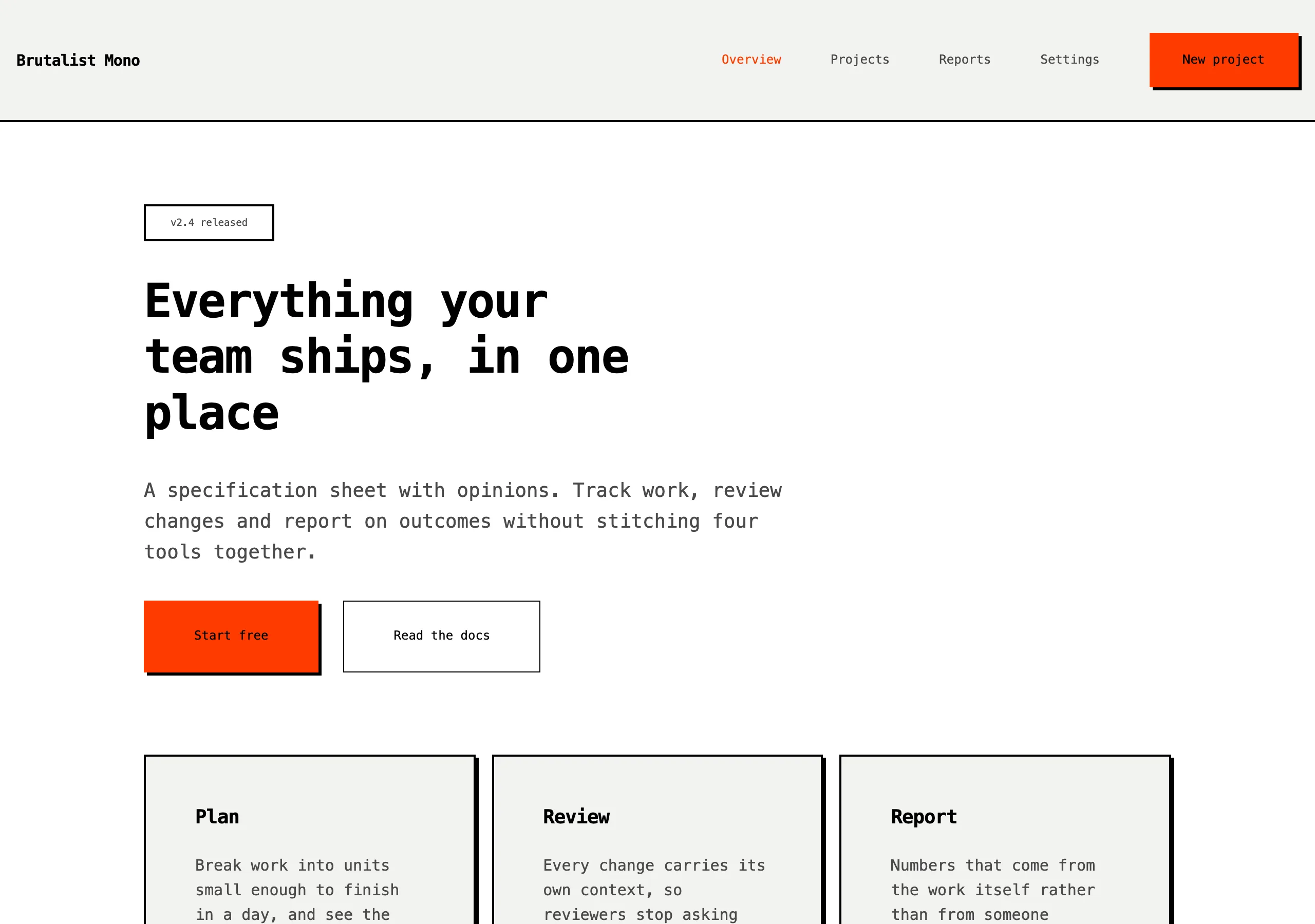
Monospace everywhere, hard black rules, zero radius and offset shadows. Loud orange for anything you can click. Structure is visible on purpose.
Install
npx styles-md add brutalist-mono Palette
Type
15px base · 1.25 ratio · weight 400/700. Fonts are not bundled — specimens fall back to what you have installed.
The quick brown fox jumps
The quick brown fox jumps
The quick brown fox jumps
The quick brown fox jumps
The quick brown fox jumps
The quick brown fox jumps
The quick brown fox jumps
The quick brown fox jumps
Shape, space & motion
- stroke
- 2px
- radius
- 0px · 0px · 0px
- spacing unit
- 8px
- gutter
- 16px
- section gap
- 80px
- max width
- 1000px
- motion
- 0ms steps(1, end)
Brutalist Mono
Nothing is hidden. Borders are black and 2px, shadows are hard offsets, and every element sits on an 8px grid you can see if you squint.
Principles
- Radius is zero everywhere. There are no exceptions and no pills.
- Every container gets a 2px black border. Borders are the layout.
- Shadows are solid offsets in black, never blurred.
- Transitions are instant. Motion has no place here.
- Headings are uppercase with tight negative tracking.
Typography
One family, monospace, for everything. Hierarchy comes from weight (400 vs 700), case, and the 1.25 size ramp. Because mono is wide, the measure runs to 1000px and line height stays at 1.5.
Colour
Black, white, one grey, one orange. surface is a barely-there grey used to separate a block from
the page when a border alone is not enough. accent is reserved strictly for interactive things.
Components
- Button: accent fill, black label, 2px black border,
shadow-sm; on press it translates 3px and drops the shadow. - Card:
surfacefill, 2px black border,shadow-md, 24px padding. - Input: white fill, 2px black border, 12px padding, mono text; focus adds
shadow-sm. - Nav: 2px bottom border, uppercase links at
text-sm, 24px gap, accent underline when active. - Table: 2px outer border, 1px inner rules,
surfaceheader row, 12px cells. - Badge: 2px black border,
surfacefill, uppercasetext-xs, 4px/8px padding. - Heading: uppercase, weight 700, tracking -0.03em, black.
- Focus ring: 3px accent outline, 0 offset, square.
Do / Don’t
- Do label things in uppercase — nav, buttons, badges, table headers.
- Do keep the 8px grid visible; every gap is a multiple of 8.
- Do let content touch the borders. Padding is 24px maximum.
- Don’t round any corner, ever.
- Don’t blur a shadow.
- Don’t animate anything, including hovers.
- Don’t use accent for large fills — it is a 15% colour at most.
- Don’t add a third font or a second accent.
When to use
Portfolios, tools with personality, launch pages, anything that wants to look built rather than designed. Wrong for enterprise software or long-form reading.
# Brutalist Mono

a specification sheet with opinions. Monospace everywhere, hard black rules, zero radius and offset shadows. Loud orange for anything you can click. Structure is visible on purpose.

## Tokens

```yaml
color:  { bg: "#ffffff", surface: "#f2f2f0", fg: "#000000", muted: "#4a4a4a",
          accent: "#ff3b00", accentFg: "#000000", border: "#000000" }
font:   { sans: "\"IBM Plex Mono\", ui-monospace, \"SFMono-Regular\", Menlo, monospace",
          mono: "\"IBM Plex Mono\", ui-monospace, \"SFMono-Regular\", Menlo, monospace",
          base: "15px", scale: 1.25,
          weightBody: 400, weightHeading: 700,
          headingTracking: "-0.03em" }
type:   { xs: "9.6px", sm: "12px", base: "15px", lg: "18.75px", xl: "23.44px", 2xl: "29.3px", 3xl: "36.62px", 4xl: "45.78px" }
space:  { unit: "8px", gutter: "16px",
          section: "80px", maxWidth: "1000px" }
shape:  { strokeWidth: "2px", radiusSm: "0px",
          radiusMd: "0px", radiusLg: "0px" }
motion: { duration: "0ms", easing: "steps(1, end)" }
```

## Principles

- Radius is zero everywhere. There are no exceptions and no pills.
- Every container gets a 2px black border. Borders are the layout.
- Shadows are solid offsets in black, never blurred.
- Transitions are instant. Motion has no place here.
- Headings are uppercase with tight negative tracking.

## Components

- Button: accent fill, black label, 2px black border, `shadow-sm`; on press it translates 3px and drops the shadow.
- Card: `surface` fill, 2px black border, `shadow-md`, 24px padding.
- Input: white fill, 2px black border, 12px padding, mono text; focus adds `shadow-sm`.
- Nav: 2px bottom border, uppercase links at `text-sm`, 24px gap, accent underline when active.
- Table: 2px outer border, 1px inner rules, `surface` header row, 12px cells.
- Badge: 2px black border, `surface` fill, uppercase `text-xs`, 4px/8px padding.
- Heading: uppercase, weight 700, tracking -0.03em, black.
- Focus ring: 3px accent outline, 0 offset, square.

## Do / Don't

- Do label things in uppercase — nav, buttons, badges, table headers.
- Do keep the 8px grid visible; every gap is a multiple of 8.
- Do let content touch the borders. Padding is 24px maximum.
- Don't round any corner, ever.
- Don't blur a shadow.
- Don't animate anything, including hovers.
- Don't use accent for large fills — it is a 15% colour at most.
- Don't add a third font or a second accent.

<!-- styles-md/brutalist-mono@1.0.0 — CC-BY-4.0. Full spec: DESIGN.md -->
/* Brutalist Mono — Tailwind v4 theme. Import after `@import "tailwindcss";` */
@theme {
--color-bg: #ffffff;
--color-surface: #f2f2f0;
--color-fg: #000000;
--color-muted: #4a4a4a;
--color-accent: #ff3b00;
--color-accent-fg: #000000;
--color-border: #000000;
--color-success: #007a3d;
--color-danger: #d40000;
--font-sans: "IBM Plex Mono", ui-monospace, "SFMono-Regular", Menlo, monospace;
--font-mono: "IBM Plex Mono", ui-monospace, "SFMono-Regular", Menlo, monospace;
--text-xs: 9.6px;
--text-sm: 12px;
--text-base: 15px;
--text-lg: 18.75px;
--text-xl: 23.44px;
--text-2xl: 29.3px;
--text-3xl: 36.62px;
--text-4xl: 45.78px;
--radius-sm: 0px;
--radius-md: 0px;
--radius-lg: 0px;
--radius-full: 0px;
--spacing: 8px;
--ease-default: steps(1, end);
}/* Brutalist Mono — a specification sheet with opinions
styles-md style "brutalist-mono" v1.0.0, CC-BY-4.0 */
:root {
--sm-color-bg: #ffffff;
--sm-color-surface: #f2f2f0;
--sm-color-fg: #000000;
--sm-color-muted: #4a4a4a;
--sm-color-accent: #ff3b00;
--sm-color-accent-fg: #000000;
--sm-color-border: #000000;
--sm-color-success: #007a3d;
--sm-color-danger: #d40000;
--sm-font-sans: "IBM Plex Mono", ui-monospace, "SFMono-Regular", Menlo, monospace;
--sm-font-mono: "IBM Plex Mono", ui-monospace, "SFMono-Regular", Menlo, monospace;
--sm-font-weight-body: 400;
--sm-font-weight-heading: 700;
--sm-heading-tracking: -0.03em;
--sm-text-xs: 9.6px;
--sm-text-sm: 12px;
--sm-text-base: 15px;
--sm-text-lg: 18.75px;
--sm-text-xl: 23.44px;
--sm-text-2xl: 29.3px;
--sm-text-3xl: 36.62px;
--sm-text-4xl: 45.78px;
--sm-space-1: 8px;
--sm-space-2: 16px;
--sm-space-3: 24px;
--sm-space-4: 32px;
--sm-space-6: 48px;
--sm-space-8: 64px;
--sm-space-12: 96px;
--sm-space-16: 128px;
--sm-space-24: 192px;
--sm-gutter: 16px;
--sm-section: 80px;
--sm-max-width: 1000px;
--sm-stroke-width: 2px;
--sm-radius-sm: 0px;
--sm-radius-md: 0px;
--sm-radius-lg: 0px;
--sm-radius-full: 0px;
--sm-duration: 0ms;
--sm-easing: steps(1, end);
--sm-shadow-sm: 3px 3px 0 #000000;
--sm-shadow-md: 6px 6px 0 #000000;
--sm-shadow-lg: 10px 10px 0 #000000;
}{
"id": "brutalist-mono",
"name": "Brutalist Mono",
"version": "1.0.0",
"license": "CC-BY-4.0",
"mood": "a specification sheet with opinions",
"tags": [
"light",
"brutalist",
"mono",
"high-contrast",
"experimental"
],
"tokens": {
"color": {
"bg": "#ffffff",
"surface": "#f2f2f0",
"fg": "#000000",
"muted": "#4a4a4a",
"accent": "#ff3b00",
"accentFg": "#000000",
"border": "#000000",
"success": "#007a3d",
"danger": "#d40000"
},
"font": {
"sans": "\"IBM Plex Mono\", ui-monospace, \"SFMono-Regular\", Menlo, monospace",
"mono": "\"IBM Plex Mono\", ui-monospace, \"SFMono-Regular\", Menlo, monospace",
"scale": 1.25,
"baseSize": "15px",
"weightBody": 400,
"weightHeading": 700,
"headingTracking": -0.03
},
"space": {
"unit": "8px",
"gutter": "16px",
"section": "80px",
"maxWidth": "1000px"
},
"stroke": {
"width": "2px"
},
"radius": {
"sm": "0px",
"md": "0px",
"lg": "0px",
"full": "0px"
},
"motion": {
"duration": "0ms",
"easing": "steps(1, end)"
},
"shadow": {
"sm": "3px 3px 0 #000000",
"md": "6px 6px 0 #000000",
"lg": "10px 10px 0 #000000"
}
},
"derived": {
"type": [
{
"name": "xs",
"size": "9.6px"
},
{
"name": "sm",
"size": "12px"
},
{
"name": "base",
"size": "15px"
},
{
"name": "lg",
"size": "18.75px"
},
{
"name": "xl",
"size": "23.44px"
},
{
"name": "2xl",
"size": "29.3px"
},
{
"name": "3xl",
"size": "36.62px"
},
{
"name": "4xl",
"size": "45.78px"
}
],
"space": [
{
"step": 1,
"size": "8px"
},
{
"step": 2,
"size": "16px"
},
{
"step": 3,
"size": "24px"
},
{
"step": 4,
"size": "32px"
},
{
"step": 6,
"size": "48px"
},
{
"step": 8,
"size": "64px"
},
{
"step": 12,
"size": "96px"
},
{
"step": 16,
"size": "128px"
},
{
"step": 24,
"size": "192px"
}
]
},
"variables": {
"color-bg": "#ffffff",
"color-surface": "#f2f2f0",
"color-fg": "#000000",
"color-muted": "#4a4a4a",
"color-accent": "#ff3b00",
"color-accent-fg": "#000000",
"color-border": "#000000",
"color-success": "#007a3d",
"color-danger": "#d40000",
"font-sans": "\"IBM Plex Mono\", ui-monospace, \"SFMono-Regular\", Menlo, monospace",
"font-mono": "\"IBM Plex Mono\", ui-monospace, \"SFMono-Regular\", Menlo, monospace",
"font-weight-body": "400",
"font-weight-heading": "700",
"heading-tracking": "-0.03em",
"text-xs": "9.6px",
"text-sm": "12px",
"text-base": "15px",
"text-lg": "18.75px",
"text-xl": "23.44px",
"text-2xl": "29.3px",
"text-3xl": "36.62px",
"text-4xl": "45.78px",
"space-1": "8px",
"space-2": "16px",
"space-3": "24px",
"space-4": "32px",
"space-6": "48px",
"space-8": "64px",
"space-12": "96px",
"space-16": "128px",
"space-24": "192px",
"gutter": "16px",
"section": "80px",
"max-width": "1000px",
"stroke-width": "2px",
"radius-sm": "0px",
"radius-md": "0px",
"radius-lg": "0px",
"radius-full": "0px",
"duration": "0ms",
"easing": "steps(1, end)",
"shadow-sm": "3px 3px 0 #000000",
"shadow-md": "6px 6px 0 #000000",
"shadow-lg": "10px 10px 0 #000000"
}
}