
Candy Playful
bright, chunky and pleased to see you
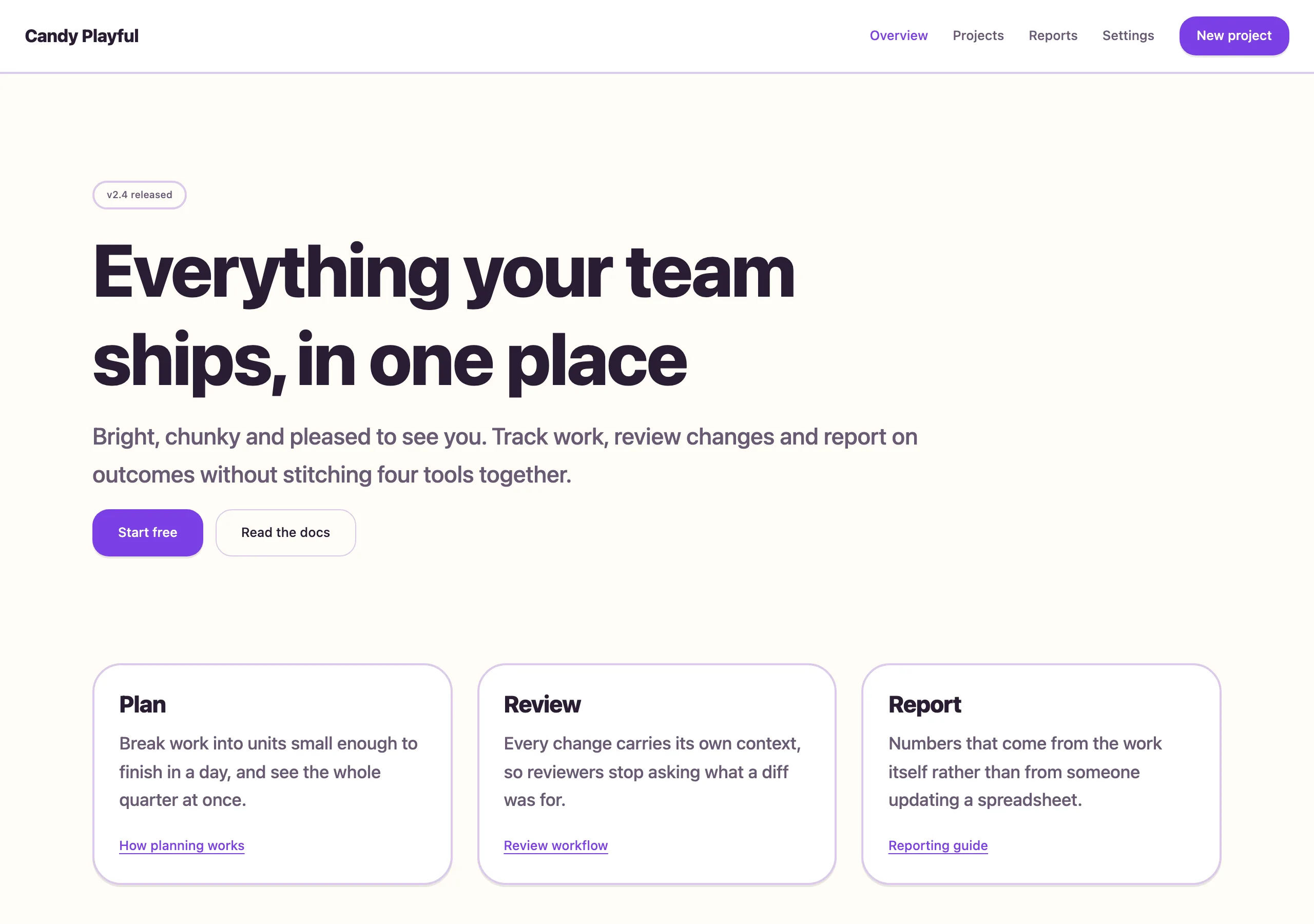
Big radii, thick weights, saturated violet and a springy motion curve. Confident and friendly without slipping into childish.
Install
npx styles-md add candy-playful Palette
Type
17px base · 1.333 ratio · weight 500/800. Fonts are not bundled — specimens fall back to what you have installed.
The quick brown fox jumps
The quick brown fox jumps
The quick brown fox jumps
The quick brown fox jumps
The quick brown fox jumps
The quick brown fox jumps
The quick brown fox jumps
The quick brown fox jumps
Shape, space & motion
- stroke
- 2px
- radius
- 10px · 16px · 28px
- spacing unit
- 4px
- gutter
- 24px
- section gap
- 104px
- max width
- 1100px
- motion
- 260ms cubic-bezier(0.34, 1.56, 0.64, 1)
Candy Playful
Chunky and warm. Weight does the shouting so colour does not have to, and everything you can press looks genuinely pressable.
Principles
- Body text is weight 500 and headings are 800. There is no thin type in this style.
- Buttons and cards use a solid offset shadow so they read as physical objects.
- The motion curve overshoots slightly. Every hover and open should feel springy.
- Radius scales with the element: 10px controls, 16px buttons, 28px cards.
- Violet is the only accent; warmth comes from the cream background, not a second hue.
Typography
Nunito at 17px with a 1.333 ratio gives a big, cheerful ramp. Headings are tightly tracked at weight 800 so they stay compact despite the size. Line height 1.6 body, 1.15 headings. Sentence case everywhere — uppercase kills the friendliness instantly.
Colour
Cream page, white cards, violet accent. border is a light violet tint rather than grey, which
keeps the whole surface warm even where nothing is coloured.
Components
- Button (primary): accent fill, white label,
radius-md, 14px/26px padding, weight 700,shadow-sm; presses down 2px on active. - Button (secondary): white fill, 2px border,
fglabel, same metrics. - Card: white fill, 2px border,
radius-lg, 28px padding,shadow-md. - Input: white fill, 2px border,
radius-md, 14px/16px padding; focus swaps border to accent. - Nav: 72px tall, transparent,
fglinks at weight 600, accent pill behind the active item. - Badge: tinted accent fill, accent text,
radius-full, weight 700text-xs, 4px/12px padding. - Avatar:
radius-full, 2px white ring over a coloured background. - Illustration: flat shapes in accent tints, never gradients or drop shadows.
Do / Don’t
- Do give sections 104px of air — the chunky elements need it.
- Do use sentence case for every label, button and heading.
- Do animate hovers with the springy curve; it is the personality of the style.
- Don’t use thin or light font weights anywhere.
- Don’t drop below 16px radius on a button.
- Don’t add a second saturated colour. Tints of the accent only.
- Don’t use blurred shadows on buttons; the solid offset is the look.
- Don’t set body copy at weight 400 — it looks broken next to the headings.
When to use
Consumer apps, education, community products, onboarding flows, anything where warmth beats authority. Wrong for finance, security tooling or dense data.
# Candy Playful

bright, chunky and pleased to see you. Big radii, thick weights, saturated violet and a springy motion curve. Confident and friendly without slipping into childish.

## Tokens

```yaml
color:  { bg: "#fffdf7", surface: "#ffffff", fg: "#2a1d33", muted: "#6b5a75",
          accent: "#7b3fe4", accentFg: "#ffffff", border: "#dcc9ea" }
font:   { sans: "\"Nunito\", \"Inter\", system-ui, -apple-system, sans-serif",
          mono: "\"JetBrains Mono\", ui-monospace, \"SFMono-Regular\", Menlo, monospace",
          base: "17px", scale: 1.333,
          weightBody: 500, weightHeading: 800,
          headingTracking: "-0.02em" }
type:   { xs: "9.57px", sm: "12.75px", base: "17px", lg: "22.66px", xl: "30.21px", 2xl: "40.27px", 3xl: "53.67px", 4xl: "71.55px" }
space:  { unit: "4px", gutter: "24px",
          section: "104px", maxWidth: "1100px" }
shape:  { strokeWidth: "2px", radiusSm: "10px",
          radiusMd: "16px", radiusLg: "28px" }
motion: { duration: "260ms", easing: "cubic-bezier(0.34, 1.56, 0.64, 1)" }
```

## Principles

- Body text is weight 500 and headings are 800. There is no thin type in this style.
- Buttons and cards use a solid offset shadow so they read as physical objects.
- The motion curve overshoots slightly. Every hover and open should feel springy.
- Radius scales with the element: 10px controls, 16px buttons, 28px cards.
- Violet is the only accent; warmth comes from the cream background, not a second hue.

## Components

- Button (primary): accent fill, white label, `radius-md`, 14px/26px padding, weight 700, `shadow-sm`; presses down 2px on active.
- Button (secondary): white fill, 2px border, `fg` label, same metrics.
- Card: white fill, 2px border, `radius-lg`, 28px padding, `shadow-md`.
- Input: white fill, 2px border, `radius-md`, 14px/16px padding; focus swaps border to accent.
- Nav: 72px tall, transparent, `fg` links at weight 600, accent pill behind the active item.
- Badge: tinted accent fill, accent text, `radius-full`, weight 700 `text-xs`, 4px/12px padding.
- Avatar: `radius-full`, 2px white ring over a coloured background.
- Illustration: flat shapes in accent tints, never gradients or drop shadows.

## Do / Don't

- Do give sections 104px of air — the chunky elements need it.
- Do use sentence case for every label, button and heading.
- Do animate hovers with the springy curve; it is the personality of the style.
- Don't use thin or light font weights anywhere.
- Don't drop below 16px radius on a button.
- Don't add a second saturated colour. Tints of the accent only.
- Don't use blurred shadows on buttons; the solid offset is the look.
- Don't set body copy at weight 400 — it looks broken next to the headings.

<!-- styles-md/candy-playful@1.0.0 — CC-BY-4.0. Full spec: DESIGN.md -->
/* Candy Playful — Tailwind v4 theme. Import after `@import "tailwindcss";` */
@theme {
--color-bg: #fffdf7;
--color-surface: #ffffff;
--color-fg: #2a1d33;
--color-muted: #6b5a75;
--color-accent: #7b3fe4;
--color-accent-fg: #ffffff;
--color-border: #dcc9ea;
--color-success: #1f8a4c;
--color-danger: #d62839;
--font-sans: "Nunito", "Inter", system-ui, -apple-system, sans-serif;
--font-mono: "JetBrains Mono", ui-monospace, "SFMono-Regular", Menlo, monospace;
--text-xs: 9.57px;
--text-sm: 12.75px;
--text-base: 17px;
--text-lg: 22.66px;
--text-xl: 30.21px;
--text-2xl: 40.27px;
--text-3xl: 53.67px;
--text-4xl: 71.55px;
--radius-sm: 10px;
--radius-md: 16px;
--radius-lg: 28px;
--radius-full: 9999px;
--spacing: 4px;
--ease-default: cubic-bezier(0.34, 1.56, 0.64, 1);
}/* Candy Playful — bright, chunky and pleased to see you
styles-md style "candy-playful" v1.0.0, CC-BY-4.0 */
:root {
--sm-color-bg: #fffdf7;
--sm-color-surface: #ffffff;
--sm-color-fg: #2a1d33;
--sm-color-muted: #6b5a75;
--sm-color-accent: #7b3fe4;
--sm-color-accent-fg: #ffffff;
--sm-color-border: #dcc9ea;
--sm-color-success: #1f8a4c;
--sm-color-danger: #d62839;
--sm-font-sans: "Nunito", "Inter", system-ui, -apple-system, sans-serif;
--sm-font-mono: "JetBrains Mono", ui-monospace, "SFMono-Regular", Menlo, monospace;
--sm-font-weight-body: 500;
--sm-font-weight-heading: 800;
--sm-heading-tracking: -0.02em;
--sm-text-xs: 9.57px;
--sm-text-sm: 12.75px;
--sm-text-base: 17px;
--sm-text-lg: 22.66px;
--sm-text-xl: 30.21px;
--sm-text-2xl: 40.27px;
--sm-text-3xl: 53.67px;
--sm-text-4xl: 71.55px;
--sm-space-1: 4px;
--sm-space-2: 8px;
--sm-space-3: 12px;
--sm-space-4: 16px;
--sm-space-6: 24px;
--sm-space-8: 32px;
--sm-space-12: 48px;
--sm-space-16: 64px;
--sm-space-24: 96px;
--sm-gutter: 24px;
--sm-section: 104px;
--sm-max-width: 1100px;
--sm-stroke-width: 2px;
--sm-radius-sm: 10px;
--sm-radius-md: 16px;
--sm-radius-lg: 28px;
--sm-radius-full: 9999px;
--sm-duration: 260ms;
--sm-easing: cubic-bezier(0.34, 1.56, 0.64, 1);
--sm-shadow-sm: 0 2px 0 rgba(42,29,51,0.10);
--sm-shadow-md: 0 6px 0 rgba(42,29,51,0.12);
--sm-shadow-lg: 0 14px 32px rgba(42,29,51,0.16);
}{
"id": "candy-playful",
"name": "Candy Playful",
"version": "1.0.0",
"license": "CC-BY-4.0",
"mood": "bright, chunky and pleased to see you",
"tags": [
"light",
"playful",
"consumer",
"rounded",
"bold",
"vibrant"
],
"tokens": {
"color": {
"bg": "#fffdf7",
"surface": "#ffffff",
"fg": "#2a1d33",
"muted": "#6b5a75",
"accent": "#7b3fe4",
"accentFg": "#ffffff",
"border": "#dcc9ea",
"success": "#1f8a4c",
"danger": "#d62839"
},
"font": {
"sans": "\"Nunito\", \"Inter\", system-ui, -apple-system, sans-serif",
"mono": "\"JetBrains Mono\", ui-monospace, \"SFMono-Regular\", Menlo, monospace",
"scale": 1.333,
"baseSize": "17px",
"weightBody": 500,
"weightHeading": 800,
"headingTracking": -0.02
},
"space": {
"unit": "4px",
"gutter": "24px",
"section": "104px",
"maxWidth": "1100px"
},
"stroke": {
"width": "2px"
},
"radius": {
"sm": "10px",
"md": "16px",
"lg": "28px",
"full": "9999px"
},
"motion": {
"duration": "260ms",
"easing": "cubic-bezier(0.34, 1.56, 0.64, 1)"
},
"shadow": {
"sm": "0 2px 0 rgba(42,29,51,0.10)",
"md": "0 6px 0 rgba(42,29,51,0.12)",
"lg": "0 14px 32px rgba(42,29,51,0.16)"
}
},
"derived": {
"type": [
{
"name": "xs",
"size": "9.57px"
},
{
"name": "sm",
"size": "12.75px"
},
{
"name": "base",
"size": "17px"
},
{
"name": "lg",
"size": "22.66px"
},
{
"name": "xl",
"size": "30.21px"
},
{
"name": "2xl",
"size": "40.27px"
},
{
"name": "3xl",
"size": "53.67px"
},
{
"name": "4xl",
"size": "71.55px"
}
],
"space": [
{
"step": 1,
"size": "4px"
},
{
"step": 2,
"size": "8px"
},
{
"step": 3,
"size": "12px"
},
{
"step": 4,
"size": "16px"
},
{
"step": 6,
"size": "24px"
},
{
"step": 8,
"size": "32px"
},
{
"step": 12,
"size": "48px"
},
{
"step": 16,
"size": "64px"
},
{
"step": 24,
"size": "96px"
}
]
},
"variables": {
"color-bg": "#fffdf7",
"color-surface": "#ffffff",
"color-fg": "#2a1d33",
"color-muted": "#6b5a75",
"color-accent": "#7b3fe4",
"color-accent-fg": "#ffffff",
"color-border": "#dcc9ea",
"color-success": "#1f8a4c",
"color-danger": "#d62839",
"font-sans": "\"Nunito\", \"Inter\", system-ui, -apple-system, sans-serif",
"font-mono": "\"JetBrains Mono\", ui-monospace, \"SFMono-Regular\", Menlo, monospace",
"font-weight-body": "500",
"font-weight-heading": "800",
"heading-tracking": "-0.02em",
"text-xs": "9.57px",
"text-sm": "12.75px",
"text-base": "17px",
"text-lg": "22.66px",
"text-xl": "30.21px",
"text-2xl": "40.27px",
"text-3xl": "53.67px",
"text-4xl": "71.55px",
"space-1": "4px",
"space-2": "8px",
"space-3": "12px",
"space-4": "16px",
"space-6": "24px",
"space-8": "32px",
"space-12": "48px",
"space-16": "64px",
"space-24": "96px",
"gutter": "24px",
"section": "104px",
"max-width": "1100px",
"stroke-width": "2px",
"radius-sm": "10px",
"radius-md": "16px",
"radius-lg": "28px",
"radius-full": "9999px",
"duration": "260ms",
"easing": "cubic-bezier(0.34, 1.56, 0.64, 1)",
"shadow-sm": "0 2px 0 rgba(42,29,51,0.10)",
"shadow-md": "0 6px 0 rgba(42,29,51,0.12)",
"shadow-lg": "0 14px 32px rgba(42,29,51,0.16)"
}
}