
Drafting Sheet
an architect's plot sheet on the desk
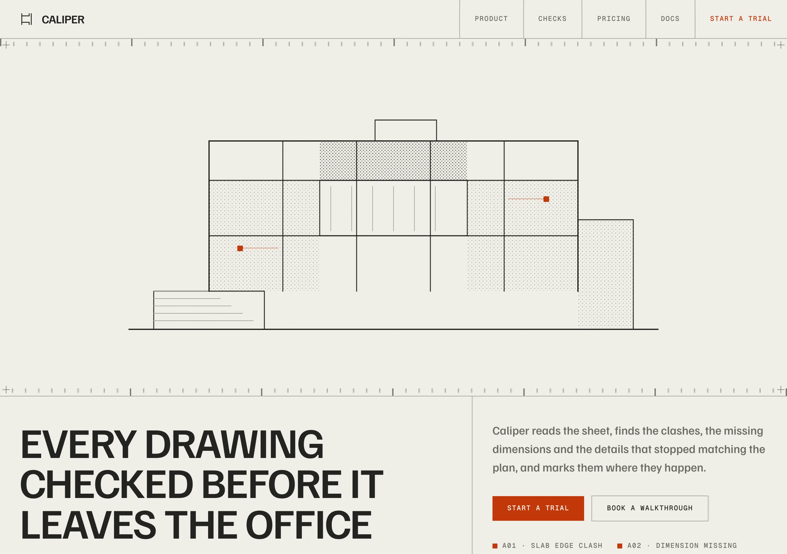
Warm paper ground, ink grotesk set in tight uppercase, and one plot orange for annotation. Corners are square, rules are hairlines, and the page is bounded by ruler ticks and register marks like a sheet off a plotter.
Install
npx styles-md add drafting-sheet Palette
Type
Aa Bb Cc 0123 The quick brown fox
"Familjen Grotesk", "Helvetica Neue", Arial, sans-serif const total = 1 + lI0O;
"Geist Mono", ui-monospace, "SFMono-Regular", Menlo, monospace 16px base · 1.2 ratio · body 500 / heading 600 · heading tracking -0.02em. Fonts are not bundled. Install the first family in each stack, or the specimens below fall back to the next one your device has.
The quick brown fox jumps
The quick brown fox jumps
The quick brown fox jumps
The quick brown fox jumps
The quick brown fox jumps
The quick brown fox jumps
The quick brown fox jumps
The quick brown fox jumps
Licensing
No font files are redistributed here. Every family this style asks for by name is free for commercial use, and CI rejects a style that names one which is not.
- Familjen Grotesk sans SIL Open Font License 1.1 Neo grotesque with a slightly narrow cap. Holds a tight negative tracking without closing up.
- Geist Mono mono SIL Open Font License 1.1 Every label, dimension and annotation on the sheet.
Fallbacks: Helvetica Neue, Arial, sans-serif, ui-monospace, SFMono-Regular, Menlo, monospace. These are CSS generics and fonts the reader's OS already ships, referenced by name only, so nothing is licensed or downloaded.
The spec itself, and everything generated from it, is CC-BY-4.0. Attribution is the comment at the top of each generated file; keep it and you have complied.
Shape, space & motion
- stroke
- 1px
- radius
- 0px · 0px · 0px
- spacing unit
- 4px
- gutter
- 24px
- section gap
- 96px
- max width
- 1440px
- motion
- 400ms cubic-bezier(0.625, 0.05, 0, 1)
Drafting Sheet
A plot sheet, not a landing page. Paper ground, ink type, hairline rules, and one orange reserved for the marks an engineer would make by hand. Nothing is rounded and nothing is blurred, so the page reads as something printed and measured rather than rendered.
Principles
- Corners are square.
radius-smthroughradius-lgare all 0, and only markers are circles. - Rules are 1px hairlines. They divide the page into cells the way a drawing has a border and a grid.
- Type is uppercase grotesk at -0.02em. Sentence case appears only in body paragraphs.
- Orange is annotation. Small squares, one hairline, a link, a single filled control per screen.
- Illustration is drawn, stippled and monochrome, sitting on the paper with no frame around it.
- Shadows are hard offsets in ink with no blur. A soft shadow is the one thing that breaks this.
Typography
One grotesk does headings and body, one mono does everything the sheet needs to label. Headings run uppercase at weight 600 with tracking pulled to -0.02em, because at that width the caps close ranks and read as a title block rather than as a sentence. Mono is small on purpose: 10 to 13px, wide tracking, uppercase, and it carries dimensions, section keys and annotations. Body copy is the only sentence case on the page, at weight 500 so it holds against the greige.
Colour
Paper #efede7 is the ground and ink #232320 sits on it at 13.46:1. surface greige is a filled
cell, and ink still clears AA on it at 9.61:1. accent is a burnt plot orange, dark enough that
white on it clears AA at 5.43:1 and that it works as link text on paper at 4.64:1. Brighter oranges
look better and fail both, which is the tradeoff this palette settles. border is a greige
hairline at 2.15:1 against the paper.
Components
- Title block: uppercase, weight 600, -0.02em, sitting against a hairline with a mono key above it.
- Rule: 1px
border, full bleed, dividing sections into cells rather than framing them. - Ruler edge: mono tick marks along a section edge, with a plus register mark at each corner.
- Button (primary):
accentfill,accentFglabel, square, 12px/24px, uppercase mono. - Button (secondary): 1px
border,fglabel, square, same metrics,shadow-smon hover. - Cell:
surfaceor paper, 1pxborder, 24px padding, square, no radius and no blur. - Annotation mark: an 8px
accentsquare with a mono label, pinned to a point on a drawing. - Drawing: stippled monochrome linework, no frame, no fill behind it.
- Nav: hairline underneath, items in cells divided by 1px rules, active item in
accent. - Focus ring: 2px
accentat 2px offset.
Do / Don’t
- Do keep every corner square. Circles are for markers and nothing else.
- Do divide the page with hairlines into cells, and let the cells be uneven.
- Do set headings uppercase and tight, and leave body copy in sentence case.
- Do use orange as annotation: a mark, a rule, a link, one filled control.
- Do put ticks and register marks on the edge of a full bleed section.
- Don’t use a blurred shadow. The offsets here are hard and inked.
- Don’t fill a large area with orange. It stops being an annotation and becomes a brand band.
- Don’t set body copy in the mono. It is for labels, dimensions and keys.
- Don’t add a second accent hue, or a gradient of any kind.
- Don’t round a button, a cell or an image. The sheet has no rounded corners on it.
When to use
Tools for people who model, draw or measure: architecture and engineering software, hardware, data tooling, technical documentation. A poor fit for consumer lifestyle brands and anything sold on warmth, where square corners and a title block read as cold.
# Drafting Sheet

an architect's plot sheet on the desk. Warm paper ground, ink grotesk set in tight uppercase, and one plot orange for annotation. Corners are square, rules are hairlines, and the page is bounded by ruler ticks and register marks like a sheet off a plotter.

## Tokens

```yaml
color:  { bg: "#efede7", surface: "#cdcac1", fg: "#232320", muted: "#6b6a64",
          accent: "#c2380a", accentFg: "#ffffff", border: "#a6a39a" }
font:   { sans: "\"Familjen Grotesk\", \"Helvetica Neue\", Arial, sans-serif",
          mono: "\"Geist Mono\", ui-monospace, \"SFMono-Regular\", Menlo, monospace",
          base: "16px", scale: 1.2,
          weightBody: 500, weightHeading: 600,
          headingTracking: "-0.02em" }
type:   { xs: "11.11px", sm: "13.33px", base: "16px", lg: "19.2px", xl: "23.04px", 2xl: "27.65px", 3xl: "33.18px", 4xl: "39.81px" }
space:  { unit: "4px", gutter: "24px",
          section: "96px", maxWidth: "1440px" }
shape:  { strokeWidth: "1px", radiusSm: "0px",
          radiusMd: "0px", radiusLg: "0px" }
motion: { duration: "400ms", easing: "cubic-bezier(0.625, 0.05, 0, 1)" }
```

## Principles

- Corners are square. `radius-sm` through `radius-lg` are all 0, and only markers are circles.
- Rules are 1px hairlines. They divide the page into cells the way a drawing has a border and a grid.
- Type is uppercase grotesk at -0.02em. Sentence case appears only in body paragraphs.
- Orange is annotation. Small squares, one hairline, a link, a single filled control per screen.
- Illustration is drawn, stippled and monochrome, sitting on the paper with no frame around it.
- Shadows are hard offsets in ink with no blur. A soft shadow is the one thing that breaks this.

## Components

- Title block: uppercase, weight 600, -0.02em, sitting against a hairline with a mono key above it.
- Rule: 1px `border`, full bleed, dividing sections into cells rather than framing them.
- Ruler edge: mono tick marks along a section edge, with a plus register mark at each corner.
- Button (primary): `accent` fill, `accentFg` label, square, 12px/24px, uppercase mono.
- Button (secondary): 1px `border`, `fg` label, square, same metrics, `shadow-sm` on hover.
- Cell: `surface` or paper, 1px `border`, 24px padding, square, no radius and no blur.
- Annotation mark: an 8px `accent` square with a mono label, pinned to a point on a drawing.
- Drawing: stippled monochrome linework, no frame, no fill behind it.
- Nav: hairline underneath, items in cells divided by 1px rules, active item in `accent`.
- Focus ring: 2px `accent` at 2px offset.

## Do / Don't

- Do keep every corner square. Circles are for markers and nothing else.
- Do divide the page with hairlines into cells, and let the cells be uneven.
- Do set headings uppercase and tight, and leave body copy in sentence case.
- Do use orange as annotation: a mark, a rule, a link, one filled control.
- Do put ticks and register marks on the edge of a full bleed section.
- Don't use a blurred shadow. The offsets here are hard and inked.
- Don't fill a large area with orange. It stops being an annotation and becomes a brand band.
- Don't set body copy in the mono. It is for labels, dimensions and keys.
- Don't add a second accent hue, or a gradient of any kind.
- Don't round a button, a cell or an image. The sheet has no rounded corners on it.

<!-- styles-md/drafting-sheet@1.0.0, CC-BY-4.0. Full spec: DESIGN.md -->
/* Drafting Sheet: Tailwind v4 theme. Import after `@import "tailwindcss";` */
@theme {
--color-bg: #efede7;
--color-surface: #cdcac1;
--color-fg: #232320;
--color-muted: #6b6a64;
--color-accent: #c2380a;
--color-accent-fg: #ffffff;
--color-border: #a6a39a;
--font-sans: "Familjen Grotesk", "Helvetica Neue", Arial, sans-serif;
--font-mono: "Geist Mono", ui-monospace, "SFMono-Regular", Menlo, monospace;
--font-display: "Familjen Grotesk", "Helvetica Neue", Arial, sans-serif;
--text-xs: 11.11px;
--text-sm: 13.33px;
--text-base: 16px;
--text-lg: 19.2px;
--text-xl: 23.04px;
--text-2xl: 27.65px;
--text-3xl: 33.18px;
--text-4xl: 39.81px;
--radius-sm: 0px;
--radius-md: 0px;
--radius-lg: 0px;
--radius-full: 9999px;
--spacing: 4px;
--ease-default: cubic-bezier(0.625, 0.05, 0, 1);
}/* Drafting Sheet: an architect's plot sheet on the desk
styles-md style "drafting-sheet" v1.0.0, CC-BY-4.0 */
:root {
--sm-color-bg: #efede7;
--sm-color-surface: #cdcac1;
--sm-color-fg: #232320;
--sm-color-muted: #6b6a64;
--sm-color-accent: #c2380a;
--sm-color-accent-fg: #ffffff;
--sm-color-border: #a6a39a;
--sm-font-sans: "Familjen Grotesk", "Helvetica Neue", Arial, sans-serif;
--sm-font-mono: "Geist Mono", ui-monospace, "SFMono-Regular", Menlo, monospace;
--sm-font-display: "Familjen Grotesk", "Helvetica Neue", Arial, sans-serif;
--sm-font-weight-body: 500;
--sm-font-weight-heading: 600;
--sm-heading-tracking: -0.02em;
--sm-text-xs: 11.11px;
--sm-text-sm: 13.33px;
--sm-text-base: 16px;
--sm-text-lg: 19.2px;
--sm-text-xl: 23.04px;
--sm-text-2xl: 27.65px;
--sm-text-3xl: 33.18px;
--sm-text-4xl: 39.81px;
--sm-space-1: 4px;
--sm-space-2: 8px;
--sm-space-3: 12px;
--sm-space-4: 16px;
--sm-space-6: 24px;
--sm-space-8: 32px;
--sm-space-12: 48px;
--sm-space-16: 64px;
--sm-space-24: 96px;
--sm-gutter: 24px;
--sm-section: 96px;
--sm-max-width: 1440px;
--sm-stroke-width: 1px;
--sm-radius-sm: 0px;
--sm-radius-md: 0px;
--sm-radius-lg: 0px;
--sm-radius-full: 9999px;
--sm-duration: 400ms;
--sm-easing: cubic-bezier(0.625, 0.05, 0, 1);
--sm-shadow-sm: 3px 3px 0 -1px #232320;
--sm-shadow-md: 0 6px 0 -2px #232320;
--sm-shadow-lg: 8px 8px 0 -2px #232320;
}{
"id": "drafting-sheet",
"name": "Drafting Sheet",
"version": "1.0.0",
"license": "CC-BY-4.0",
"mood": "an architect's plot sheet on the desk",
"tags": [
"light",
"technical",
"editorial",
"architecture",
"saas",
"uppercase",
"minimal"
],
"fonts": [
{
"family": "Familjen Grotesk",
"role": "sans",
"license": "OFL-1.1",
"url": "https://fonts.google.com/specimen/Familjen+Grotesk",
"note": "Neo grotesque with a slightly narrow cap. Holds a tight negative tracking without closing up."
},
{
"family": "Geist Mono",
"role": "mono",
"license": "OFL-1.1",
"url": "https://fonts.google.com/specimen/Geist+Mono",
"note": "Every label, dimension and annotation on the sheet."
}
],
"tokens": {
"color": {
"bg": "#efede7",
"surface": "#cdcac1",
"fg": "#232320",
"muted": "#6b6a64",
"accent": "#c2380a",
"accentFg": "#ffffff",
"border": "#a6a39a"
},
"font": {
"sans": "\"Familjen Grotesk\", \"Helvetica Neue\", Arial, sans-serif",
"mono": "\"Geist Mono\", ui-monospace, \"SFMono-Regular\", Menlo, monospace",
"display": "\"Familjen Grotesk\", \"Helvetica Neue\", Arial, sans-serif",
"scale": 1.2,
"baseSize": "16px",
"weightBody": 500,
"weightHeading": 600,
"headingTracking": -0.02
},
"space": {
"unit": "4px",
"gutter": "24px",
"section": "96px",
"maxWidth": "1440px"
},
"stroke": {
"width": "1px"
},
"radius": {
"sm": "0px",
"md": "0px",
"lg": "0px",
"full": "9999px"
},
"motion": {
"duration": "400ms",
"easing": "cubic-bezier(0.625, 0.05, 0, 1)"
},
"shadow": {
"sm": "3px 3px 0 -1px #232320",
"md": "0 6px 0 -2px #232320",
"lg": "8px 8px 0 -2px #232320"
}
},
"derived": {
"type": [
{
"name": "xs",
"size": "11.11px"
},
{
"name": "sm",
"size": "13.33px"
},
{
"name": "base",
"size": "16px"
},
{
"name": "lg",
"size": "19.2px"
},
{
"name": "xl",
"size": "23.04px"
},
{
"name": "2xl",
"size": "27.65px"
},
{
"name": "3xl",
"size": "33.18px"
},
{
"name": "4xl",
"size": "39.81px"
}
],
"space": [
{
"step": 1,
"size": "4px"
},
{
"step": 2,
"size": "8px"
},
{
"step": 3,
"size": "12px"
},
{
"step": 4,
"size": "16px"
},
{
"step": 6,
"size": "24px"
},
{
"step": 8,
"size": "32px"
},
{
"step": 12,
"size": "48px"
},
{
"step": 16,
"size": "64px"
},
{
"step": 24,
"size": "96px"
}
]
},
"variables": {
"color-bg": "#efede7",
"color-surface": "#cdcac1",
"color-fg": "#232320",
"color-muted": "#6b6a64",
"color-accent": "#c2380a",
"color-accent-fg": "#ffffff",
"color-border": "#a6a39a",
"font-sans": "\"Familjen Grotesk\", \"Helvetica Neue\", Arial, sans-serif",
"font-mono": "\"Geist Mono\", ui-monospace, \"SFMono-Regular\", Menlo, monospace",
"font-display": "\"Familjen Grotesk\", \"Helvetica Neue\", Arial, sans-serif",
"font-weight-body": "500",
"font-weight-heading": "600",
"heading-tracking": "-0.02em",
"text-xs": "11.11px",
"text-sm": "13.33px",
"text-base": "16px",
"text-lg": "19.2px",
"text-xl": "23.04px",
"text-2xl": "27.65px",
"text-3xl": "33.18px",
"text-4xl": "39.81px",
"space-1": "4px",
"space-2": "8px",
"space-3": "12px",
"space-4": "16px",
"space-6": "24px",
"space-8": "32px",
"space-12": "48px",
"space-16": "64px",
"space-24": "96px",
"gutter": "24px",
"section": "96px",
"max-width": "1440px",
"stroke-width": "1px",
"radius-sm": "0px",
"radius-md": "0px",
"radius-lg": "0px",
"radius-full": "9999px",
"duration": "400ms",
"easing": "cubic-bezier(0.625, 0.05, 0, 1)",
"shadow-sm": "3px 3px 0 -1px #232320",
"shadow-md": "0 6px 0 -2px #232320",
"shadow-lg": "8px 8px 0 -2px #232320"
}
}