
Ember Darkroom
one object lit in a warm dark room
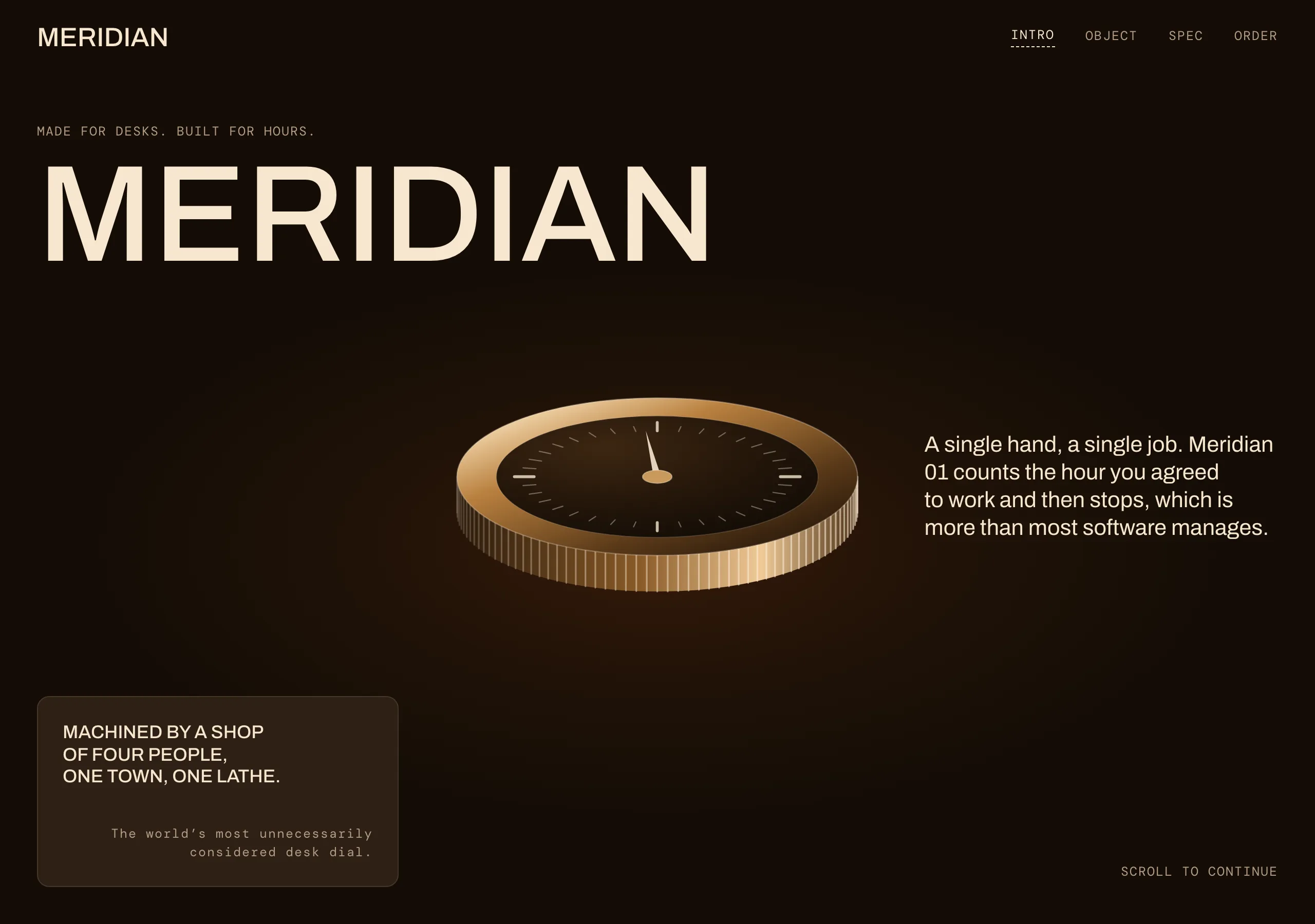
Warm near-black canvas, cream uppercase grotesk at a single weight, and one ember orange rationed to a single button and a few credit lines. Depth comes from a second surface, never a shadow, and every divider is a dashed hairline.
Install
npx styles-md add ember-darkroom Palette
Type
Aa Bb Cc 0123 The quick brown fox
"Archivo", "Inter", "Helvetica Neue", Arial, sans-serif const total = 1 + lI0O;
"DM Mono", ui-monospace, "SFMono-Regular", Menlo, monospace 18px base · 1.2 ratio · body 400 / heading 500 · heading tracking 0em. Fonts are not bundled. Install the first family in each stack, or the specimens below fall back to the next one your device has.
The quick brown fox jumps
The quick brown fox jumps
The quick brown fox jumps
The quick brown fox jumps
The quick brown fox jumps
The quick brown fox jumps
The quick brown fox jumps
The quick brown fox jumps
Licensing
No font files are redistributed here. Every family this style asks for by name is free for commercial use, and CI rejects a style that names one which is not.
- Archivo display SIL Open Font License 1.1 Grotesk with a tall x-height and flat terminals. Holds shape at 120px uppercase.
- Inter sans SIL Open Font License 1.1 Fallback. Same skeleton, slightly narrower caps, so a missing Archivo does not reflow the page.
- DM Mono mono SIL Open Font License 1.1 Specs, model numbers and footnote credits only.
Fallbacks: Helvetica Neue, Arial, sans-serif, ui-monospace, SFMono-Regular, Menlo, monospace. These are CSS generics and fonts the reader's OS already ships, referenced by name only, so nothing is licensed or downloaded.
The spec itself, and everything generated from it, is CC-BY-4.0. Attribution is the comment at the top of each generated file; keep it and you have complied.
Shape, space & motion
- stroke
- 1px
- radius
- 12px · 22px · 36px
- spacing unit
- 6px
- gutter
- 18px
- section gap
- 160px
- max width
- 1440px
- motion
- 250ms cubic-bezier(0.33, 0, 0.2, 1)
Ember Darkroom
A product photographed in a warm dark room, with the copy set around it in cream capitals. The page is a gallery wall: one object per section, generous emptiness, and no chrome arguing with the form. What makes it feel expensive is what is missing, so the rules below are mostly removals.
Principles
- One family does every job. Weight 500 uppercase for headings, nav and labels; weight 400 mixed case only for body copy.
- The canvas is warm near-black, never pure black, and text is warm cream, never pure white.
- Ember is rationed: one filled control per page, and otherwise text for links, credits and footnotes.
- Depth is two surfaces,
bgthensurface. No shadow exists in this style. - One object per section, centred, with copy flanking it left and right.
- Dividers are 1px dashed in
border. A solid rule reads as a UI frame and breaks the gallery.
Typography
The scale is a minor third from an 18px base, which puts body copy well above the usual 16px and lets a page carry very few sizes. Headings run past the emitted ramp: the display line is set around 120px on a wide viewport and 51px on a phone, at line height 0.9, and continuing the same 1.2 ratio is how you get there. Nothing is bold. Weight 500 against weight 400 is the entire emphasis system, and the difference reads because the two are never mixed inside a line.
Colour
bg is a brown-black, so a screenshot next to a pure #000 page looks lit rather than switched
off. surface is the one chromatic step up, for cards and secondary buttons, and the step is small
on purpose. muted is a warm grey that clears AA on the canvas at 7.42:1; the darker
structural browns in this family sit far below that, which is why they are borders and never text.
Ember is the only saturated hue and it appears a handful of times per page.
Components
- Display line:
font-display, weight 500, uppercase, line height 0.9, tracking 0. - Body copy: weight 400, mixed case,
text-lgtotext-xl, left aligned, measure under 46 characters. - Button (primary):
accentfill,accentFglabel,radius-lgpill, 14px/28px padding. One per page. - Button (secondary):
surfacefill or 1pxborderover the canvas,fglabel,radius-md, same padding. - Card:
surface,radius-sm, 24px padding, 1pxborder, no shadow. - Divider: 1px dashed
border, full bleed, withsectionspace above and below. - Nav: no bar, no fill. Wordmark left, uppercase 12px links right, active link underlined dashed.
- Label / eyebrow: mono, uppercase, 12px,
muted, sitting directly above the display line. - Credit line: mono, 12px,
accent, bottom corner of a section. - Focus ring: 2px
accentoutline at 3px offset.
Do / Don’t
- Do set every heading, nav item and label in uppercase weight 500. Sentence case is for body copy only.
- Do give each product reveal its own full viewport height. Two reveals in one screen kills both.
- Do use dashed hairlines for every divider, including the footer.
- Do keep ember to one fill and a handful of small text marks per page.
- Don’t use
#000for a background or#ffffor text. The warm tint is the whole style. - Don’t fill a card, a badge or a section band with ember. One button is the whole budget.
- Don’t add a shadow, a glow or a blur to lift a card. Change the surface instead.
- Don’t tighten tracking on display type, and don’t letterspace the body.
- Don’t centre body copy, even when it flanks a centred image.
- Don’t go below
radius-smon a container, and don’t put two filled buttons in one section.
When to use
Single-product launches, hardware, coffee and spirits, studio portfolios: anywhere one object has to carry the page. A poor fit for dense dashboards and long forms, where full-viewport sections and all-caps labels cost more than they return.
# Ember Darkroom

one object lit in a warm dark room. Warm near-black canvas, cream uppercase grotesk at a single weight, and one ember orange rationed to a single button and a few credit lines. Depth comes from a second surface, never a shadow, and every divider is a dashed hairline.

## Tokens

```yaml
color:  { bg: "#140d06", surface: "#2e2015", fg: "#f7e7cf", muted: "#b39d86",
          accent: "#e2601a", accentFg: "#140d06", border: "#443729" }
font:   { sans: "\"Archivo\", \"Inter\", \"Helvetica Neue\", Arial, sans-serif",
          mono: "\"DM Mono\", ui-monospace, \"SFMono-Regular\", Menlo, monospace",
          base: "18px", scale: 1.2,
          weightBody: 400, weightHeading: 500,
          headingTracking: "0em" }
type:   { xs: "12.5px", sm: "15px", base: "18px", lg: "21.6px", xl: "25.92px", 2xl: "31.1px", 3xl: "37.32px", 4xl: "44.79px" }
space:  { unit: "6px", gutter: "18px",
          section: "160px", maxWidth: "1440px" }
shape:  { strokeWidth: "1px", radiusSm: "12px",
          radiusMd: "22px", radiusLg: "36px" }
motion: { duration: "250ms", easing: "cubic-bezier(0.33, 0, 0.2, 1)" }
```

## Principles

- One family does every job. Weight 500 uppercase for headings, nav and labels; weight 400 mixed case only for body copy.
- The canvas is warm near-black, never pure black, and text is warm cream, never pure white.
- Ember is rationed: one filled control per page, and otherwise text for links, credits and footnotes.
- Depth is two surfaces, `bg` then `surface`. No shadow exists in this style.
- One object per section, centred, with copy flanking it left and right.
- Dividers are 1px dashed in `border`. A solid rule reads as a UI frame and breaks the gallery.

## Components

- Display line: `font-display`, weight 500, uppercase, line height 0.9, tracking 0.
- Body copy: weight 400, mixed case, `text-lg` to `text-xl`, left aligned, measure under 46 characters.
- Button (primary): `accent` fill, `accentFg` label, `radius-lg` pill, 14px/28px padding. One per page.
- Button (secondary): `surface` fill or 1px `border` over the canvas, `fg` label, `radius-md`, same padding.
- Card: `surface`, `radius-sm`, 24px padding, 1px `border`, no shadow.
- Divider: 1px dashed `border`, full bleed, with `section` space above and below.
- Nav: no bar, no fill. Wordmark left, uppercase 12px links right, active link underlined dashed.
- Label / eyebrow: mono, uppercase, 12px, `muted`, sitting directly above the display line.
- Credit line: mono, 12px, `accent`, bottom corner of a section.
- Focus ring: 2px `accent` outline at 3px offset.

## Do / Don't

- Do set every heading, nav item and label in uppercase weight 500. Sentence case is for body copy only.
- Do give each product reveal its own full viewport height. Two reveals in one screen kills both.
- Do use dashed hairlines for every divider, including the footer.
- Do keep ember to one fill and a handful of small text marks per page.
- Don't use `#000` for a background or `#fff` for text. The warm tint is the whole style.
- Don't fill a card, a badge or a section band with ember. One button is the whole budget.
- Don't add a shadow, a glow or a blur to lift a card. Change the surface instead.
- Don't tighten tracking on display type, and don't letterspace the body.
- Don't centre body copy, even when it flanks a centred image.
- Don't go below `radius-sm` on a container, and don't put two filled buttons in one section.

<!-- styles-md/ember-darkroom@1.0.0, CC-BY-4.0. Full spec: DESIGN.md -->
/* Ember Darkroom: Tailwind v4 theme. Import after `@import "tailwindcss";` */
@theme {
--color-bg: #140d06;
--color-surface: #2e2015;
--color-fg: #f7e7cf;
--color-muted: #b39d86;
--color-accent: #e2601a;
--color-accent-fg: #140d06;
--color-border: #443729;
--color-success: #93a862;
--color-danger: #e0655a;
--font-sans: "Archivo", "Inter", "Helvetica Neue", Arial, sans-serif;
--font-mono: "DM Mono", ui-monospace, "SFMono-Regular", Menlo, monospace;
--font-display: "Archivo", "Inter", "Helvetica Neue", Arial, sans-serif;
--text-xs: 12.5px;
--text-sm: 15px;
--text-base: 18px;
--text-lg: 21.6px;
--text-xl: 25.92px;
--text-2xl: 31.1px;
--text-3xl: 37.32px;
--text-4xl: 44.79px;
--radius-sm: 12px;
--radius-md: 22px;
--radius-lg: 36px;
--radius-full: 9999px;
--spacing: 6px;
--ease-default: cubic-bezier(0.33, 0, 0.2, 1);
}/* Ember Darkroom: one object lit in a warm dark room
styles-md style "ember-darkroom" v1.0.0, CC-BY-4.0 */
:root {
--sm-color-bg: #140d06;
--sm-color-surface: #2e2015;
--sm-color-fg: #f7e7cf;
--sm-color-muted: #b39d86;
--sm-color-accent: #e2601a;
--sm-color-accent-fg: #140d06;
--sm-color-border: #443729;
--sm-color-success: #93a862;
--sm-color-danger: #e0655a;
--sm-font-sans: "Archivo", "Inter", "Helvetica Neue", Arial, sans-serif;
--sm-font-mono: "DM Mono", ui-monospace, "SFMono-Regular", Menlo, monospace;
--sm-font-display: "Archivo", "Inter", "Helvetica Neue", Arial, sans-serif;
--sm-font-weight-body: 400;
--sm-font-weight-heading: 500;
--sm-heading-tracking: 0em;
--sm-text-xs: 12.5px;
--sm-text-sm: 15px;
--sm-text-base: 18px;
--sm-text-lg: 21.6px;
--sm-text-xl: 25.92px;
--sm-text-2xl: 31.1px;
--sm-text-3xl: 37.32px;
--sm-text-4xl: 44.79px;
--sm-space-1: 6px;
--sm-space-2: 12px;
--sm-space-3: 18px;
--sm-space-4: 24px;
--sm-space-6: 36px;
--sm-space-8: 48px;
--sm-space-12: 72px;
--sm-space-16: 96px;
--sm-space-24: 144px;
--sm-gutter: 18px;
--sm-section: 160px;
--sm-max-width: 1440px;
--sm-stroke-width: 1px;
--sm-radius-sm: 12px;
--sm-radius-md: 22px;
--sm-radius-lg: 36px;
--sm-radius-full: 9999px;
--sm-duration: 250ms;
--sm-easing: cubic-bezier(0.33, 0, 0.2, 1);
}{
"id": "ember-darkroom",
"name": "Ember Darkroom",
"version": "1.0.0",
"license": "CC-BY-4.0",
"mood": "one object lit in a warm dark room",
"tags": [
"dark",
"warm",
"editorial",
"product",
"minimal",
"uppercase",
"luxury"
],
"fonts": [
{
"family": "Archivo",
"role": "display",
"license": "OFL-1.1",
"url": "https://fonts.google.com/specimen/Archivo",
"note": "Grotesk with a tall x-height and flat terminals. Holds shape at 120px uppercase."
},
{
"family": "Inter",
"role": "sans",
"license": "OFL-1.1",
"url": "https://fonts.google.com/specimen/Inter",
"note": "Fallback. Same skeleton, slightly narrower caps, so a missing Archivo does not reflow the page."
},
{
"family": "DM Mono",
"role": "mono",
"license": "OFL-1.1",
"url": "https://fonts.google.com/specimen/DM+Mono",
"note": "Specs, model numbers and footnote credits only."
}
],
"tokens": {
"color": {
"bg": "#140d06",
"surface": "#2e2015",
"fg": "#f7e7cf",
"muted": "#b39d86",
"accent": "#e2601a",
"accentFg": "#140d06",
"border": "#443729",
"success": "#93a862",
"danger": "#e0655a"
},
"font": {
"sans": "\"Archivo\", \"Inter\", \"Helvetica Neue\", Arial, sans-serif",
"mono": "\"DM Mono\", ui-monospace, \"SFMono-Regular\", Menlo, monospace",
"display": "\"Archivo\", \"Inter\", \"Helvetica Neue\", Arial, sans-serif",
"scale": 1.2,
"baseSize": "18px",
"weightBody": 400,
"weightHeading": 500,
"headingTracking": 0
},
"space": {
"unit": "6px",
"gutter": "18px",
"section": "160px",
"maxWidth": "1440px"
},
"stroke": {
"width": "1px"
},
"radius": {
"sm": "12px",
"md": "22px",
"lg": "36px",
"full": "9999px"
},
"motion": {
"duration": "250ms",
"easing": "cubic-bezier(0.33, 0, 0.2, 1)"
}
},
"derived": {
"type": [
{
"name": "xs",
"size": "12.5px"
},
{
"name": "sm",
"size": "15px"
},
{
"name": "base",
"size": "18px"
},
{
"name": "lg",
"size": "21.6px"
},
{
"name": "xl",
"size": "25.92px"
},
{
"name": "2xl",
"size": "31.1px"
},
{
"name": "3xl",
"size": "37.32px"
},
{
"name": "4xl",
"size": "44.79px"
}
],
"space": [
{
"step": 1,
"size": "6px"
},
{
"step": 2,
"size": "12px"
},
{
"step": 3,
"size": "18px"
},
{
"step": 4,
"size": "24px"
},
{
"step": 6,
"size": "36px"
},
{
"step": 8,
"size": "48px"
},
{
"step": 12,
"size": "72px"
},
{
"step": 16,
"size": "96px"
},
{
"step": 24,
"size": "144px"
}
]
},
"variables": {
"color-bg": "#140d06",
"color-surface": "#2e2015",
"color-fg": "#f7e7cf",
"color-muted": "#b39d86",
"color-accent": "#e2601a",
"color-accent-fg": "#140d06",
"color-border": "#443729",
"color-success": "#93a862",
"color-danger": "#e0655a",
"font-sans": "\"Archivo\", \"Inter\", \"Helvetica Neue\", Arial, sans-serif",
"font-mono": "\"DM Mono\", ui-monospace, \"SFMono-Regular\", Menlo, monospace",
"font-display": "\"Archivo\", \"Inter\", \"Helvetica Neue\", Arial, sans-serif",
"font-weight-body": "400",
"font-weight-heading": "500",
"heading-tracking": "0em",
"text-xs": "12.5px",
"text-sm": "15px",
"text-base": "18px",
"text-lg": "21.6px",
"text-xl": "25.92px",
"text-2xl": "31.1px",
"text-3xl": "37.32px",
"text-4xl": "44.79px",
"space-1": "6px",
"space-2": "12px",
"space-3": "18px",
"space-4": "24px",
"space-6": "36px",
"space-8": "48px",
"space-12": "72px",
"space-16": "96px",
"space-24": "144px",
"gutter": "18px",
"section": "160px",
"max-width": "1440px",
"stroke-width": "1px",
"radius-sm": "12px",
"radius-md": "22px",
"radius-lg": "36px",
"radius-full": "9999px",
"duration": "250ms",
"easing": "cubic-bezier(0.33, 0, 0.2, 1)"
}
}