
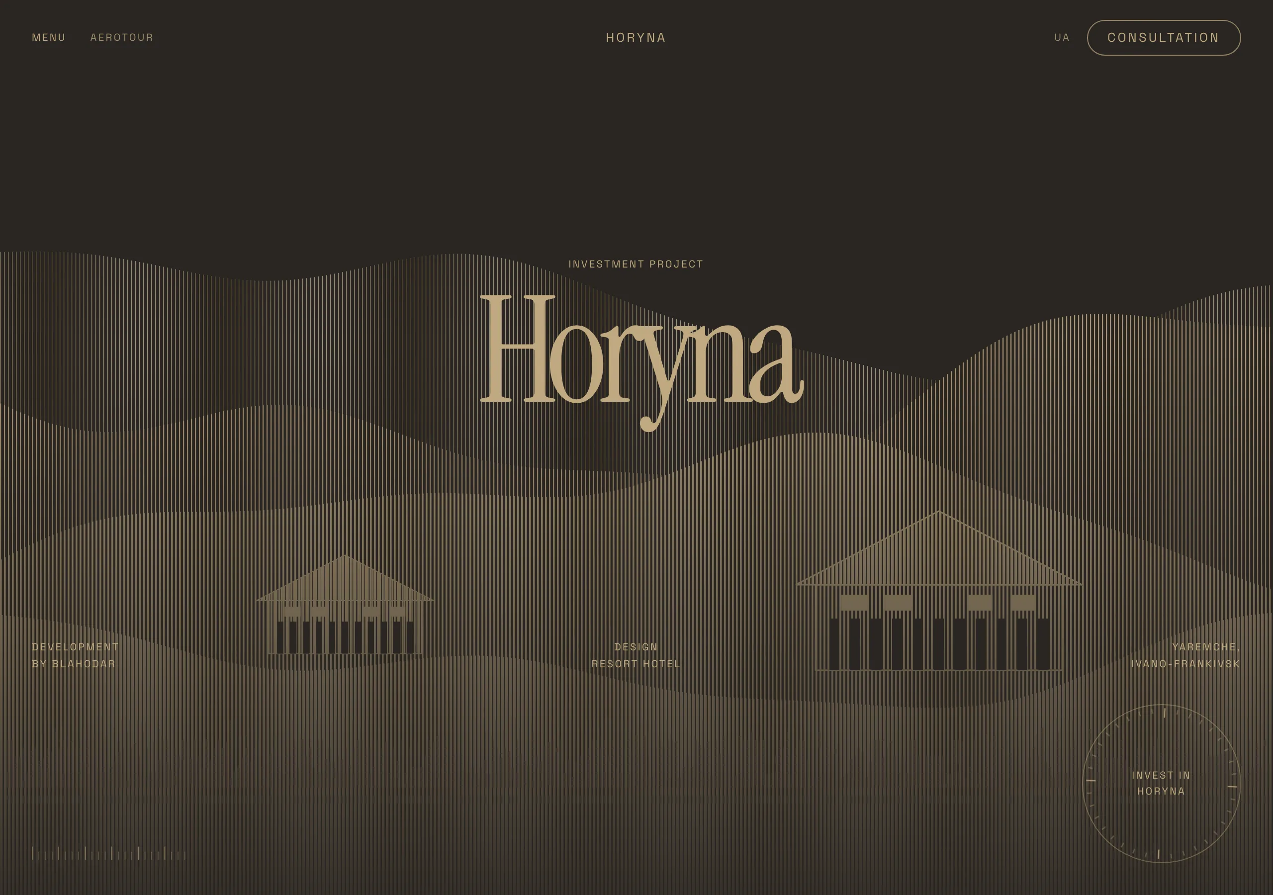
Hatched Lodge
a mountain lodge printed in two inks
Umber ground, sand ink, and nothing else. Photographs are redrawn as vertical line screens, micro labels are tracked wide while the display line is tracked tight, and every transition takes 600ms.
Install
npx styles-md add hatched-lodge Palette
Type
Aa Bb Cc 0123 The quick brown fox
"Space Grotesk", "Helvetica Neue", Arial, sans-serif Aa Bb Cc 0123 The quick brown fox
"Instrument Serif", "Times New Roman", Georgia, serif const total = 1 + lI0O;
"Space Mono", ui-monospace, "SFMono-Regular", Menlo, monospace 16px base · 1.25 ratio · body 400 / heading 400 · heading tracking -0.06em. Fonts are not bundled. Install the first family in each stack, or the specimens below fall back to the next one your device has.
The quick brown fox jumps
The quick brown fox jumps
The quick brown fox jumps
The quick brown fox jumps
The quick brown fox jumps
The quick brown fox jumps
The quick brown fox jumps
The quick brown fox jumps
Licensing
No font files are redistributed here. Every family this style asks for by name is free for commercial use, and CI rejects a style that names one which is not.
- Instrument Serif display SIL Open Font License 1.1 One weight, high contrast, narrow. Built for the sizes this style sets it at.
- Space Grotesk sans SIL Open Font License 1.1 Technical grotesk. Holds a 10px label at wide tracking without turning to mush.
- Space Mono mono SIL Open Font License 1.1 Coordinates, measures and tick rules.
Fallbacks: Helvetica Neue, Arial, sans-serif, ui-monospace, SFMono-Regular, Menlo, monospace, Times New Roman, Georgia, serif. These are CSS generics and fonts the reader's OS already ships, referenced by name only, so nothing is licensed or downloaded.
The spec itself, and everything generated from it, is CC-BY-4.0. Attribution is the comment at the top of each generated file; keep it and you have complied.
Shape, space & motion
- stroke
- 1px
- radius
- 12px · 20px · 40px
- spacing unit
- 4px
- gutter
- 24px
- section gap
- 120px
- max width
- 1680px
- motion
- 600ms cubic-bezier(0.25, 1, 0.5, 1)
Hatched Lodge
A printed brochure for a building in the mountains, run at two inks. The ground is umber, every mark is sand, and the pictures are engravings rather than photographs. It is slow, wide and quiet, and it falls apart the moment a third colour or a second weight arrives.
Principles
- Two inks. Umber is every surface, sand is every mark, and nothing else is coloured.
- Pictures are redrawn as vertical line screens in sand, never placed as photographs.
- Micro type is uppercase and tracked out to about +0.08em. Display type is tracked in to -0.06em.
- One weight does everything. Hierarchy is size, tracking and space, never boldness.
- Corners are generous:
radius-lgon controls,radius-mdon cards,radius-smon chips. - Motion is long. 600ms on a control, and up to 1200ms on anything the size of a section.
Typography
Two faces at one weight each. The display serif runs from 40px upward and gets tighter as it grows, reaching about -0.06em, so a wordmark set at 144px reads as one object rather than a row of letters. The grotesk runs at 10, 12 and 16px only, uppercase, tracked wide enough that a 10px label is still legible against a photograph. The gap between 16px and 40px is deliberately empty. A style with nothing in the middle forces a page to decide whether a line is a label or a statement.
Colour
fg sand on bg umber clears AA at 6.58:1, which is what lets a two ink system carry body copy at
all. accent is the same sand lifted toward lamplight, and it exists so a single filled control can
sit inside a field of text without introducing a hue. muted is the sand dimmed to 4.71:1, for
labels that should recede but still pass. border is a raised umber at 1.52:1, drawn as a hairline
around cards and circles.
Components
- Display line: display face, uppercase, -0.06em, line height 0.9, sand on umber.
- Label: sans, uppercase, 10 to 12px, +0.08em,
muted, anchored to a corner. - Button (primary):
accentfill,accentFglabel,radius-lg, 12px/24px, uppercase label. - Button (outline): transparent, 1px
fgborder,fglabel, same metrics. - Card:
surface, 1pxborder,radius-md, 24px padding, no shadow. - Circle badge: 1px
border, 160px across, uppercase label centred, turning slowly. - Hatch image: sand lines 1 to 2px wide on a 4px pitch, length carrying the tone, no frame.
- Scrim: a gradient from transparent to umber at 40 percent, over any hatch that carries text.
- Tick rule: mono tick marks at a corner, used as a measure rather than as decoration.
- Focus ring: 2px
accentat 3px offset.
Do / Don’t
- Do keep every surface umber and every mark sand.
- Do redraw imagery as a line screen, and keep one pitch across the whole page.
- Do track labels out and display in. The two moving in opposite directions is the voice.
- Do let a transition take 600ms. This system is slow on purpose.
- Do anchor metadata to the corners of a full bleed section rather than centring it.
- Don’t add a third hue, including for status or for a hover.
- Don’t set body copy above 16px or a display line below 40px.
- Don’t reach for a shadow. Depth is the scrim and the one surface step.
- Don’t put a picture in a rounded box. It becomes a card, and the page becomes a template.
- Don’t bold anything, and don’t fake a bold with a second face.
When to use
Hotels, architecture and land, festivals and culture programmes: anything sold on atmosphere where the pictures can be redrawn. A poor fit for dashboards, data tables and long forms, where two inks and an empty middle of the type scale leave nothing to build a hierarchy from.
# Hatched Lodge

a mountain lodge printed in two inks. Umber ground, sand ink, and nothing else. Photographs are redrawn as vertical line screens, micro labels are tracked wide while the display line is tracked tight, and every transition takes 600ms.

## Tokens

```yaml
color:  { bg: "#2a2622", surface: "#37312a", fg: "#bfa980", muted: "#a08e6d",
          accent: "#d8bd8a", accentFg: "#2a2622", border: "#4a4238" }
font:   { sans: "\"Space Grotesk\", \"Helvetica Neue\", Arial, sans-serif",
          mono: "\"Space Mono\", ui-monospace, \"SFMono-Regular\", Menlo, monospace",
          base: "16px", scale: 1.25,
          weightBody: 400, weightHeading: 400,
          headingTracking: "-0.06em" }
type:   { xs: "10.24px", sm: "12.8px", base: "16px", lg: "20px", xl: "25px", 2xl: "31.25px", 3xl: "39.06px", 4xl: "48.83px" }
space:  { unit: "4px", gutter: "24px",
          section: "120px", maxWidth: "1680px" }
shape:  { strokeWidth: "1px", radiusSm: "12px",
          radiusMd: "20px", radiusLg: "40px" }
motion: { duration: "600ms", easing: "cubic-bezier(0.25, 1, 0.5, 1)" }
```

## Principles

- Two inks. Umber is every surface, sand is every mark, and nothing else is coloured.
- Pictures are redrawn as vertical line screens in sand, never placed as photographs.
- Micro type is uppercase and tracked out to about +0.08em. Display type is tracked in to -0.06em.
- One weight does everything. Hierarchy is size, tracking and space, never boldness.
- Corners are generous: `radius-lg` on controls, `radius-md` on cards, `radius-sm` on chips.
- Motion is long. 600ms on a control, and up to 1200ms on anything the size of a section.

## Components

- Display line: display face, uppercase, -0.06em, line height 0.9, sand on umber.
- Label: sans, uppercase, 10 to 12px, +0.08em, `muted`, anchored to a corner.
- Button (primary): `accent` fill, `accentFg` label, `radius-lg`, 12px/24px, uppercase label.
- Button (outline): transparent, 1px `fg` border, `fg` label, same metrics.
- Card: `surface`, 1px `border`, `radius-md`, 24px padding, no shadow.
- Circle badge: 1px `border`, 160px across, uppercase label centred, turning slowly.
- Hatch image: sand lines 1 to 2px wide on a 4px pitch, length carrying the tone, no frame.
- Scrim: a gradient from transparent to umber at 40 percent, over any hatch that carries text.
- Tick rule: mono tick marks at a corner, used as a measure rather than as decoration.
- Focus ring: 2px `accent` at 3px offset.

## Do / Don't

- Do keep every surface umber and every mark sand.
- Do redraw imagery as a line screen, and keep one pitch across the whole page.
- Do track labels out and display in. The two moving in opposite directions is the voice.
- Do let a transition take 600ms. This system is slow on purpose.
- Do anchor metadata to the corners of a full bleed section rather than centring it.
- Don't add a third hue, including for status or for a hover.
- Don't set body copy above 16px or a display line below 40px.
- Don't reach for a shadow. Depth is the scrim and the one surface step.
- Don't put a picture in a rounded box. It becomes a card, and the page becomes a template.
- Don't bold anything, and don't fake a bold with a second face.

<!-- styles-md/hatched-lodge@1.0.0, CC-BY-4.0. Full spec: DESIGN.md -->
/* Hatched Lodge: Tailwind v4 theme. Import after `@import "tailwindcss";` */
@theme {
--color-bg: #2a2622;
--color-surface: #37312a;
--color-fg: #bfa980;
--color-muted: #a08e6d;
--color-accent: #d8bd8a;
--color-accent-fg: #2a2622;
--color-border: #4a4238;
--font-sans: "Space Grotesk", "Helvetica Neue", Arial, sans-serif;
--font-mono: "Space Mono", ui-monospace, "SFMono-Regular", Menlo, monospace;
--font-display: "Instrument Serif", "Times New Roman", Georgia, serif;
--text-xs: 10.24px;
--text-sm: 12.8px;
--text-base: 16px;
--text-lg: 20px;
--text-xl: 25px;
--text-2xl: 31.25px;
--text-3xl: 39.06px;
--text-4xl: 48.83px;
--radius-sm: 12px;
--radius-md: 20px;
--radius-lg: 40px;
--radius-full: 9999px;
--spacing: 4px;
--ease-default: cubic-bezier(0.25, 1, 0.5, 1);
}/* Hatched Lodge: a mountain lodge printed in two inks
styles-md style "hatched-lodge" v1.0.0, CC-BY-4.0 */
:root {
--sm-color-bg: #2a2622;
--sm-color-surface: #37312a;
--sm-color-fg: #bfa980;
--sm-color-muted: #a08e6d;
--sm-color-accent: #d8bd8a;
--sm-color-accent-fg: #2a2622;
--sm-color-border: #4a4238;
--sm-font-sans: "Space Grotesk", "Helvetica Neue", Arial, sans-serif;
--sm-font-mono: "Space Mono", ui-monospace, "SFMono-Regular", Menlo, monospace;
--sm-font-display: "Instrument Serif", "Times New Roman", Georgia, serif;
--sm-font-weight-body: 400;
--sm-font-weight-heading: 400;
--sm-heading-tracking: -0.06em;
--sm-text-xs: 10.24px;
--sm-text-sm: 12.8px;
--sm-text-base: 16px;
--sm-text-lg: 20px;
--sm-text-xl: 25px;
--sm-text-2xl: 31.25px;
--sm-text-3xl: 39.06px;
--sm-text-4xl: 48.83px;
--sm-space-1: 4px;
--sm-space-2: 8px;
--sm-space-3: 12px;
--sm-space-4: 16px;
--sm-space-6: 24px;
--sm-space-8: 32px;
--sm-space-12: 48px;
--sm-space-16: 64px;
--sm-space-24: 96px;
--sm-gutter: 24px;
--sm-section: 120px;
--sm-max-width: 1680px;
--sm-stroke-width: 1px;
--sm-radius-sm: 12px;
--sm-radius-md: 20px;
--sm-radius-lg: 40px;
--sm-radius-full: 9999px;
--sm-duration: 600ms;
--sm-easing: cubic-bezier(0.25, 1, 0.5, 1);
}{
"id": "hatched-lodge",
"name": "Hatched Lodge",
"version": "1.0.0",
"license": "CC-BY-4.0",
"mood": "a mountain lodge printed in two inks",
"tags": [
"dark",
"warm",
"editorial",
"hospitality",
"architecture",
"minimal",
"uppercase"
],
"fonts": [
{
"family": "Instrument Serif",
"role": "display",
"license": "OFL-1.1",
"url": "https://fonts.google.com/specimen/Instrument+Serif",
"note": "One weight, high contrast, narrow. Built for the sizes this style sets it at."
},
{
"family": "Space Grotesk",
"role": "sans",
"license": "OFL-1.1",
"url": "https://fonts.google.com/specimen/Space+Grotesk",
"note": "Technical grotesk. Holds a 10px label at wide tracking without turning to mush."
},
{
"family": "Space Mono",
"role": "mono",
"license": "OFL-1.1",
"url": "https://fonts.google.com/specimen/Space+Mono",
"note": "Coordinates, measures and tick rules."
}
],
"tokens": {
"color": {
"bg": "#2a2622",
"surface": "#37312a",
"fg": "#bfa980",
"muted": "#a08e6d",
"accent": "#d8bd8a",
"accentFg": "#2a2622",
"border": "#4a4238"
},
"font": {
"sans": "\"Space Grotesk\", \"Helvetica Neue\", Arial, sans-serif",
"mono": "\"Space Mono\", ui-monospace, \"SFMono-Regular\", Menlo, monospace",
"display": "\"Instrument Serif\", \"Times New Roman\", Georgia, serif",
"scale": 1.25,
"baseSize": "16px",
"weightBody": 400,
"weightHeading": 400,
"headingTracking": -0.06
},
"space": {
"unit": "4px",
"gutter": "24px",
"section": "120px",
"maxWidth": "1680px"
},
"stroke": {
"width": "1px"
},
"radius": {
"sm": "12px",
"md": "20px",
"lg": "40px",
"full": "9999px"
},
"motion": {
"duration": "600ms",
"easing": "cubic-bezier(0.25, 1, 0.5, 1)"
}
},
"derived": {
"type": [
{
"name": "xs",
"size": "10.24px"
},
{
"name": "sm",
"size": "12.8px"
},
{
"name": "base",
"size": "16px"
},
{
"name": "lg",
"size": "20px"
},
{
"name": "xl",
"size": "25px"
},
{
"name": "2xl",
"size": "31.25px"
},
{
"name": "3xl",
"size": "39.06px"
},
{
"name": "4xl",
"size": "48.83px"
}
],
"space": [
{
"step": 1,
"size": "4px"
},
{
"step": 2,
"size": "8px"
},
{
"step": 3,
"size": "12px"
},
{
"step": 4,
"size": "16px"
},
{
"step": 6,
"size": "24px"
},
{
"step": 8,
"size": "32px"
},
{
"step": 12,
"size": "48px"
},
{
"step": 16,
"size": "64px"
},
{
"step": 24,
"size": "96px"
}
]
},
"variables": {
"color-bg": "#2a2622",
"color-surface": "#37312a",
"color-fg": "#bfa980",
"color-muted": "#a08e6d",
"color-accent": "#d8bd8a",
"color-accent-fg": "#2a2622",
"color-border": "#4a4238",
"font-sans": "\"Space Grotesk\", \"Helvetica Neue\", Arial, sans-serif",
"font-mono": "\"Space Mono\", ui-monospace, \"SFMono-Regular\", Menlo, monospace",
"font-display": "\"Instrument Serif\", \"Times New Roman\", Georgia, serif",
"font-weight-body": "400",
"font-weight-heading": "400",
"heading-tracking": "-0.06em",
"text-xs": "10.24px",
"text-sm": "12.8px",
"text-base": "16px",
"text-lg": "20px",
"text-xl": "25px",
"text-2xl": "31.25px",
"text-3xl": "39.06px",
"text-4xl": "48.83px",
"space-1": "4px",
"space-2": "8px",
"space-3": "12px",
"space-4": "16px",
"space-6": "24px",
"space-8": "32px",
"space-12": "48px",
"space-16": "64px",
"space-24": "96px",
"gutter": "24px",
"section": "120px",
"max-width": "1680px",
"stroke-width": "1px",
"radius-sm": "12px",
"radius-md": "20px",
"radius-lg": "40px",
"radius-full": "9999px",
"duration": "600ms",
"easing": "cubic-bezier(0.25, 1, 0.5, 1)"
}
}