
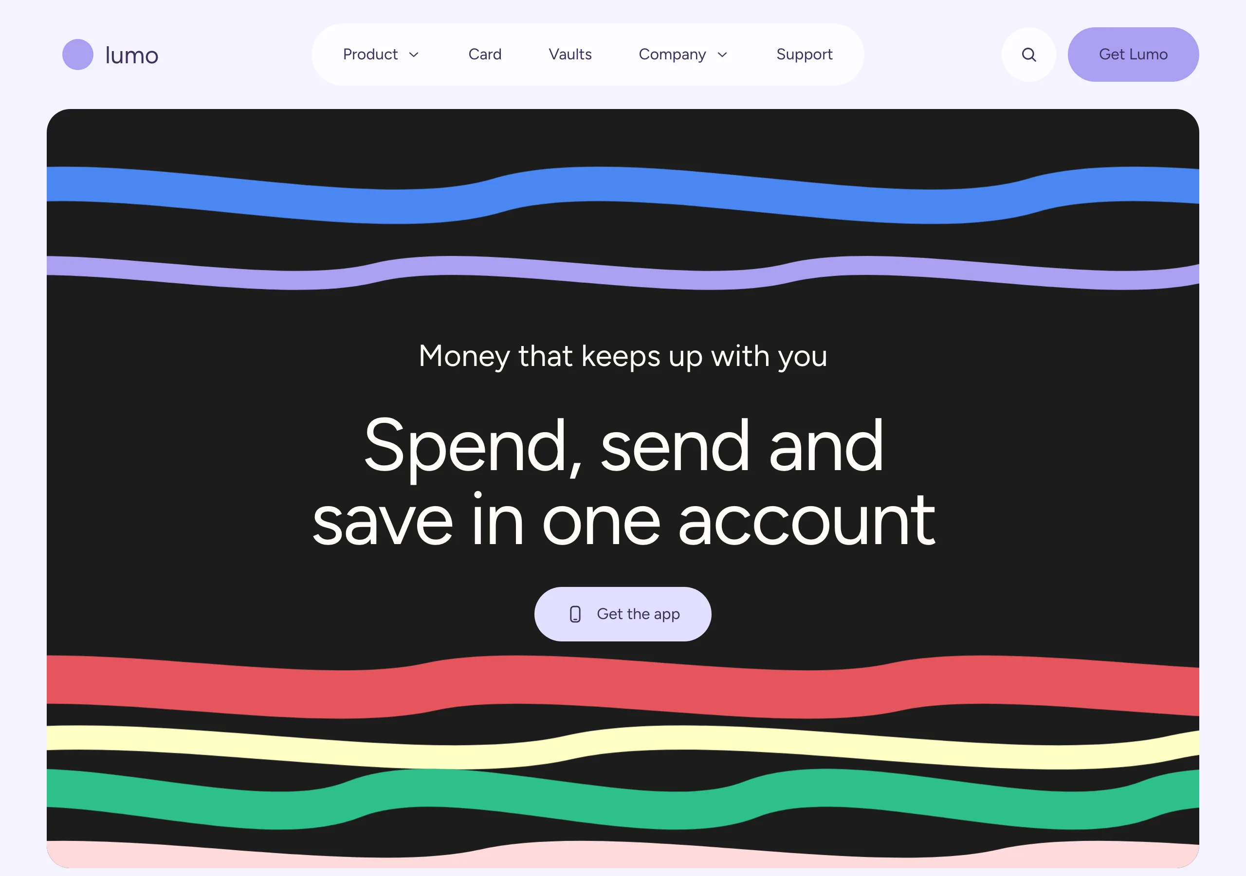
Lavender Pill
a lavender candy shop at dusk
A violet-tinted page, aubergine type and big soft-cornered colour blocks. One regular weight does every job, from a 13px caption to a 96px display line.
Install
npx styles-md add lavender-pill Palette
Type
Aa Bb Cc 0123 The quick brown fox
"Figtree", "DM Sans", system-ui, -apple-system, "Segoe UI", sans-serif const total = 1 + lI0O;
"IBM Plex Mono", ui-monospace, "SFMono-Regular", Menlo, monospace 16px base · 1.25 ratio · body 400 / heading 400 · heading tracking -0.025em. Fonts are not bundled. Install the first family in each stack, or the specimens below fall back to the next one your device has.
The quick brown fox jumps
The quick brown fox jumps
The quick brown fox jumps
The quick brown fox jumps
The quick brown fox jumps
The quick brown fox jumps
The quick brown fox jumps
The quick brown fox jumps
Licensing
No font files are redistributed here. Every family this style asks for by name is free for commercial use, and CI rejects a style that names one which is not.
- Figtree sans SIL Open Font License 1.1 Geometric with rounded terminals and a tall x-height, which is what makes 400 read as friendly.
- DM Sans sans SIL Open Font License 1.1 Fallback. Slightly wider, so display lines rewrap but hold their shape.
- IBM Plex Mono mono SIL Open Font License 1.1
Fallbacks: system-ui, -apple-system, Segoe UI, sans-serif, ui-monospace, SFMono-Regular, Menlo, monospace. These are CSS generics and fonts the reader's OS already ships, referenced by name only, so nothing is licensed or downloaded.
The spec itself, and everything generated from it, is CC-BY-4.0. Attribution is the comment at the top of each generated file; keep it and you have complied.
Shape, space & motion
- stroke
- 1px
- radius
- 16px · 24px · 32px
- spacing unit
- 4px
- gutter
- 32px
- section gap
- 96px
- max width
- 1560px
- motion
- 400ms cubic-bezier(0.22, 1, 0.36, 1)
Lavender Pill
A violet-tinted plane with soft-cornered blocks laid on it. There are no outlines and almost no shadows: everything is separated by fill and by air. Type does the shouting, at one weight, by getting very large.
Principles
- The page is tinted, never white. White is a raised material here, reserved for the nav and chips.
- Cards are colour blocks. A row rotates fills rather than repeating one surface.
- One weight does every job. 400 from a 13px caption to a 96px display line.
- Rounding is generous and graded:
radius-mdon blocks,radius-lgon anything you click. - Nothing is outlined. If two things need separating, change the fill or add space.
- Copy runs large. A card leads with a 30px sentence, not a small heading over smaller body.
Typography
One family carries the page, so the only real variables are size and tracking. Tracking is -0.025em on headings and nothing else: body and card copy sit at normal, and applying the negative value there crushes it. Display lines run 64px to 96px at line height 1.1, card copy is 30px/36px, and body is 16px. The mono stack is only for addresses, hashes and code.
Colour
Aubergine fg is the default ink for the whole page and the label on every light fill. Two other
inks exist and each belongs to one kind of block: #1c1c1c on the pale fills and cream #fffdf8
on near-black. The block set is periwinkle accent, near-black #1c1c1c and ash #e9e8ea, with
soft lavender #e2dffe for quieter actions. Buttercream #ffffc4, blush #ffdadc and cornflower
#4a87f2 are occasional guests. muted is darker than a purely decorative grey would be, so
secondary copy still clears AA on the tinted page.
Components
- Nav:
surfacepill floating 24px below the top edge,radius-lg, links at 16px infg, 12px/24px padding. - Button (primary):
accentfill,accentFglabel,radius-lg, 16px/32px padding, no border. - Button (soft):
#e2dffefill,accentFglabel, same metrics. The quieter of the two. - Card:
radius-md, 48px padding,shadow-sm, one fill from the block set, artwork bleeding off the bottom edge. - Card copy: 30px/36px at 400 with no tracking,
#1c1c1con a pale fill and#fffdf8on near-black. - Section chip:
surfacepill with a leading icon, 16px label,radius-lg, 12px/20px padding. - Icon button: 40px or 56px circle,
surfaceoraccentfill,radius-full. - Hero panel: near-black, inset 48px from the page edge,
radius-md,overflow: clip, cream display type centred. - Heading: 64px to 96px at 400, line height 1.1, tracking -0.025em.
- Focus ring: 2px
accentoutline at 2px offset, following the element radius.
Do / Don’t
- Do tint the page. Pure white drains the palette and the blocks stop reading as blocks.
- Do rotate card fills across a row. Three cards, three different fills.
- Do let artwork bleed off the bottom of a card instead of sitting inside the padding.
- Do keep tracking on headings only, and give sections 96px of air.
- Do inset full-bleed panels 48px from the page edge rather than running them to the viewport.
- Don’t reach for a heavier weight to make something important. Size does that here.
- Don’t outline a card. If it needs separating, change the fill.
- Don’t blur or offset a shadow. The lavender halo is all the elevation there is.
- Don’t go below
radius-smanywhere, or belowradius-mdon a block. - Don’t put small text on cornflower or near-black in aubergine. Those two fills take cream.
When to use
Consumer fintech, wallets, and product pages that want to feel playful without going loud. A poor fit for dense dashboards and long-form reading: one weight and 96px headlines give you very little to build fine-grained hierarchy from.
# Lavender Pill

a lavender candy shop at dusk. A violet-tinted page, aubergine type and big soft-cornered colour blocks. One regular weight does every job, from a 13px caption to a 96px display line.

## Tokens

```yaml
color:  { bg: "#f5f2ff", surface: "#fdfcfe", fg: "#3c315b", muted: "#6f6a80",
          accent: "#ab9ff2", accentFg: "#3c315b", border: "#cec9e3" }
font:   { sans: "\"Figtree\", \"DM Sans\", system-ui, -apple-system, \"Segoe UI\", sans-serif",
          mono: "\"IBM Plex Mono\", ui-monospace, \"SFMono-Regular\", Menlo, monospace",
          base: "16px", scale: 1.25,
          weightBody: 400, weightHeading: 400,
          headingTracking: "-0.025em" }
type:   { xs: "10.24px", sm: "12.8px", base: "16px", lg: "20px", xl: "25px", 2xl: "31.25px", 3xl: "39.06px", 4xl: "48.83px" }
space:  { unit: "4px", gutter: "32px",
          section: "96px", maxWidth: "1560px" }
shape:  { strokeWidth: "1px", radiusSm: "16px",
          radiusMd: "24px", radiusLg: "32px" }
motion: { duration: "400ms", easing: "cubic-bezier(0.22, 1, 0.36, 1)" }
```

## Principles

- The page is tinted, never white. White is a raised material here, reserved for the nav and chips.
- Cards are colour blocks. A row rotates fills rather than repeating one surface.
- One weight does every job. 400 from a 13px caption to a 96px display line.
- Rounding is generous and graded: `radius-md` on blocks, `radius-lg` on anything you click.
- Nothing is outlined. If two things need separating, change the fill or add space.
- Copy runs large. A card leads with a 30px sentence, not a small heading over smaller body.

## Components

- Nav: `surface` pill floating 24px below the top edge, `radius-lg`, links at 16px in `fg`, 12px/24px padding.
- Button (primary): `accent` fill, `accentFg` label, `radius-lg`, 16px/32px padding, no border.
- Button (soft): `#e2dffe` fill, `accentFg` label, same metrics. The quieter of the two.
- Card: `radius-md`, 48px padding, `shadow-sm`, one fill from the block set, artwork bleeding off the bottom edge.
- Card copy: 30px/36px at 400 with no tracking, `#1c1c1c` on a pale fill and `#fffdf8` on near-black.
- Section chip: `surface` pill with a leading icon, 16px label, `radius-lg`, 12px/20px padding.
- Icon button: 40px or 56px circle, `surface` or `accent` fill, `radius-full`.
- Hero panel: near-black, inset 48px from the page edge, `radius-md`, `overflow: clip`, cream display type centred.
- Heading: 64px to 96px at 400, line height 1.1, tracking -0.025em.
- Focus ring: 2px `accent` outline at 2px offset, following the element radius.

## Do / Don't

- Do tint the page. Pure white drains the palette and the blocks stop reading as blocks.
- Do rotate card fills across a row. Three cards, three different fills.
- Do let artwork bleed off the bottom of a card instead of sitting inside the padding.
- Do keep tracking on headings only, and give sections 96px of air.
- Do inset full-bleed panels 48px from the page edge rather than running them to the viewport.
- Don't reach for a heavier weight to make something important. Size does that here.
- Don't outline a card. If it needs separating, change the fill.
- Don't blur or offset a shadow. The lavender halo is all the elevation there is.
- Don't go below `radius-sm` anywhere, or below `radius-md` on a block.
- Don't put small text on cornflower or near-black in aubergine. Those two fills take cream.

<!-- styles-md/lavender-pill@1.0.0, CC-BY-4.0. Full spec: DESIGN.md -->
/* Lavender Pill: Tailwind v4 theme. Import after `@import "tailwindcss";` */
@theme {
--color-bg: #f5f2ff;
--color-surface: #fdfcfe;
--color-fg: #3c315b;
--color-muted: #6f6a80;
--color-accent: #ab9ff2;
--color-accent-fg: #3c315b;
--color-border: #cec9e3;
--color-success: #2ec08b;
--color-danger: #e5555c;
--font-sans: "Figtree", "DM Sans", system-ui, -apple-system, "Segoe UI", sans-serif;
--font-mono: "IBM Plex Mono", ui-monospace, "SFMono-Regular", Menlo, monospace;
--text-xs: 10.24px;
--text-sm: 12.8px;
--text-base: 16px;
--text-lg: 20px;
--text-xl: 25px;
--text-2xl: 31.25px;
--text-3xl: 39.06px;
--text-4xl: 48.83px;
--radius-sm: 16px;
--radius-md: 24px;
--radius-lg: 32px;
--radius-full: 9999px;
--spacing: 4px;
--ease-default: cubic-bezier(0.22, 1, 0.36, 1);
}/* Lavender Pill: a lavender candy shop at dusk
styles-md style "lavender-pill" v1.0.0, CC-BY-4.0 */
:root {
--sm-color-bg: #f5f2ff;
--sm-color-surface: #fdfcfe;
--sm-color-fg: #3c315b;
--sm-color-muted: #6f6a80;
--sm-color-accent: #ab9ff2;
--sm-color-accent-fg: #3c315b;
--sm-color-border: #cec9e3;
--sm-color-success: #2ec08b;
--sm-color-danger: #e5555c;
--sm-font-sans: "Figtree", "DM Sans", system-ui, -apple-system, "Segoe UI", sans-serif;
--sm-font-mono: "IBM Plex Mono", ui-monospace, "SFMono-Regular", Menlo, monospace;
--sm-font-weight-body: 400;
--sm-font-weight-heading: 400;
--sm-heading-tracking: -0.025em;
--sm-text-xs: 10.24px;
--sm-text-sm: 12.8px;
--sm-text-base: 16px;
--sm-text-lg: 20px;
--sm-text-xl: 25px;
--sm-text-2xl: 31.25px;
--sm-text-3xl: 39.06px;
--sm-text-4xl: 48.83px;
--sm-space-1: 4px;
--sm-space-2: 8px;
--sm-space-3: 12px;
--sm-space-4: 16px;
--sm-space-6: 24px;
--sm-space-8: 32px;
--sm-space-12: 48px;
--sm-space-16: 64px;
--sm-space-24: 96px;
--sm-gutter: 32px;
--sm-section: 96px;
--sm-max-width: 1560px;
--sm-stroke-width: 1px;
--sm-radius-sm: 16px;
--sm-radius-md: 24px;
--sm-radius-lg: 32px;
--sm-radius-full: 9999px;
--sm-duration: 400ms;
--sm-easing: cubic-bezier(0.22, 1, 0.36, 1);
--sm-shadow-sm: 0 0 4px 0 #e2dffe;
--sm-shadow-md: 0 0 16px 0 #e2dffe;
--sm-shadow-lg: 0 0 40px 0 #e2dffe;
}{
"id": "lavender-pill",
"name": "Lavender Pill",
"version": "1.0.0",
"license": "CC-BY-4.0",
"mood": "a lavender candy shop at dusk",
"tags": [
"light",
"violet",
"pastel",
"rounded",
"playful",
"fintech",
"marketing"
],
"fonts": [
{
"family": "Figtree",
"role": "sans",
"license": "OFL-1.1",
"url": "https://github.com/erikdkennedy/figtree",
"note": "Geometric with rounded terminals and a tall x-height, which is what makes 400 read as friendly."
},
{
"family": "DM Sans",
"role": "sans",
"license": "OFL-1.1",
"url": "https://fonts.google.com/specimen/DM+Sans",
"note": "Fallback. Slightly wider, so display lines rewrap but hold their shape."
},
{
"family": "IBM Plex Mono",
"role": "mono",
"license": "OFL-1.1",
"url": "https://github.com/IBM/plex"
}
],
"tokens": {
"color": {
"bg": "#f5f2ff",
"surface": "#fdfcfe",
"fg": "#3c315b",
"muted": "#6f6a80",
"accent": "#ab9ff2",
"accentFg": "#3c315b",
"border": "#cec9e3",
"success": "#2ec08b",
"danger": "#e5555c"
},
"font": {
"sans": "\"Figtree\", \"DM Sans\", system-ui, -apple-system, \"Segoe UI\", sans-serif",
"mono": "\"IBM Plex Mono\", ui-monospace, \"SFMono-Regular\", Menlo, monospace",
"scale": 1.25,
"baseSize": "16px",
"weightBody": 400,
"weightHeading": 400,
"headingTracking": -0.025
},
"space": {
"unit": "4px",
"gutter": "32px",
"section": "96px",
"maxWidth": "1560px"
},
"stroke": {
"width": "1px"
},
"radius": {
"sm": "16px",
"md": "24px",
"lg": "32px",
"full": "9999px"
},
"motion": {
"duration": "400ms",
"easing": "cubic-bezier(0.22, 1, 0.36, 1)"
},
"shadow": {
"sm": "0 0 4px 0 #e2dffe",
"md": "0 0 16px 0 #e2dffe",
"lg": "0 0 40px 0 #e2dffe"
}
},
"derived": {
"type": [
{
"name": "xs",
"size": "10.24px"
},
{
"name": "sm",
"size": "12.8px"
},
{
"name": "base",
"size": "16px"
},
{
"name": "lg",
"size": "20px"
},
{
"name": "xl",
"size": "25px"
},
{
"name": "2xl",
"size": "31.25px"
},
{
"name": "3xl",
"size": "39.06px"
},
{
"name": "4xl",
"size": "48.83px"
}
],
"space": [
{
"step": 1,
"size": "4px"
},
{
"step": 2,
"size": "8px"
},
{
"step": 3,
"size": "12px"
},
{
"step": 4,
"size": "16px"
},
{
"step": 6,
"size": "24px"
},
{
"step": 8,
"size": "32px"
},
{
"step": 12,
"size": "48px"
},
{
"step": 16,
"size": "64px"
},
{
"step": 24,
"size": "96px"
}
]
},
"variables": {
"color-bg": "#f5f2ff",
"color-surface": "#fdfcfe",
"color-fg": "#3c315b",
"color-muted": "#6f6a80",
"color-accent": "#ab9ff2",
"color-accent-fg": "#3c315b",
"color-border": "#cec9e3",
"color-success": "#2ec08b",
"color-danger": "#e5555c",
"font-sans": "\"Figtree\", \"DM Sans\", system-ui, -apple-system, \"Segoe UI\", sans-serif",
"font-mono": "\"IBM Plex Mono\", ui-monospace, \"SFMono-Regular\", Menlo, monospace",
"font-weight-body": "400",
"font-weight-heading": "400",
"heading-tracking": "-0.025em",
"text-xs": "10.24px",
"text-sm": "12.8px",
"text-base": "16px",
"text-lg": "20px",
"text-xl": "25px",
"text-2xl": "31.25px",
"text-3xl": "39.06px",
"text-4xl": "48.83px",
"space-1": "4px",
"space-2": "8px",
"space-3": "12px",
"space-4": "16px",
"space-6": "24px",
"space-8": "32px",
"space-12": "48px",
"space-16": "64px",
"space-24": "96px",
"gutter": "32px",
"section": "96px",
"max-width": "1560px",
"stroke-width": "1px",
"radius-sm": "16px",
"radius-md": "24px",
"radius-lg": "32px",
"radius-full": "9999px",
"duration": "400ms",
"easing": "cubic-bezier(0.22, 1, 0.36, 1)",
"shadow-sm": "0 0 4px 0 #e2dffe",
"shadow-md": "0 0 16px 0 #e2dffe",
"shadow-lg": "0 0 40px 0 #e2dffe"
}
}