
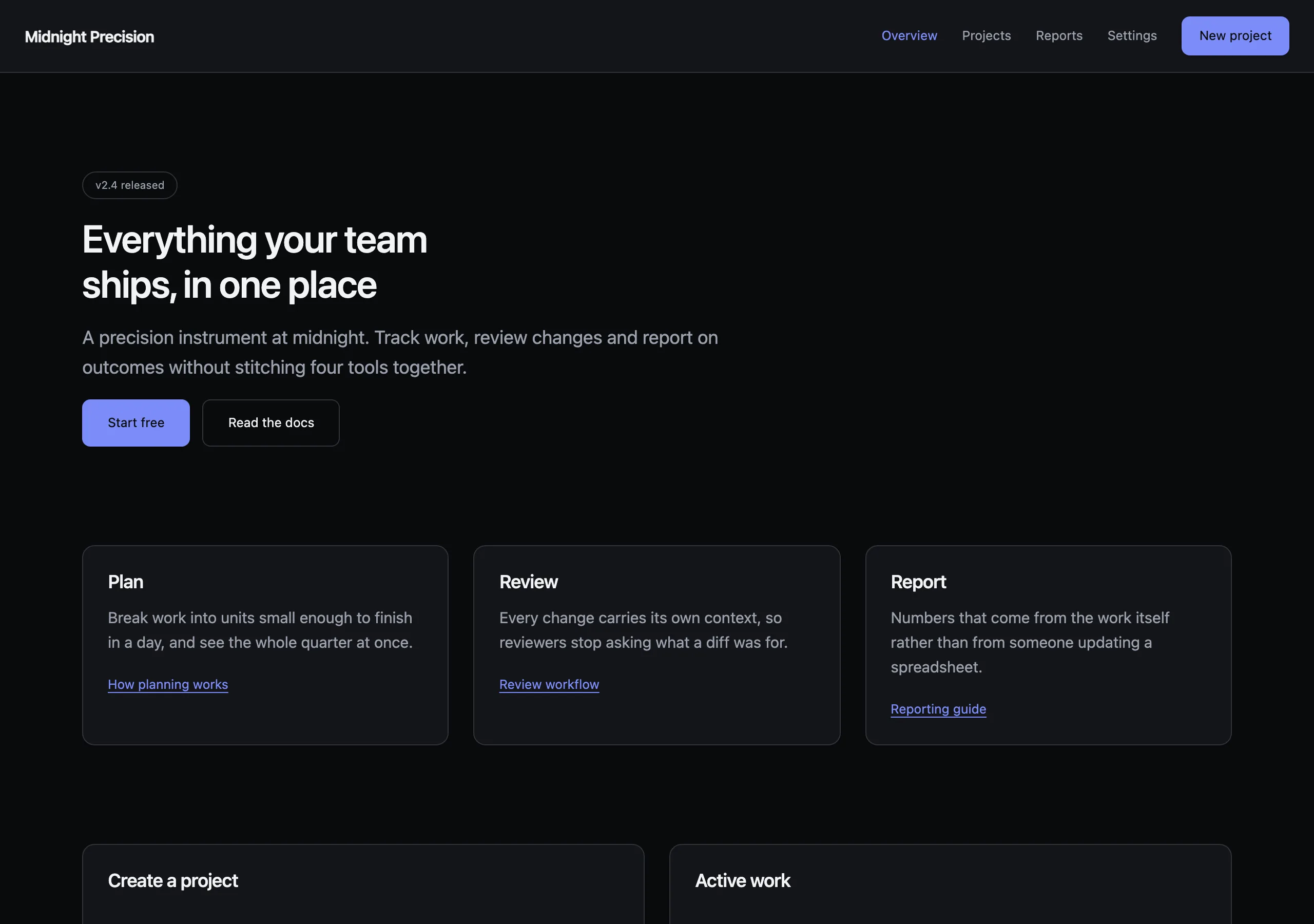
Midnight Precision
a precision instrument at midnight
Dark, quiet and exact. Tight tracking, restrained colour, and a single indigo accent that only appears where an action lives.
Install
npx styles-md add midnight-precision Palette
Type
15px base · 1.2 ratio · weight 400/560. Fonts are not bundled — specimens fall back to what you have installed.
The quick brown fox jumps
The quick brown fox jumps
The quick brown fox jumps
The quick brown fox jumps
The quick brown fox jumps
The quick brown fox jumps
The quick brown fox jumps
The quick brown fox jumps
Shape, space & motion
- stroke
- 1px
- radius
- 4px · 8px · 12px
- spacing unit
- 4px
- gutter
- 24px
- section gap
- 96px
- max width
- 1120px
- motion
- 160ms cubic-bezier(0.4, 0, 0.2, 1)
Midnight Precision
The house style for tools people keep open all day. Everything is low-noise until it needs attention. Colour is a signal, not decoration.
Principles
- Accent colour marks exactly one action per view. A second accent means you picked the wrong one.
- Depth comes from surface lightness, never from borders plus shadows plus fills at once.
- Headings sit tight: negative tracking, medium weight, never bold.
- Interface text stays at base size or smaller. Only page titles exceed it.
- Motion is short and linear-feeling. Nothing bounces, nothing fades slower than 200ms.
Typography
Inter at 15px with a 1.2 ratio gives a narrow ramp — the gap between body and heading is
deliberately small so that hierarchy comes from weight and spacing rather than size. Use
weightHeading (560) for every heading level and let the size step carry the rest. Numerals in
tables and metrics use the mono stack with tabular figures.
Colour
The two greys do the work: bg for the page, surface for anything raised. border is visible
but never assertive — it exists so a card reads as a card at a glance, not so it draws a box.
Reserve accent for primary buttons, active nav items and focus rings.
Components
- Button (primary): accent fill,
accentFglabel,radius-md, 10px/16px padding, no shadow. - Button (secondary): transparent fill, 1px border,
fglabel, same metrics as primary. - Card:
surfacefill, 1px border,radius-lg, 24px padding,shadow-smonly when interactive. - Input:
bgfill, 1px border,radius-md, 9px/12px padding; focus swaps border to accent. - Nav: 48px tall,
surfacefill, 1px bottom border, links atmutedandfgwhen active. - Table: no vertical rules, 1px horizontal borders, 12px/16px cells,
mutedheaders attext-sm. - Badge:
surfacefill, 1px border,radius-full,text-xs, 2px/10px padding. - Focus ring: 2px accent outline, 2px offset, on every interactive element without exception.
Do / Don’t
- Do keep page sections 96px apart. Crowding is the fastest way to lose this style.
- Do use
mutedfor every label, caption and timestamp. - Do left-align text. Centred body copy breaks the instrument feeling immediately.
- Don’t use pure black or pure white anywhere.
- Don’t add a gradient. Not on buttons, not on backgrounds, not on borders.
- Don’t stack more than two surface levels —
bgandsurfaceis the whole depth budget. - Don’t use accent colour for text on the page background; contrast is legal but the effect is loud.
- Don’t round anything past 12px. Pills are for badges only.
When to use
Developer tools, dashboards, internal consoles, anything with dense data and a long session length. A poor fit for marketing pages, where the restraint reads as coldness.
# Midnight Precision

a precision instrument at midnight. Dark, quiet and exact. Tight tracking, restrained colour, and a single indigo accent that only appears where an action lives.

## Tokens

```yaml
color:  { bg: "#0a0b0d", surface: "#141519", fg: "#f2f3f5", muted: "#9ba1ad",
          accent: "#7c8cf8", accentFg: "#0a0b0d", border: "#2f333b" }
font:   { sans: "\"Inter\", \"Inter Variable\", system-ui, -apple-system, \"Segoe UI\", sans-serif",
          mono: "\"JetBrains Mono\", ui-monospace, \"SFMono-Regular\", Menlo, monospace",
          base: "15px", scale: 1.2,
          weightBody: 400, weightHeading: 560,
          headingTracking: "-0.022em" }
type:   { xs: "10.42px", sm: "12.5px", base: "15px", lg: "18px", xl: "21.6px", 2xl: "25.92px", 3xl: "31.1px", 4xl: "37.32px" }
space:  { unit: "4px", gutter: "24px",
          section: "96px", maxWidth: "1120px" }
shape:  { strokeWidth: "1px", radiusSm: "4px",
          radiusMd: "8px", radiusLg: "12px" }
motion: { duration: "160ms", easing: "cubic-bezier(0.4, 0, 0.2, 1)" }
```

## Principles

- Accent colour marks exactly one action per view. A second accent means you picked the wrong one.
- Depth comes from surface lightness, never from borders plus shadows plus fills at once.
- Headings sit tight: negative tracking, medium weight, never bold.
- Interface text stays at base size or smaller. Only page titles exceed it.
- Motion is short and linear-feeling. Nothing bounces, nothing fades slower than 200ms.

## Components

- Button (primary): accent fill, `accentFg` label, `radius-md`, 10px/16px padding, no shadow.
- Button (secondary): transparent fill, 1px border, `fg` label, same metrics as primary.
- Card: `surface` fill, 1px border, `radius-lg`, 24px padding, `shadow-sm` only when interactive.
- Input: `bg` fill, 1px border, `radius-md`, 9px/12px padding; focus swaps border to accent.
- Nav: 48px tall, `surface` fill, 1px bottom border, links at `muted` and `fg` when active.
- Table: no vertical rules, 1px horizontal borders, 12px/16px cells, `muted` headers at `text-sm`.
- Badge: `surface` fill, 1px border, `radius-full`, `text-xs`, 2px/10px padding.
- Focus ring: 2px accent outline, 2px offset, on every interactive element without exception.

## Do / Don't

- Do keep page sections 96px apart. Crowding is the fastest way to lose this style.
- Do use `muted` for every label, caption and timestamp.
- Do left-align text. Centred body copy breaks the instrument feeling immediately.
- Don't use pure black or pure white anywhere.
- Don't add a gradient. Not on buttons, not on backgrounds, not on borders.
- Don't stack more than two surface levels — `bg` and `surface` is the whole depth budget.
- Don't use accent colour for text on the page background; contrast is legal but the effect is loud.
- Don't round anything past 12px. Pills are for badges only.

<!-- styles-md/midnight-precision@1.0.0 — CC-BY-4.0. Full spec: DESIGN.md -->
/* Midnight Precision — Tailwind v4 theme. Import after `@import "tailwindcss";` */
@theme {
--color-bg: #0a0b0d;
--color-surface: #141519;
--color-fg: #f2f3f5;
--color-muted: #9ba1ad;
--color-accent: #7c8cf8;
--color-accent-fg: #0a0b0d;
--color-border: #2f333b;
--color-success: #4ec9a5;
--color-danger: #f2555a;
--font-sans: "Inter", "Inter Variable", system-ui, -apple-system, "Segoe UI", sans-serif;
--font-mono: "JetBrains Mono", ui-monospace, "SFMono-Regular", Menlo, monospace;
--text-xs: 10.42px;
--text-sm: 12.5px;
--text-base: 15px;
--text-lg: 18px;
--text-xl: 21.6px;
--text-2xl: 25.92px;
--text-3xl: 31.1px;
--text-4xl: 37.32px;
--radius-sm: 4px;
--radius-md: 8px;
--radius-lg: 12px;
--radius-full: 9999px;
--spacing: 4px;
--ease-default: cubic-bezier(0.4, 0, 0.2, 1);
}/* Midnight Precision — a precision instrument at midnight
styles-md style "midnight-precision" v1.0.0, CC-BY-4.0 */
:root {
--sm-color-bg: #0a0b0d;
--sm-color-surface: #141519;
--sm-color-fg: #f2f3f5;
--sm-color-muted: #9ba1ad;
--sm-color-accent: #7c8cf8;
--sm-color-accent-fg: #0a0b0d;
--sm-color-border: #2f333b;
--sm-color-success: #4ec9a5;
--sm-color-danger: #f2555a;
--sm-font-sans: "Inter", "Inter Variable", system-ui, -apple-system, "Segoe UI", sans-serif;
--sm-font-mono: "JetBrains Mono", ui-monospace, "SFMono-Regular", Menlo, monospace;
--sm-font-weight-body: 400;
--sm-font-weight-heading: 560;
--sm-heading-tracking: -0.022em;
--sm-text-xs: 10.42px;
--sm-text-sm: 12.5px;
--sm-text-base: 15px;
--sm-text-lg: 18px;
--sm-text-xl: 21.6px;
--sm-text-2xl: 25.92px;
--sm-text-3xl: 31.1px;
--sm-text-4xl: 37.32px;
--sm-space-1: 4px;
--sm-space-2: 8px;
--sm-space-3: 12px;
--sm-space-4: 16px;
--sm-space-6: 24px;
--sm-space-8: 32px;
--sm-space-12: 48px;
--sm-space-16: 64px;
--sm-space-24: 96px;
--sm-gutter: 24px;
--sm-section: 96px;
--sm-max-width: 1120px;
--sm-stroke-width: 1px;
--sm-radius-sm: 4px;
--sm-radius-md: 8px;
--sm-radius-lg: 12px;
--sm-radius-full: 9999px;
--sm-duration: 160ms;
--sm-easing: cubic-bezier(0.4, 0, 0.2, 1);
--sm-shadow-sm: 0 1px 2px rgba(0,0,0,0.4);
--sm-shadow-md: 0 4px 16px rgba(0,0,0,0.45);
--sm-shadow-lg: 0 16px 48px rgba(0,0,0,0.55);
}{
"id": "midnight-precision",
"name": "Midnight Precision",
"version": "1.0.0",
"license": "CC-BY-4.0",
"mood": "a precision instrument at midnight",
"tags": [
"dark",
"minimal",
"saas",
"product",
"high-contrast"
],
"tokens": {
"color": {
"bg": "#0a0b0d",
"surface": "#141519",
"fg": "#f2f3f5",
"muted": "#9ba1ad",
"accent": "#7c8cf8",
"accentFg": "#0a0b0d",
"border": "#2f333b",
"success": "#4ec9a5",
"danger": "#f2555a"
},
"font": {
"sans": "\"Inter\", \"Inter Variable\", system-ui, -apple-system, \"Segoe UI\", sans-serif",
"mono": "\"JetBrains Mono\", ui-monospace, \"SFMono-Regular\", Menlo, monospace",
"scale": 1.2,
"baseSize": "15px",
"weightBody": 400,
"weightHeading": 560,
"headingTracking": -0.022
},
"space": {
"unit": "4px",
"gutter": "24px",
"section": "96px",
"maxWidth": "1120px"
},
"stroke": {
"width": "1px"
},
"radius": {
"sm": "4px",
"md": "8px",
"lg": "12px",
"full": "9999px"
},
"motion": {
"duration": "160ms",
"easing": "cubic-bezier(0.4, 0, 0.2, 1)"
},
"shadow": {
"sm": "0 1px 2px rgba(0,0,0,0.4)",
"md": "0 4px 16px rgba(0,0,0,0.45)",
"lg": "0 16px 48px rgba(0,0,0,0.55)"
}
},
"derived": {
"type": [
{
"name": "xs",
"size": "10.42px"
},
{
"name": "sm",
"size": "12.5px"
},
{
"name": "base",
"size": "15px"
},
{
"name": "lg",
"size": "18px"
},
{
"name": "xl",
"size": "21.6px"
},
{
"name": "2xl",
"size": "25.92px"
},
{
"name": "3xl",
"size": "31.1px"
},
{
"name": "4xl",
"size": "37.32px"
}
],
"space": [
{
"step": 1,
"size": "4px"
},
{
"step": 2,
"size": "8px"
},
{
"step": 3,
"size": "12px"
},
{
"step": 4,
"size": "16px"
},
{
"step": 6,
"size": "24px"
},
{
"step": 8,
"size": "32px"
},
{
"step": 12,
"size": "48px"
},
{
"step": 16,
"size": "64px"
},
{
"step": 24,
"size": "96px"
}
]
},
"variables": {
"color-bg": "#0a0b0d",
"color-surface": "#141519",
"color-fg": "#f2f3f5",
"color-muted": "#9ba1ad",
"color-accent": "#7c8cf8",
"color-accent-fg": "#0a0b0d",
"color-border": "#2f333b",
"color-success": "#4ec9a5",
"color-danger": "#f2555a",
"font-sans": "\"Inter\", \"Inter Variable\", system-ui, -apple-system, \"Segoe UI\", sans-serif",
"font-mono": "\"JetBrains Mono\", ui-monospace, \"SFMono-Regular\", Menlo, monospace",
"font-weight-body": "400",
"font-weight-heading": "560",
"heading-tracking": "-0.022em",
"text-xs": "10.42px",
"text-sm": "12.5px",
"text-base": "15px",
"text-lg": "18px",
"text-xl": "21.6px",
"text-2xl": "25.92px",
"text-3xl": "31.1px",
"text-4xl": "37.32px",
"space-1": "4px",
"space-2": "8px",
"space-3": "12px",
"space-4": "16px",
"space-6": "24px",
"space-8": "32px",
"space-12": "48px",
"space-16": "64px",
"space-24": "96px",
"gutter": "24px",
"section": "96px",
"max-width": "1120px",
"stroke-width": "1px",
"radius-sm": "4px",
"radius-md": "8px",
"radius-lg": "12px",
"radius-full": "9999px",
"duration": "160ms",
"easing": "cubic-bezier(0.4, 0, 0.2, 1)",
"shadow-sm": "0 1px 2px rgba(0,0,0,0.4)",
"shadow-md": "0 4px 16px rgba(0,0,0,0.45)",
"shadow-lg": "0 16px 48px rgba(0,0,0,0.55)"
}
}