
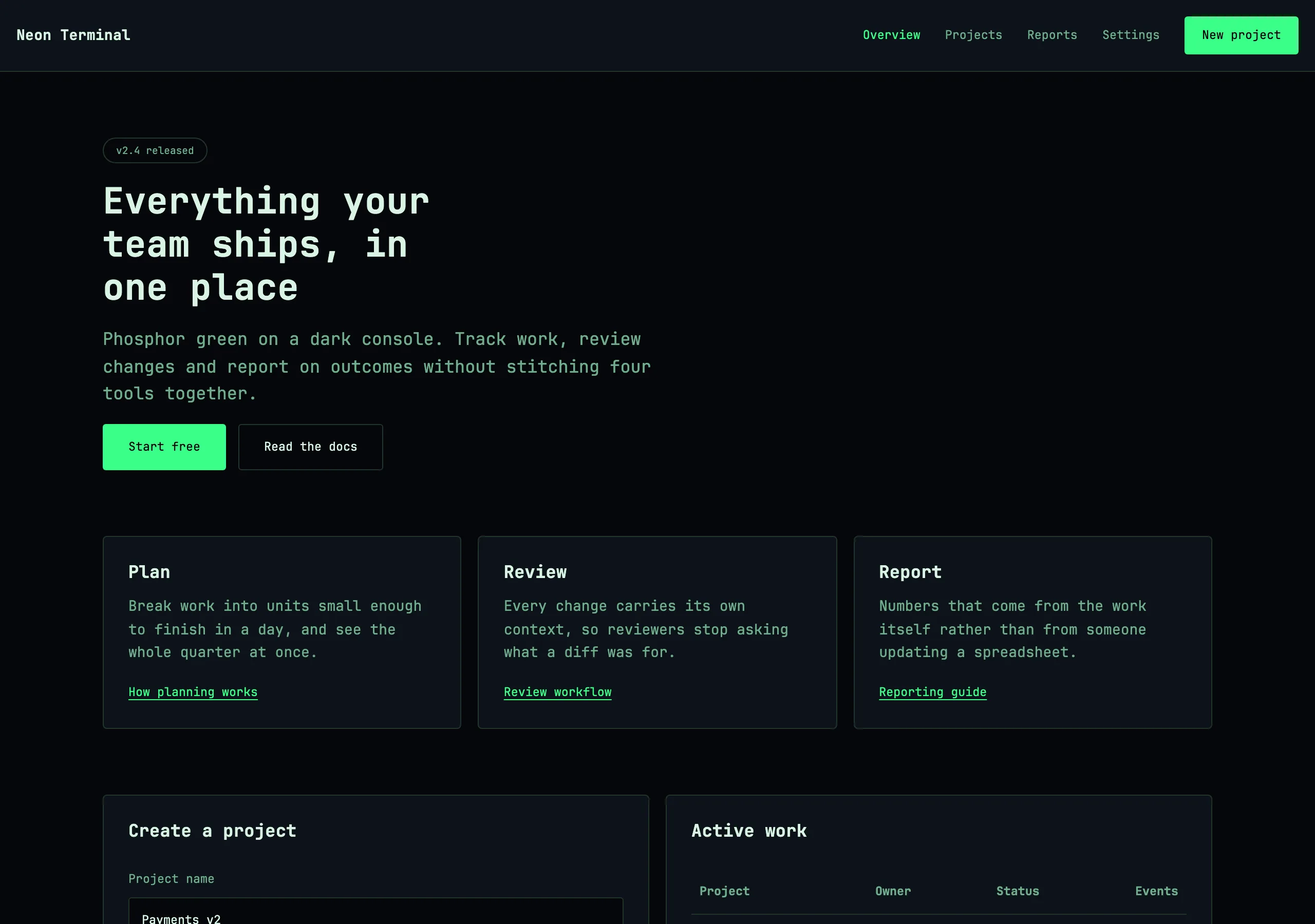
Neon Terminal
phosphor green on a dark console
Near-black background, monospace type and one electric green that carries every state. Dense, technical, and unmistakably a terminal.
Install
npx styles-md add neon-terminal Palette
Type
14px base · 1.2 ratio · weight 400/700. Fonts are not bundled — specimens fall back to what you have installed.
The quick brown fox jumps
The quick brown fox jumps
The quick brown fox jumps
The quick brown fox jumps
The quick brown fox jumps
The quick brown fox jumps
The quick brown fox jumps
The quick brown fox jumps
Shape, space & motion
- stroke
- 1px
- radius
- 2px · 3px · 4px
- spacing unit
- 4px
- gutter
- 16px
- section gap
- 64px
- max width
- 1080px
- motion
- 90ms linear
Neon Terminal
A console that someone designed. Dense by default, monospace throughout, and green used as the only voice in the room.
Principles
- One family, monospace, at 14px. Density is a feature.
- Green is the whole palette. Every state — active, success, focus, link — is the same green.
- Radius is nearly zero; 3px keeps it from looking like a mistake, nothing more.
- Prefix interactive labels with a symbol (
>,$,//) instead of adding decoration. - Transitions run at 90ms linear. Anything slower breaks the responsiveness illusion.
Typography
Monospace at 14px, line height 1.55. Headings are uppercase at weight 700 with slightly positive tracking, which mono needs to avoid looking cramped. Never use a proportional font — not for marketing copy, not for buttons.
Colour
bg is almost black and surface is a barely lifted panel. fg is a pale mint rather than white
so long sessions do not glare. muted is a desaturated green used for comments, timestamps and
disabled states.
Components
- Button: transparent fill, 1px accent border, accent label,
radius-md, 8px/14px padding; hover inverts to accent fill withaccentFg. - Card:
surfacefill, 1px border,radius-md, 16px padding, no shadow. - Input:
bgfill, 1px border,radius-sm, 8px/10px padding, block caret in accent. - Nav: 44px tall, 1px bottom border,
mutedlinks, accent with a leading>when active. - Table: 1px rules both directions, 8px/12px cells, uppercase
mutedheaders. - Badge: 1px border,
radius-sm, uppercasetext-xs, 2px/6px padding. - Log line: mono
text-sm,mutedtimestamp,fgmessage, accent or danger level tag. - Focus ring: 1px accent outline, 1px offset, square.
Do / Don’t
- Do keep rows tight — 32px is a comfortable table row here.
- Do use
mutedheavily; most text on screen should not be fullfg. - Do align numeric columns right with tabular figures.
- Don’t add a second accent hue. Warnings use
danger, everything else is green. - Don’t apply a glow or text-shadow to the accent. It ages badly and hurts legibility.
- Don’t use large radii or soft shadows.
- Don’t set anything above
text-2xl; this style has no hero type. - Don’t centre-align body content.
When to use
CLIs with a web UI, logs, observability, crypto and infra dashboards, hacker-adjacent landing pages. Wrong for anything aimed at non-technical users.
# Neon Terminal

phosphor green on a dark console. Near-black background, monospace type and one electric green that carries every state. Dense, technical, and unmistakably a terminal.

## Tokens

```yaml
color:  { bg: "#05070a", surface: "#0c1218", fg: "#d8f5e3", muted: "#6fae8c",
          accent: "#39ff88", accentFg: "#05070a", border: "#24352c" }
font:   { sans: "\"JetBrains Mono\", ui-monospace, \"SFMono-Regular\", Menlo, monospace",
          mono: "\"JetBrains Mono\", ui-monospace, \"SFMono-Regular\", Menlo, monospace",
          base: "14px", scale: 1.2,
          weightBody: 400, weightHeading: 700,
          headingTracking: "0.01em" }
type:   { xs: "9.72px", sm: "11.67px", base: "14px", lg: "16.8px", xl: "20.16px", 2xl: "24.19px", 3xl: "29.03px", 4xl: "34.84px" }
space:  { unit: "4px", gutter: "16px",
          section: "64px", maxWidth: "1080px" }
shape:  { strokeWidth: "1px", radiusSm: "2px",
          radiusMd: "3px", radiusLg: "4px" }
motion: { duration: "90ms", easing: "linear" }
```

## Principles

- One family, monospace, at 14px. Density is a feature.
- Green is the whole palette. Every state — active, success, focus, link — is the same green.
- Radius is nearly zero; 3px keeps it from looking like a mistake, nothing more.
- Prefix interactive labels with a symbol (`>`, `$`, `//`) instead of adding decoration.
- Transitions run at 90ms linear. Anything slower breaks the responsiveness illusion.

## Components

- Button: transparent fill, 1px accent border, accent label, `radius-md`, 8px/14px padding; hover inverts to accent fill with `accentFg`.
- Card: `surface` fill, 1px border, `radius-md`, 16px padding, no shadow.
- Input: `bg` fill, 1px border, `radius-sm`, 8px/10px padding, block caret in accent.
- Nav: 44px tall, 1px bottom border, `muted` links, accent with a leading `>` when active.
- Table: 1px rules both directions, 8px/12px cells, uppercase `muted` headers.
- Badge: 1px border, `radius-sm`, uppercase `text-xs`, 2px/6px padding.
- Log line: mono `text-sm`, `muted` timestamp, `fg` message, accent or danger level tag.
- Focus ring: 1px accent outline, 1px offset, square.

## Do / Don't

- Do keep rows tight — 32px is a comfortable table row here.
- Do use `muted` heavily; most text on screen should not be full `fg`.
- Do align numeric columns right with tabular figures.
- Don't add a second accent hue. Warnings use `danger`, everything else is green.
- Don't apply a glow or text-shadow to the accent. It ages badly and hurts legibility.
- Don't use large radii or soft shadows.
- Don't set anything above `text-2xl`; this style has no hero type.
- Don't centre-align body content.

<!-- styles-md/neon-terminal@1.0.0 — CC-BY-4.0. Full spec: DESIGN.md -->
/* Neon Terminal — Tailwind v4 theme. Import after `@import "tailwindcss";` */
@theme {
--color-bg: #05070a;
--color-surface: #0c1218;
--color-fg: #d8f5e3;
--color-muted: #6fae8c;
--color-accent: #39ff88;
--color-accent-fg: #05070a;
--color-border: #24352c;
--color-success: #39ff88;
--color-danger: #ff5f56;
--font-sans: "JetBrains Mono", ui-monospace, "SFMono-Regular", Menlo, monospace;
--font-mono: "JetBrains Mono", ui-monospace, "SFMono-Regular", Menlo, monospace;
--text-xs: 9.72px;
--text-sm: 11.67px;
--text-base: 14px;
--text-lg: 16.8px;
--text-xl: 20.16px;
--text-2xl: 24.19px;
--text-3xl: 29.03px;
--text-4xl: 34.84px;
--radius-sm: 2px;
--radius-md: 3px;
--radius-lg: 4px;
--radius-full: 9999px;
--spacing: 4px;
--ease-default: linear;
}/* Neon Terminal — phosphor green on a dark console
styles-md style "neon-terminal" v1.0.0, CC-BY-4.0 */
:root {
--sm-color-bg: #05070a;
--sm-color-surface: #0c1218;
--sm-color-fg: #d8f5e3;
--sm-color-muted: #6fae8c;
--sm-color-accent: #39ff88;
--sm-color-accent-fg: #05070a;
--sm-color-border: #24352c;
--sm-color-success: #39ff88;
--sm-color-danger: #ff5f56;
--sm-font-sans: "JetBrains Mono", ui-monospace, "SFMono-Regular", Menlo, monospace;
--sm-font-mono: "JetBrains Mono", ui-monospace, "SFMono-Regular", Menlo, monospace;
--sm-font-weight-body: 400;
--sm-font-weight-heading: 700;
--sm-heading-tracking: 0.01em;
--sm-text-xs: 9.72px;
--sm-text-sm: 11.67px;
--sm-text-base: 14px;
--sm-text-lg: 16.8px;
--sm-text-xl: 20.16px;
--sm-text-2xl: 24.19px;
--sm-text-3xl: 29.03px;
--sm-text-4xl: 34.84px;
--sm-space-1: 4px;
--sm-space-2: 8px;
--sm-space-3: 12px;
--sm-space-4: 16px;
--sm-space-6: 24px;
--sm-space-8: 32px;
--sm-space-12: 48px;
--sm-space-16: 64px;
--sm-space-24: 96px;
--sm-gutter: 16px;
--sm-section: 64px;
--sm-max-width: 1080px;
--sm-stroke-width: 1px;
--sm-radius-sm: 2px;
--sm-radius-md: 3px;
--sm-radius-lg: 4px;
--sm-radius-full: 9999px;
--sm-duration: 90ms;
--sm-easing: linear;
}{
"id": "neon-terminal",
"name": "Neon Terminal",
"version": "1.0.0",
"license": "CC-BY-4.0",
"mood": "phosphor green on a dark console",
"tags": [
"dark",
"mono",
"terminal",
"developer",
"technical"
],
"tokens": {
"color": {
"bg": "#05070a",
"surface": "#0c1218",
"fg": "#d8f5e3",
"muted": "#6fae8c",
"accent": "#39ff88",
"accentFg": "#05070a",
"border": "#24352c",
"success": "#39ff88",
"danger": "#ff5f56"
},
"font": {
"sans": "\"JetBrains Mono\", ui-monospace, \"SFMono-Regular\", Menlo, monospace",
"mono": "\"JetBrains Mono\", ui-monospace, \"SFMono-Regular\", Menlo, monospace",
"scale": 1.2,
"baseSize": "14px",
"weightBody": 400,
"weightHeading": 700,
"headingTracking": 0.01
},
"space": {
"unit": "4px",
"gutter": "16px",
"section": "64px",
"maxWidth": "1080px"
},
"stroke": {
"width": "1px"
},
"radius": {
"sm": "2px",
"md": "3px",
"lg": "4px",
"full": "9999px"
},
"motion": {
"duration": "90ms",
"easing": "linear"
}
},
"derived": {
"type": [
{
"name": "xs",
"size": "9.72px"
},
{
"name": "sm",
"size": "11.67px"
},
{
"name": "base",
"size": "14px"
},
{
"name": "lg",
"size": "16.8px"
},
{
"name": "xl",
"size": "20.16px"
},
{
"name": "2xl",
"size": "24.19px"
},
{
"name": "3xl",
"size": "29.03px"
},
{
"name": "4xl",
"size": "34.84px"
}
],
"space": [
{
"step": 1,
"size": "4px"
},
{
"step": 2,
"size": "8px"
},
{
"step": 3,
"size": "12px"
},
{
"step": 4,
"size": "16px"
},
{
"step": 6,
"size": "24px"
},
{
"step": 8,
"size": "32px"
},
{
"step": 12,
"size": "48px"
},
{
"step": 16,
"size": "64px"
},
{
"step": 24,
"size": "96px"
}
]
},
"variables": {
"color-bg": "#05070a",
"color-surface": "#0c1218",
"color-fg": "#d8f5e3",
"color-muted": "#6fae8c",
"color-accent": "#39ff88",
"color-accent-fg": "#05070a",
"color-border": "#24352c",
"color-success": "#39ff88",
"color-danger": "#ff5f56",
"font-sans": "\"JetBrains Mono\", ui-monospace, \"SFMono-Regular\", Menlo, monospace",
"font-mono": "\"JetBrains Mono\", ui-monospace, \"SFMono-Regular\", Menlo, monospace",
"font-weight-body": "400",
"font-weight-heading": "700",
"heading-tracking": "0.01em",
"text-xs": "9.72px",
"text-sm": "11.67px",
"text-base": "14px",
"text-lg": "16.8px",
"text-xl": "20.16px",
"text-2xl": "24.19px",
"text-3xl": "29.03px",
"text-4xl": "34.84px",
"space-1": "4px",
"space-2": "8px",
"space-3": "12px",
"space-4": "16px",
"space-6": "24px",
"space-8": "32px",
"space-12": "48px",
"space-16": "64px",
"space-24": "96px",
"gutter": "16px",
"section": "64px",
"max-width": "1080px",
"stroke-width": "1px",
"radius-sm": "2px",
"radius-md": "3px",
"radius-lg": "4px",
"radius-full": "9999px",
"duration": "90ms",
"easing": "linear"
}
}