
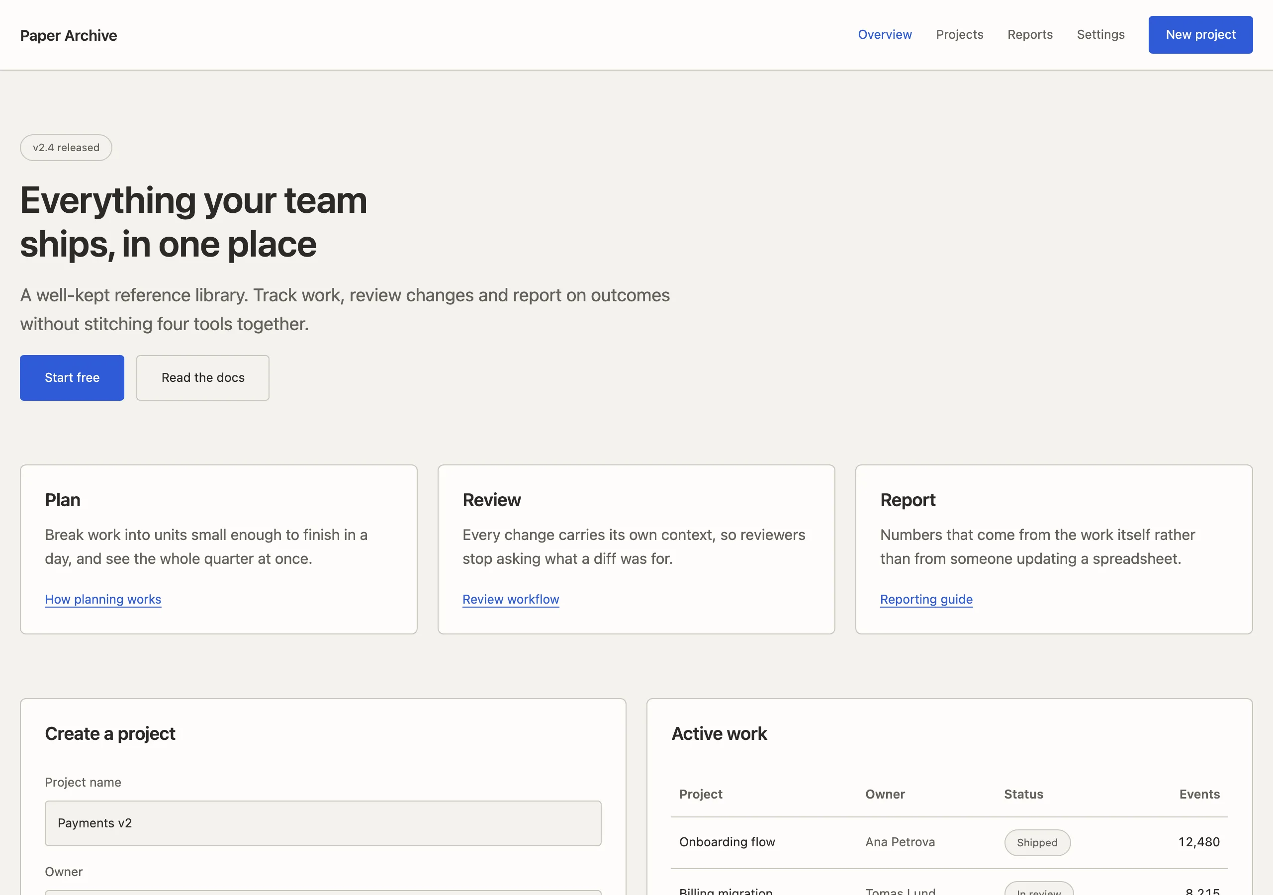
Paper Archive
a well-kept reference library
Warm grey paper, small type, dense information and no ornament. Made for documentation and reference material that people scan rather than read.
Install
npx styles-md add paper-archive Palette
Type
15px base · 1.2 ratio · weight 400/600. Fonts are not bundled — specimens fall back to what you have installed.
The quick brown fox jumps
The quick brown fox jumps
The quick brown fox jumps
The quick brown fox jumps
The quick brown fox jumps
The quick brown fox jumps
The quick brown fox jumps
The quick brown fox jumps
Shape, space & motion
- stroke
- 1px
- radius
- 3px · 4px · 6px
- spacing unit
- 4px
- gutter
- 20px
- section gap
- 64px
- max width
- 1240px
- motion
- 120ms ease-out
Paper Archive
Documentation styling with no personality budget spent on decoration. Everything goes into scannability: clear hierarchy, tight rows, and a sidebar you can navigate without thinking.
Principles
- Optimise for scanning, not reading. Short paragraphs, frequent headings, lots of lists.
- Three-column layout: nav, content, page outline. The outline is not optional.
- Blue is a link colour and nothing else — never a button fill on the page body.
- Code is a first-class citizen; give it a tinted surface and real padding.
- Headings carry a persistent anchor link revealed on hover.
Typography
Inter at 15px with a conservative 1.2 ratio. Because the ramp is shallow, headings rely on weight
and the horizontal rule beneath h2 for separation. Line height 1.65 in prose, 1.45 in lists.
Inline code uses mono at 0.9em with a tinted background.
Colour
Warm grey paper with a near-white content surface. border is a soft taupe used constantly — for
sidebar dividers, table rules, callout edges and code block outlines.
Components
- Sidebar: 260px wide,
bgfill, 1px right border,text-smlinks, accent + weight 600 when active. - Content:
surfacefill, 1240px max width, 40px padding. - H2:
text-2xl, 1px bottom border, 40px above and 16px below. - Code block:
bgfill, 1px border,radius-md, monotext-sm, 16px padding, copy button top right. - Callout: 3px left rule in accent or danger, tinted fill,
radius-sm, 16px padding. - Table: 1px rules, 10px/14px cells,
bgheader row,text-smthroughout. - Breadcrumb:
text-smatmuted,/separators, above the page title. - Page outline: right rail, 220px,
text-smmutedlinks, accent when in view.
Do / Don’t
- Do keep sections 64px apart and paragraphs under five lines.
- Do use tables and lists instead of prose wherever the content allows.
- Do show the file path or route above every code sample.
- Don’t add shadows, gradients or illustration. This style has no mood to sell.
- Don’t centre anything except the site footer.
- Don’t use accent as a background fill outside of a single primary CTA in the nav.
- Don’t exceed
text-3xl, even for the page title. - Don’t hide navigation behind a menu on desktop.
When to use
API references, product documentation, changelogs, internal wikis, handbooks. Wrong for marketing sites, where it reads as unfinished.
# Paper Archive

a well-kept reference library. Warm grey paper, small type, dense information and no ornament. Made for documentation and reference material that people scan rather than read.

## Tokens

```yaml
color:  { bg: "#f4f2ee", surface: "#fdfcfa", fg: "#2b2a27", muted: "#63605a",
          accent: "#2f5bd8", accentFg: "#ffffff", border: "#cbc6bc" }
font:   { sans: "\"Inter\", system-ui, -apple-system, \"Segoe UI\", sans-serif",
          mono: "\"IBM Plex Mono\", ui-monospace, \"SFMono-Regular\", Menlo, monospace",
          base: "15px", scale: 1.2,
          weightBody: 400, weightHeading: 600,
          headingTracking: "-0.01em" }
type:   { xs: "10.42px", sm: "12.5px", base: "15px", lg: "18px", xl: "21.6px", 2xl: "25.92px", 3xl: "31.1px", 4xl: "37.32px" }
space:  { unit: "4px", gutter: "20px",
          section: "64px", maxWidth: "1240px" }
shape:  { strokeWidth: "1px", radiusSm: "3px",
          radiusMd: "4px", radiusLg: "6px" }
motion: { duration: "120ms", easing: "ease-out" }
```

## Principles

- Optimise for scanning, not reading. Short paragraphs, frequent headings, lots of lists.
- Three-column layout: nav, content, page outline. The outline is not optional.
- Blue is a link colour and nothing else — never a button fill on the page body.
- Code is a first-class citizen; give it a tinted surface and real padding.
- Headings carry a persistent anchor link revealed on hover.

## Components

- Sidebar: 260px wide, `bg` fill, 1px right border, `text-sm` links, accent + weight 600 when active.
- Content: `surface` fill, 1240px max width, 40px padding.
- H2: `text-2xl`, 1px bottom border, 40px above and 16px below.
- Code block: `bg` fill, 1px border, `radius-md`, mono `text-sm`, 16px padding, copy button top right.
- Callout: 3px left rule in accent or danger, tinted fill, `radius-sm`, 16px padding.
- Table: 1px rules, 10px/14px cells, `bg` header row, `text-sm` throughout.
- Breadcrumb: `text-sm` at `muted`, `/` separators, above the page title.
- Page outline: right rail, 220px, `text-sm` `muted` links, accent when in view.

## Do / Don't

- Do keep sections 64px apart and paragraphs under five lines.
- Do use tables and lists instead of prose wherever the content allows.
- Do show the file path or route above every code sample.
- Don't add shadows, gradients or illustration. This style has no mood to sell.
- Don't centre anything except the site footer.
- Don't use accent as a background fill outside of a single primary CTA in the nav.
- Don't exceed `text-3xl`, even for the page title.
- Don't hide navigation behind a menu on desktop.

<!-- styles-md/paper-archive@1.0.0 — CC-BY-4.0. Full spec: DESIGN.md -->
/* Paper Archive — Tailwind v4 theme. Import after `@import "tailwindcss";` */
@theme {
--color-bg: #f4f2ee;
--color-surface: #fdfcfa;
--color-fg: #2b2a27;
--color-muted: #63605a;
--color-accent: #2f5bd8;
--color-accent-fg: #ffffff;
--color-border: #cbc6bc;
--color-success: #3d6b3a;
--color-danger: #a8322b;
--font-sans: "Inter", system-ui, -apple-system, "Segoe UI", sans-serif;
--font-mono: "IBM Plex Mono", ui-monospace, "SFMono-Regular", Menlo, monospace;
--text-xs: 10.42px;
--text-sm: 12.5px;
--text-base: 15px;
--text-lg: 18px;
--text-xl: 21.6px;
--text-2xl: 25.92px;
--text-3xl: 31.1px;
--text-4xl: 37.32px;
--radius-sm: 3px;
--radius-md: 4px;
--radius-lg: 6px;
--radius-full: 9999px;
--spacing: 4px;
--ease-default: ease-out;
}/* Paper Archive — a well-kept reference library
styles-md style "paper-archive" v1.0.0, CC-BY-4.0 */
:root {
--sm-color-bg: #f4f2ee;
--sm-color-surface: #fdfcfa;
--sm-color-fg: #2b2a27;
--sm-color-muted: #63605a;
--sm-color-accent: #2f5bd8;
--sm-color-accent-fg: #ffffff;
--sm-color-border: #cbc6bc;
--sm-color-success: #3d6b3a;
--sm-color-danger: #a8322b;
--sm-font-sans: "Inter", system-ui, -apple-system, "Segoe UI", sans-serif;
--sm-font-mono: "IBM Plex Mono", ui-monospace, "SFMono-Regular", Menlo, monospace;
--sm-font-weight-body: 400;
--sm-font-weight-heading: 600;
--sm-heading-tracking: -0.01em;
--sm-text-xs: 10.42px;
--sm-text-sm: 12.5px;
--sm-text-base: 15px;
--sm-text-lg: 18px;
--sm-text-xl: 21.6px;
--sm-text-2xl: 25.92px;
--sm-text-3xl: 31.1px;
--sm-text-4xl: 37.32px;
--sm-space-1: 4px;
--sm-space-2: 8px;
--sm-space-3: 12px;
--sm-space-4: 16px;
--sm-space-6: 24px;
--sm-space-8: 32px;
--sm-space-12: 48px;
--sm-space-16: 64px;
--sm-space-24: 96px;
--sm-gutter: 20px;
--sm-section: 64px;
--sm-max-width: 1240px;
--sm-stroke-width: 1px;
--sm-radius-sm: 3px;
--sm-radius-md: 4px;
--sm-radius-lg: 6px;
--sm-radius-full: 9999px;
--sm-duration: 120ms;
--sm-easing: ease-out;
}{
"id": "paper-archive",
"name": "Paper Archive",
"version": "1.0.0",
"license": "CC-BY-4.0",
"mood": "a well-kept reference library",
"tags": [
"light",
"docs",
"dense",
"reference",
"neutral",
"muted"
],
"tokens": {
"color": {
"bg": "#f4f2ee",
"surface": "#fdfcfa",
"fg": "#2b2a27",
"muted": "#63605a",
"accent": "#2f5bd8",
"accentFg": "#ffffff",
"border": "#cbc6bc",
"success": "#3d6b3a",
"danger": "#a8322b"
},
"font": {
"sans": "\"Inter\", system-ui, -apple-system, \"Segoe UI\", sans-serif",
"mono": "\"IBM Plex Mono\", ui-monospace, \"SFMono-Regular\", Menlo, monospace",
"scale": 1.2,
"baseSize": "15px",
"weightBody": 400,
"weightHeading": 600,
"headingTracking": -0.01
},
"space": {
"unit": "4px",
"gutter": "20px",
"section": "64px",
"maxWidth": "1240px"
},
"stroke": {
"width": "1px"
},
"radius": {
"sm": "3px",
"md": "4px",
"lg": "6px",
"full": "9999px"
},
"motion": {
"duration": "120ms",
"easing": "ease-out"
}
},
"derived": {
"type": [
{
"name": "xs",
"size": "10.42px"
},
{
"name": "sm",
"size": "12.5px"
},
{
"name": "base",
"size": "15px"
},
{
"name": "lg",
"size": "18px"
},
{
"name": "xl",
"size": "21.6px"
},
{
"name": "2xl",
"size": "25.92px"
},
{
"name": "3xl",
"size": "31.1px"
},
{
"name": "4xl",
"size": "37.32px"
}
],
"space": [
{
"step": 1,
"size": "4px"
},
{
"step": 2,
"size": "8px"
},
{
"step": 3,
"size": "12px"
},
{
"step": 4,
"size": "16px"
},
{
"step": 6,
"size": "24px"
},
{
"step": 8,
"size": "32px"
},
{
"step": 12,
"size": "48px"
},
{
"step": 16,
"size": "64px"
},
{
"step": 24,
"size": "96px"
}
]
},
"variables": {
"color-bg": "#f4f2ee",
"color-surface": "#fdfcfa",
"color-fg": "#2b2a27",
"color-muted": "#63605a",
"color-accent": "#2f5bd8",
"color-accent-fg": "#ffffff",
"color-border": "#cbc6bc",
"color-success": "#3d6b3a",
"color-danger": "#a8322b",
"font-sans": "\"Inter\", system-ui, -apple-system, \"Segoe UI\", sans-serif",
"font-mono": "\"IBM Plex Mono\", ui-monospace, \"SFMono-Regular\", Menlo, monospace",
"font-weight-body": "400",
"font-weight-heading": "600",
"heading-tracking": "-0.01em",
"text-xs": "10.42px",
"text-sm": "12.5px",
"text-base": "15px",
"text-lg": "18px",
"text-xl": "21.6px",
"text-2xl": "25.92px",
"text-3xl": "31.1px",
"text-4xl": "37.32px",
"space-1": "4px",
"space-2": "8px",
"space-3": "12px",
"space-4": "16px",
"space-6": "24px",
"space-8": "32px",
"space-12": "48px",
"space-16": "64px",
"space-24": "96px",
"gutter": "20px",
"section": "64px",
"max-width": "1240px",
"stroke-width": "1px",
"radius-sm": "3px",
"radius-md": "4px",
"radius-lg": "6px",
"radius-full": "9999px",
"duration": "120ms",
"easing": "ease-out"
}
}