
Pastel Brutalist
a sticker sheet that handles your invoices
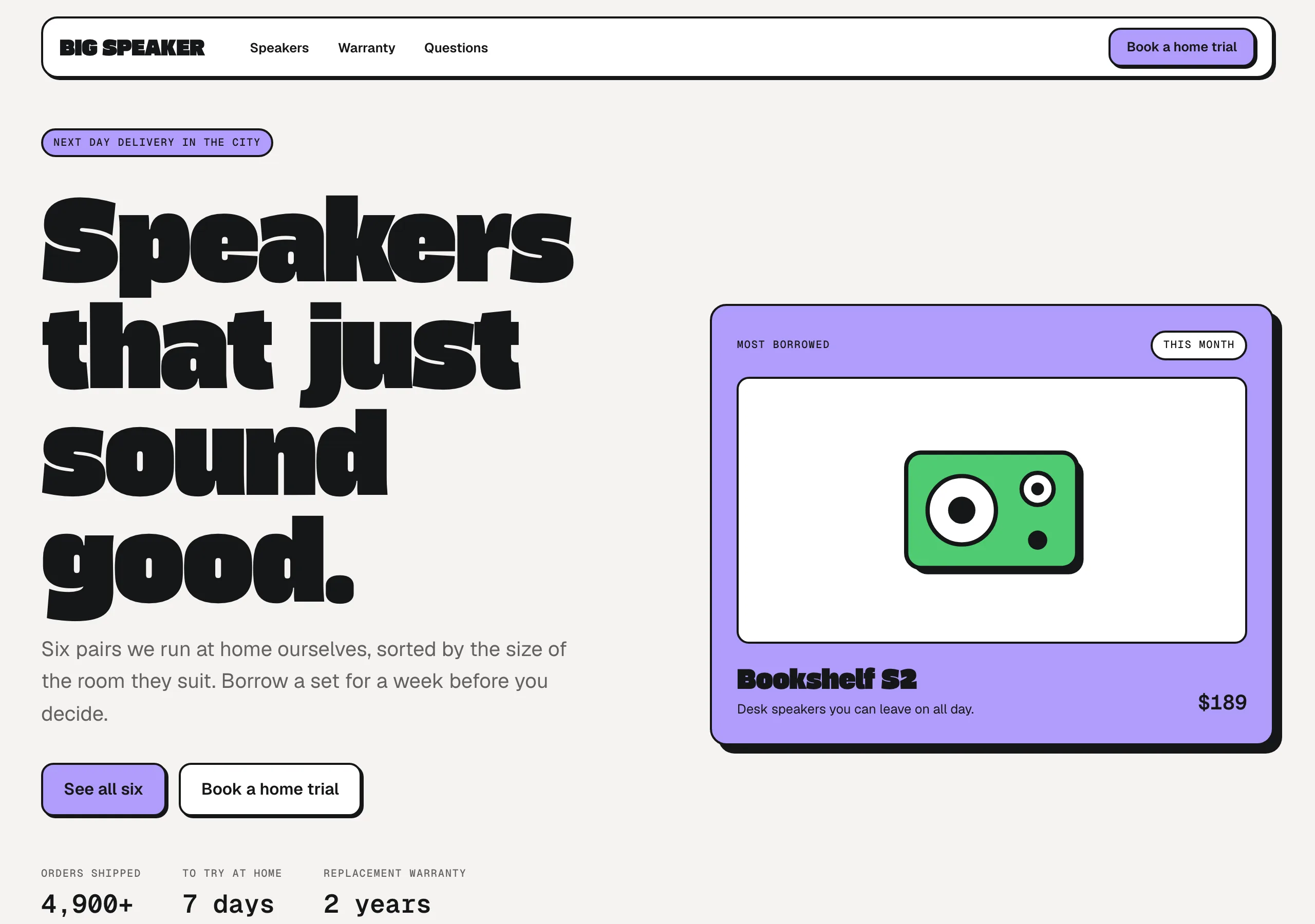
Cream page, white cards, 2px ink outlines and hard offset shadows. Flat pastel fills and one ultra-heavy display face carry all the volume.
Install
npx styles-md add pastel-brutalist Palette
Type
Aa Bb Cc 0123 The quick brown fox
"Geist", "Geist Sans", Inter, system-ui, -apple-system, "Segoe UI", sans-serif Aa Bb Cc 0123 The quick brown fox
"Gasoek One", "Archivo Black", "Arial Black", Impact, sans-serif const total = 1 + lI0O;
"Geist Mono", ui-monospace, "SFMono-Regular", Menlo, monospace 16px base · 1.25 ratio · body 400 / heading 800 · heading tracking -0.02em. Fonts are not bundled. Install the first family in each stack, or the specimens below fall back to the next one your device has.
The quick brown fox jumps
The quick brown fox jumps
The quick brown fox jumps
The quick brown fox jumps
The quick brown fox jumps
The quick brown fox jumps
The quick brown fox jumps
The quick brown fox jumps
Licensing
No font files are redistributed here. Every family this style asks for by name is free for commercial use, and CI rejects a style that names one which is not.
- Geist sans SIL Open Font License 1.1
- Geist Sans sans SIL Open Font License 1.1 The name the npm `geist` package registers. Same font as Geist.
- Geist Mono mono SIL Open Font License 1.1
- Inter sans SIL Open Font License 1.1 Fallback. Close enough in width that the layout holds if Geist is missing.
- Gasoek One display SIL Open Font License 1.1
- Archivo Black display SIL Open Font License 1.1 Fallback. Same ultra-heavy weight, slightly narrower.
Fallbacks: system-ui, -apple-system, Segoe UI, sans-serif, ui-monospace, SFMono-Regular, Menlo, monospace, Arial Black, Impact. These are CSS generics and fonts the reader's OS already ships, referenced by name only, so nothing is licensed or downloaded.
The spec itself, and everything generated from it, is CC-BY-4.0. Attribution is the comment at the top of each generated file; keep it and you have complied.
Shape, space & motion
- stroke
- 2px
- radius
- 8px · 12px · 16px
- spacing unit
- 4px
- gutter
- 24px
- section gap
- 96px
- max width
- 1200px
- motion
- 180ms cubic-bezier(0.34, 1.4, 0.64, 1)
Pastel Brutalist
Brutalist structure with the edges taken off. Every box is outlined in ink and printed a second time as a hard shadow, but the corners are round and the fills are pastel, so the page reads as friendly rather than severe.
Principles
- Every element that holds content gets a 2px ink border. The border is the drawing.
- Shadows are solid ink offsets, never blurred. Depth is a second copy of the shape, down and right.
- Corners stay round. 12px is the house radius and it is what keeps the black outlines warm.
- Fills are flat pastel. A tint fills the shape, ink outlines it, nothing gradients in between.
- Display type carries all the volume. Body text stays at base size and stays quiet.
- Pressing something moves it into its own shadow: translate 2px, drop the offset to zero.
Typography
Two families with opposite jobs. The display stack is a single ultra-heavy weight used only for headings, set tight at -0.02em with line height near 1.0, because at that weight the letters already fill the line. Everything else is the sans at 400. The mono stack handles small uppercase labels and any number that sits in a table or a metric, where tabular figures matter.
Colour
The cream page is what makes plain white cards read as raised, so the two are not
interchangeable. Ink is the only line colour and the only shadow colour. accent, success and
danger are tints for filling shapes, not for setting text: use them behind an ink label, and let
ink or muted carry the prose.
Components
- Button (primary):
accentfill, ink label at weight 600, 2px border,radius-md, 12px/20px padding,shadow-sm. - Button (secondary):
surfacefill, identical border, shadow and metrics. Only the fill changes. - Card:
surfacefill, 2px border,radius-lg, 24px padding,shadow-md. - Tinted card: same as card with a pastel fill. One per group, so the eye has a landing spot.
- Input:
surfacefill, 2px border,radius-md, 10px/14px padding; focus addsshadow-sm. - Nav: floating bar inset 16px from the top,
surfacefill, 2px border,radius-lg,shadow-sm. - Badge:
radius-full, 2px border, tint fill, mono uppercase attext-xs, 4px/10px padding. - Table: 2px outer border, 1px inner rules,
surfaceheader row in mono uppercase, 12px/16px cells. - Heading:
"Gasoek One", "Archivo Black", "Arial Black", sans-serif, tracking -0.02em, line height 1.0. - Focus ring: 3px
accentoutline at 2px offset, following the element radius.
Do / Don’t
- Do outline every tinted shape. A pastel fill with no border dissolves into the cream.
- Do keep all shadow offsets pointing the same way. One light source, down and right.
- Do use mono uppercase at
text-xsfor micro labels: badges, table headers, metric captions. - Do let headings run wide and wrap. The display face is meant to fill its measure.
- Don’t blur a shadow or tint it any colour other than ink.
- Don’t set the page to pure white. The cream is why the cards read as raised.
- Don’t set body copy, buttons or labels in the display family. It is for headings only.
- Don’t put more than three tints in one view, or the outlines stop reading as structure.
- Don’t drop the border to 1px on small elements. Badges and inputs keep the full 2px.
When to use
Marketing sites, pricing pages, launch pages and developer products that want warmth without losing structure. A poor fit for dense dashboards and long-form reading, where the outlines and offsets become noise.
# Pastel Brutalist

a sticker sheet that handles your invoices. Cream page, white cards, 2px ink outlines and hard offset shadows. Flat pastel fills and one ultra-heavy display face carry all the volume.

## Tokens

```yaml
color:  { bg: "#f5f2f0", surface: "#ffffff", fg: "#151617", muted: "#63615f",
          accent: "#b09cfb", accentFg: "#151617", border: "#151617" }
font:   { sans: "\"Geist\", \"Geist Sans\", Inter, system-ui, -apple-system, \"Segoe UI\", sans-serif",
          mono: "\"Geist Mono\", ui-monospace, \"SFMono-Regular\", Menlo, monospace",
          base: "16px", scale: 1.25,
          weightBody: 400, weightHeading: 800,
          headingTracking: "-0.02em" }
type:   { xs: "10.24px", sm: "12.8px", base: "16px", lg: "20px", xl: "25px", 2xl: "31.25px", 3xl: "39.06px", 4xl: "48.83px" }
space:  { unit: "4px", gutter: "24px",
          section: "96px", maxWidth: "1200px" }
shape:  { strokeWidth: "2px", radiusSm: "8px",
          radiusMd: "12px", radiusLg: "16px" }
motion: { duration: "180ms", easing: "cubic-bezier(0.34, 1.4, 0.64, 1)" }
```

## Principles

- Every element that holds content gets a 2px ink border. The border is the drawing.
- Shadows are solid ink offsets, never blurred. Depth is a second copy of the shape, down and right.
- Corners stay round. 12px is the house radius and it is what keeps the black outlines warm.
- Fills are flat pastel. A tint fills the shape, ink outlines it, nothing gradients in between.
- Display type carries all the volume. Body text stays at base size and stays quiet.
- Pressing something moves it into its own shadow: translate 2px, drop the offset to zero.

## Components

- Button (primary): `accent` fill, ink label at weight 600, 2px border, `radius-md`, 12px/20px padding, `shadow-sm`.
- Button (secondary): `surface` fill, identical border, shadow and metrics. Only the fill changes.
- Card: `surface` fill, 2px border, `radius-lg`, 24px padding, `shadow-md`.
- Tinted card: same as card with a pastel fill. One per group, so the eye has a landing spot.
- Input: `surface` fill, 2px border, `radius-md`, 10px/14px padding; focus adds `shadow-sm`.
- Nav: floating bar inset 16px from the top, `surface` fill, 2px border, `radius-lg`, `shadow-sm`.
- Badge: `radius-full`, 2px border, tint fill, mono uppercase at `text-xs`, 4px/10px padding.
- Table: 2px outer border, 1px inner rules, `surface` header row in mono uppercase, 12px/16px cells.
- Heading: `"Gasoek One", "Archivo Black", "Arial Black", sans-serif`, tracking -0.02em, line height 1.0.
- Focus ring: 3px `accent` outline at 2px offset, following the element radius.

## Do / Don't

- Do outline every tinted shape. A pastel fill with no border dissolves into the cream.
- Do keep all shadow offsets pointing the same way. One light source, down and right.
- Do use mono uppercase at `text-xs` for micro labels: badges, table headers, metric captions.
- Do let headings run wide and wrap. The display face is meant to fill its measure.
- Don't blur a shadow or tint it any colour other than ink.
- Don't set the page to pure white. The cream is why the cards read as raised.
- Don't set body copy, buttons or labels in the display family. It is for headings only.
- Don't put more than three tints in one view, or the outlines stop reading as structure.
- Don't drop the border to 1px on small elements. Badges and inputs keep the full 2px.

<!-- styles-md/pastel-brutalist@1.0.0, CC-BY-4.0. Full spec: DESIGN.md -->
/* Pastel Brutalist: Tailwind v4 theme. Import after `@import "tailwindcss";` */
@theme {
--color-bg: #f5f2f0;
--color-surface: #ffffff;
--color-fg: #151617;
--color-muted: #63615f;
--color-accent: #b09cfb;
--color-accent-fg: #151617;
--color-border: #151617;
--color-success: #4ecb71;
--color-danger: #ff6b52;
--font-sans: "Geist", "Geist Sans", Inter, system-ui, -apple-system, "Segoe UI", sans-serif;
--font-mono: "Geist Mono", ui-monospace, "SFMono-Regular", Menlo, monospace;
--font-display: "Gasoek One", "Archivo Black", "Arial Black", Impact, sans-serif;
--text-xs: 10.24px;
--text-sm: 12.8px;
--text-base: 16px;
--text-lg: 20px;
--text-xl: 25px;
--text-2xl: 31.25px;
--text-3xl: 39.06px;
--text-4xl: 48.83px;
--radius-sm: 8px;
--radius-md: 12px;
--radius-lg: 16px;
--radius-full: 9999px;
--spacing: 4px;
--ease-default: cubic-bezier(0.34, 1.4, 0.64, 1);
}/* Pastel Brutalist: a sticker sheet that handles your invoices
styles-md style "pastel-brutalist" v1.0.0, CC-BY-4.0 */
:root {
--sm-color-bg: #f5f2f0;
--sm-color-surface: #ffffff;
--sm-color-fg: #151617;
--sm-color-muted: #63615f;
--sm-color-accent: #b09cfb;
--sm-color-accent-fg: #151617;
--sm-color-border: #151617;
--sm-color-success: #4ecb71;
--sm-color-danger: #ff6b52;
--sm-font-sans: "Geist", "Geist Sans", Inter, system-ui, -apple-system, "Segoe UI", sans-serif;
--sm-font-mono: "Geist Mono", ui-monospace, "SFMono-Regular", Menlo, monospace;
--sm-font-display: "Gasoek One", "Archivo Black", "Arial Black", Impact, sans-serif;
--sm-font-weight-body: 400;
--sm-font-weight-heading: 800;
--sm-heading-tracking: -0.02em;
--sm-text-xs: 10.24px;
--sm-text-sm: 12.8px;
--sm-text-base: 16px;
--sm-text-lg: 20px;
--sm-text-xl: 25px;
--sm-text-2xl: 31.25px;
--sm-text-3xl: 39.06px;
--sm-text-4xl: 48.83px;
--sm-space-1: 4px;
--sm-space-2: 8px;
--sm-space-3: 12px;
--sm-space-4: 16px;
--sm-space-6: 24px;
--sm-space-8: 32px;
--sm-space-12: 48px;
--sm-space-16: 64px;
--sm-space-24: 96px;
--sm-gutter: 24px;
--sm-section: 96px;
--sm-max-width: 1200px;
--sm-stroke-width: 2px;
--sm-radius-sm: 8px;
--sm-radius-md: 12px;
--sm-radius-lg: 16px;
--sm-radius-full: 9999px;
--sm-duration: 180ms;
--sm-easing: cubic-bezier(0.34, 1.4, 0.64, 1);
--sm-shadow-sm: 2px 2px 0 #151617;
--sm-shadow-md: 4px 4px 0 #151617;
--sm-shadow-lg: 8px 8px 0 #151617;
}{
"id": "pastel-brutalist",
"name": "Pastel Brutalist",
"version": "1.0.0",
"license": "CC-BY-4.0",
"mood": "a sticker sheet that handles your invoices",
"tags": [
"light",
"brutalist",
"playful",
"pastel",
"saas",
"marketing"
],
"fonts": [
{
"family": "Geist",
"role": "sans",
"license": "OFL-1.1",
"url": "https://github.com/vercel/geist-font"
},
{
"family": "Geist Sans",
"role": "sans",
"license": "OFL-1.1",
"url": "https://github.com/vercel/geist-font",
"note": "The name the npm `geist` package registers. Same font as Geist."
},
{
"family": "Geist Mono",
"role": "mono",
"license": "OFL-1.1",
"url": "https://github.com/vercel/geist-font"
},
{
"family": "Inter",
"role": "sans",
"license": "OFL-1.1",
"url": "https://github.com/rsms/inter",
"note": "Fallback. Close enough in width that the layout holds if Geist is missing."
},
{
"family": "Gasoek One",
"role": "display",
"license": "OFL-1.1",
"url": "https://fonts.google.com/specimen/Gasoek+One"
},
{
"family": "Archivo Black",
"role": "display",
"license": "OFL-1.1",
"url": "https://fonts.google.com/specimen/Archivo+Black",
"note": "Fallback. Same ultra-heavy weight, slightly narrower."
}
],
"tokens": {
"color": {
"bg": "#f5f2f0",
"surface": "#ffffff",
"fg": "#151617",
"muted": "#63615f",
"accent": "#b09cfb",
"accentFg": "#151617",
"border": "#151617",
"success": "#4ecb71",
"danger": "#ff6b52"
},
"font": {
"sans": "\"Geist\", \"Geist Sans\", Inter, system-ui, -apple-system, \"Segoe UI\", sans-serif",
"mono": "\"Geist Mono\", ui-monospace, \"SFMono-Regular\", Menlo, monospace",
"display": "\"Gasoek One\", \"Archivo Black\", \"Arial Black\", Impact, sans-serif",
"scale": 1.25,
"baseSize": "16px",
"weightBody": 400,
"weightHeading": 800,
"headingTracking": -0.02
},
"space": {
"unit": "4px",
"gutter": "24px",
"section": "96px",
"maxWidth": "1200px"
},
"stroke": {
"width": "2px"
},
"radius": {
"sm": "8px",
"md": "12px",
"lg": "16px",
"full": "9999px"
},
"motion": {
"duration": "180ms",
"easing": "cubic-bezier(0.34, 1.4, 0.64, 1)"
},
"shadow": {
"sm": "2px 2px 0 #151617",
"md": "4px 4px 0 #151617",
"lg": "8px 8px 0 #151617"
}
},
"derived": {
"type": [
{
"name": "xs",
"size": "10.24px"
},
{
"name": "sm",
"size": "12.8px"
},
{
"name": "base",
"size": "16px"
},
{
"name": "lg",
"size": "20px"
},
{
"name": "xl",
"size": "25px"
},
{
"name": "2xl",
"size": "31.25px"
},
{
"name": "3xl",
"size": "39.06px"
},
{
"name": "4xl",
"size": "48.83px"
}
],
"space": [
{
"step": 1,
"size": "4px"
},
{
"step": 2,
"size": "8px"
},
{
"step": 3,
"size": "12px"
},
{
"step": 4,
"size": "16px"
},
{
"step": 6,
"size": "24px"
},
{
"step": 8,
"size": "32px"
},
{
"step": 12,
"size": "48px"
},
{
"step": 16,
"size": "64px"
},
{
"step": 24,
"size": "96px"
}
]
},
"variables": {
"color-bg": "#f5f2f0",
"color-surface": "#ffffff",
"color-fg": "#151617",
"color-muted": "#63615f",
"color-accent": "#b09cfb",
"color-accent-fg": "#151617",
"color-border": "#151617",
"color-success": "#4ecb71",
"color-danger": "#ff6b52",
"font-sans": "\"Geist\", \"Geist Sans\", Inter, system-ui, -apple-system, \"Segoe UI\", sans-serif",
"font-mono": "\"Geist Mono\", ui-monospace, \"SFMono-Regular\", Menlo, monospace",
"font-display": "\"Gasoek One\", \"Archivo Black\", \"Arial Black\", Impact, sans-serif",
"font-weight-body": "400",
"font-weight-heading": "800",
"heading-tracking": "-0.02em",
"text-xs": "10.24px",
"text-sm": "12.8px",
"text-base": "16px",
"text-lg": "20px",
"text-xl": "25px",
"text-2xl": "31.25px",
"text-3xl": "39.06px",
"text-4xl": "48.83px",
"space-1": "4px",
"space-2": "8px",
"space-3": "12px",
"space-4": "16px",
"space-6": "24px",
"space-8": "32px",
"space-12": "48px",
"space-16": "64px",
"space-24": "96px",
"gutter": "24px",
"section": "96px",
"max-width": "1200px",
"stroke-width": "2px",
"radius-sm": "8px",
"radius-md": "12px",
"radius-lg": "16px",
"radius-full": "9999px",
"duration": "180ms",
"easing": "cubic-bezier(0.34, 1.4, 0.64, 1)",
"shadow-sm": "2px 2px 0 #151617",
"shadow-md": "4px 4px 0 #151617",
"shadow-lg": "8px 8px 0 #151617"
}
}