
Pulp Transmission
a comic broadcast from a dead planet
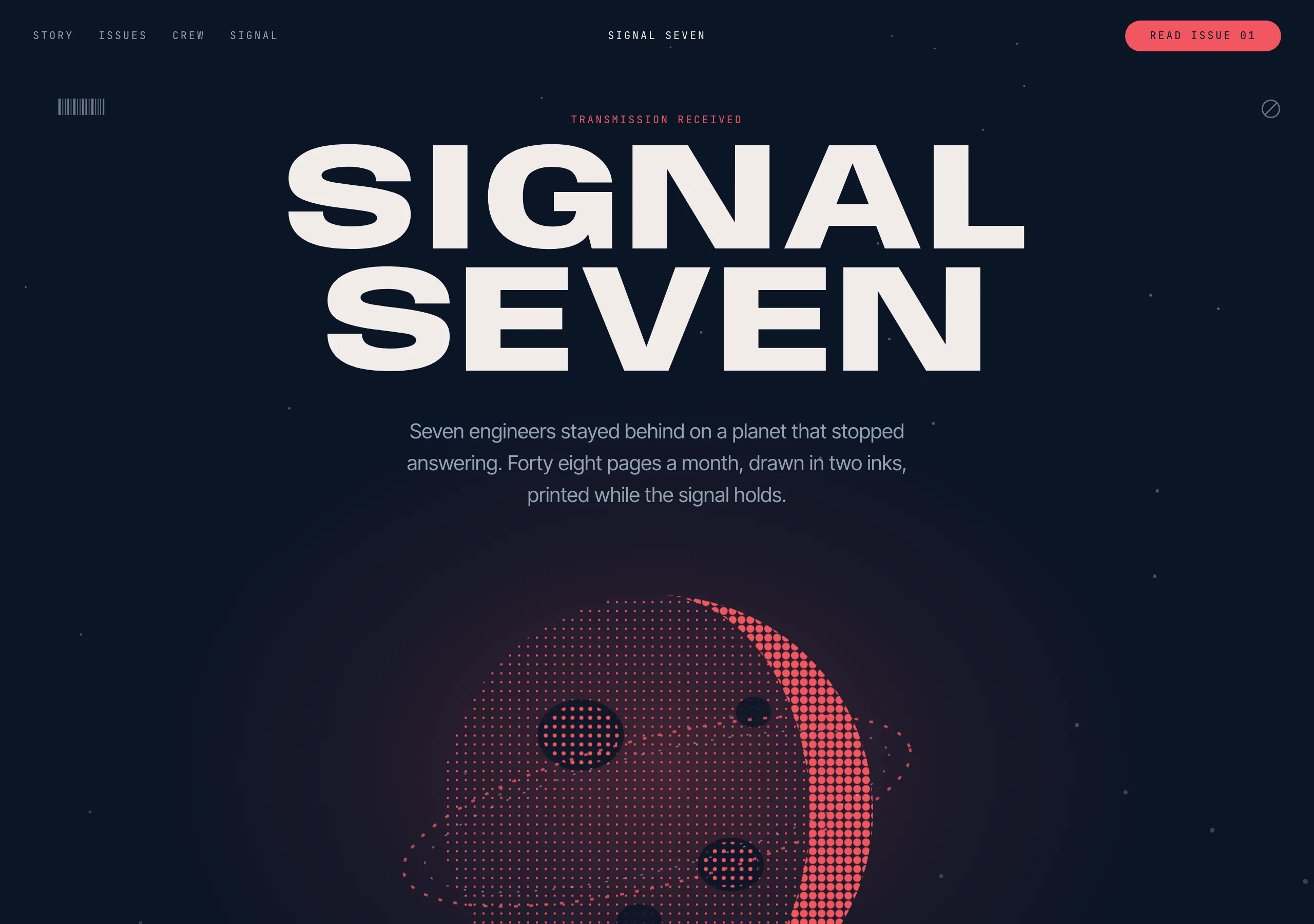
Deep navy and one flare of coral, inverted section by section. Ultra wide display caps fill the page edge to edge, halftone artwork sits in a radial glow, and technical marks hold the four corners.
Install
npx styles-md add pulp-transmission Palette
Type
Aa Bb Cc 0123 The quick brown fox
"Inter Tight", "Helvetica Neue", Arial, sans-serif Aa Bb Cc 0123 The quick brown fox
"Anybody", "Arial Black", Impact, sans-serif const total = 1 + lI0O;
"JetBrains Mono", ui-monospace, "SFMono-Regular", Menlo, monospace 16px base · 1.25 ratio · body 400 / heading 800 · heading tracking 0em. Fonts are not bundled. Install the first family in each stack, or the specimens below fall back to the next one your device has.
The quick brown fox jumps
The quick brown fox jumps
The quick brown fox jumps
The quick brown fox jumps
The quick brown fox jumps
The quick brown fox jumps
The quick brown fox jumps
The quick brown fox jumps
Licensing
No font files are redistributed here. Every family this style asks for by name is free for commercial use, and CI rejects a style that names one which is not.
- Anybody display SIL Open Font License 1.1 Variable width. Pushed to the expanded end at weight 800 it gives the wide slab caps this style is built on.
- Inter Tight sans SIL Open Font License 1.1 Body and UI. Narrow enough to sit under a display line without competing.
- JetBrains Mono mono SIL Open Font License 1.1 Corner marks, counts, coordinates and timestamps.
Fallbacks: Helvetica Neue, Arial, sans-serif, ui-monospace, SFMono-Regular, Menlo, monospace, Arial Black, Impact. These are CSS generics and fonts the reader's OS already ships, referenced by name only, so nothing is licensed or downloaded.
The spec itself, and everything generated from it, is CC-BY-4.0. Attribution is the comment at the top of each generated file; keep it and you have complied.
Shape, space & motion
- stroke
- 1px
- radius
- 6px · 10px · 90px
- spacing unit
- 4px
- gutter
- 24px
- section gap
- 120px
- max width
- 1440px
- motion
- 350ms cubic-bezier(0.2, 0.8, 0.2, 1)
Pulp Transmission
A comic book cover that happens to be a website. Two colours trade places between sections, the title is set as wide as the page will allow, and the artwork is halftoned so it belongs to the same print run as the type. The furniture in the corners is there to make the page feel like equipment.
Principles
- Two grounds, and they swap. Navy sections carry coral marks; coral sections carry navy marks.
- On coral, the ink is
bgnavy. Bone on coral fails contrast at 2.86:1, so it never appears there. - The display line is width, not size. Push the face to its expanded end and fill the measure.
- Artwork is halftoned to two inks and sits in a radial glow, never on a flat rectangle.
- Every screen keeps technical marks in its corners: a barcode, a crossed circle, a frame count.
- Shadows are layered and soft. This is the one style here where depth is allowed to be lit.
Typography
The display face is variable in width, and that axis carries the whole voice: at the expanded end, weight 800 and line height 0.8, a three word title fills 1440px with no tracking applied. Sizes jump rather than step, from 24px straight to 88px and 140px, because a poster has a title and a caption and nothing between them. Body is the narrow sans at 16 to 24px, and mono holds anything that reads as instrumentation: counts, coordinates, issue numbers.
Colour
Navy #0a1526 is the default ground and bone #f2ecea the text on it, at 15.64:1. Coral is the
flare: as text on navy it clears AA at 5.46:1, and as a full bleed ground it takes navy ink at the
same ratio. muted is a cool grey for captions at 6.97:1. surface is one step up from the ground
for a panel, and border is a hairline that reads as a rule on a page rather than as a UI frame.
Components
- Display line: display face at expanded width, weight 800, uppercase, line height 0.8, tracking 0.
- Button (primary):
accentfill,accentFglabel,radius-lg, 14px/32px, uppercase mono label. - Button (ghost): 1px
border,fglabel,radius-lg, same metrics. - Icon button: a circle at
radius-full,surfacefill, 44px, in a row of five or more. - Panel:
surface,radius-md, 1pxborder, 24px padding,shadow-md. - Card (art): the halftone bleeds to the edges,
radius-sm, caption in mono underneath. - Corner mark: mono at 10px, or a drawn barcode or crossed circle, pinned to a section corner.
- Glow: a radial gradient of
accentat 25 percent, behind the subject and nothing else. - Divider: 1px
border, full bleed, with a mono label sitting on top of it. - Focus ring: 2px
accentat 3px offset.
Do / Don’t
- Do invert the ground between sections. A page of one colour loses the whole device.
- Do set the title as wide as the container allows before you make it taller.
- Do halftone the artwork to two inks so it prints with the type.
- Do keep the corner marks on every full bleed section, at 10px, in mono.
- Do let the glow sit behind the subject, at one intensity, once per section.
- Don’t put bone text on coral. Navy is the ink on that ground.
- Don’t track the display line. Width is the axis you reach for.
- Don’t fill a mid sized rectangle with coral. It is either a full ground, a control, or a mark.
- Don’t put a photograph on the page untreated. It has to be halftoned or it does not belong.
- Don’t add a third hue. The palette is two inks and a grey for captions.
When to use
Comics, games, drops and launches, music and events: anything sold on a cover. A poor fit for dashboards, documentation and long reading, where an inverting ground and a 140px title are noise around the content rather than the content itself.
# Pulp Transmission

a comic broadcast from a dead planet. Deep navy and one flare of coral, inverted section by section. Ultra wide display caps fill the page edge to edge, halftone artwork sits in a radial glow, and technical marks hold the four corners.

## Tokens

```yaml
color:  { bg: "#0a1526", surface: "#16263f", fg: "#f2ecea", muted: "#93a1b5",
          accent: "#f2565f", accentFg: "#0a1526", border: "#2b3d59" }
font:   { sans: "\"Inter Tight\", \"Helvetica Neue\", Arial, sans-serif",
          mono: "\"JetBrains Mono\", ui-monospace, \"SFMono-Regular\", Menlo, monospace",
          base: "16px", scale: 1.25,
          weightBody: 400, weightHeading: 800,
          headingTracking: "0em" }
type:   { xs: "10.24px", sm: "12.8px", base: "16px", lg: "20px", xl: "25px", 2xl: "31.25px", 3xl: "39.06px", 4xl: "48.83px" }
space:  { unit: "4px", gutter: "24px",
          section: "120px", maxWidth: "1440px" }
shape:  { strokeWidth: "1px", radiusSm: "6px",
          radiusMd: "10px", radiusLg: "90px" }
motion: { duration: "350ms", easing: "cubic-bezier(0.2, 0.8, 0.2, 1)" }
```

## Principles

- Two grounds, and they swap. Navy sections carry coral marks; coral sections carry navy marks.
- On coral, the ink is `bg` navy. Bone on coral fails contrast at 2.86:1, so it never appears there.
- The display line is width, not size. Push the face to its expanded end and fill the measure.
- Artwork is halftoned to two inks and sits in a radial glow, never on a flat rectangle.
- Every screen keeps technical marks in its corners: a barcode, a crossed circle, a frame count.
- Shadows are layered and soft. This is the one style here where depth is allowed to be lit.

## Components

- Display line: display face at expanded width, weight 800, uppercase, line height 0.8, tracking 0.
- Button (primary): `accent` fill, `accentFg` label, `radius-lg`, 14px/32px, uppercase mono label.
- Button (ghost): 1px `border`, `fg` label, `radius-lg`, same metrics.
- Icon button: a circle at `radius-full`, `surface` fill, 44px, in a row of five or more.
- Panel: `surface`, `radius-md`, 1px `border`, 24px padding, `shadow-md`.
- Card (art): the halftone bleeds to the edges, `radius-sm`, caption in mono underneath.
- Corner mark: mono at 10px, or a drawn barcode or crossed circle, pinned to a section corner.
- Glow: a radial gradient of `accent` at 25 percent, behind the subject and nothing else.
- Divider: 1px `border`, full bleed, with a mono label sitting on top of it.
- Focus ring: 2px `accent` at 3px offset.

## Do / Don't

- Do invert the ground between sections. A page of one colour loses the whole device.
- Do set the title as wide as the container allows before you make it taller.
- Do halftone the artwork to two inks so it prints with the type.
- Do keep the corner marks on every full bleed section, at 10px, in mono.
- Do let the glow sit behind the subject, at one intensity, once per section.
- Don't put bone text on coral. Navy is the ink on that ground.
- Don't track the display line. Width is the axis you reach for.
- Don't fill a mid sized rectangle with coral. It is either a full ground, a control, or a mark.
- Don't put a photograph on the page untreated. It has to be halftoned or it does not belong.
- Don't add a third hue. The palette is two inks and a grey for captions.

<!-- styles-md/pulp-transmission@1.0.0, CC-BY-4.0. Full spec: DESIGN.md -->
/* Pulp Transmission: Tailwind v4 theme. Import after `@import "tailwindcss";` */
@theme {
--color-bg: #0a1526;
--color-surface: #16263f;
--color-fg: #f2ecea;
--color-muted: #93a1b5;
--color-accent: #f2565f;
--color-accent-fg: #0a1526;
--color-border: #2b3d59;
--font-sans: "Inter Tight", "Helvetica Neue", Arial, sans-serif;
--font-mono: "JetBrains Mono", ui-monospace, "SFMono-Regular", Menlo, monospace;
--font-display: "Anybody", "Arial Black", Impact, sans-serif;
--text-xs: 10.24px;
--text-sm: 12.8px;
--text-base: 16px;
--text-lg: 20px;
--text-xl: 25px;
--text-2xl: 31.25px;
--text-3xl: 39.06px;
--text-4xl: 48.83px;
--radius-sm: 6px;
--radius-md: 10px;
--radius-lg: 90px;
--radius-full: 9999px;
--spacing: 4px;
--ease-default: cubic-bezier(0.2, 0.8, 0.2, 1);
}/* Pulp Transmission: a comic broadcast from a dead planet
styles-md style "pulp-transmission" v1.0.0, CC-BY-4.0 */
:root {
--sm-color-bg: #0a1526;
--sm-color-surface: #16263f;
--sm-color-fg: #f2ecea;
--sm-color-muted: #93a1b5;
--sm-color-accent: #f2565f;
--sm-color-accent-fg: #0a1526;
--sm-color-border: #2b3d59;
--sm-font-sans: "Inter Tight", "Helvetica Neue", Arial, sans-serif;
--sm-font-mono: "JetBrains Mono", ui-monospace, "SFMono-Regular", Menlo, monospace;
--sm-font-display: "Anybody", "Arial Black", Impact, sans-serif;
--sm-font-weight-body: 400;
--sm-font-weight-heading: 800;
--sm-heading-tracking: 0em;
--sm-text-xs: 10.24px;
--sm-text-sm: 12.8px;
--sm-text-base: 16px;
--sm-text-lg: 20px;
--sm-text-xl: 25px;
--sm-text-2xl: 31.25px;
--sm-text-3xl: 39.06px;
--sm-text-4xl: 48.83px;
--sm-space-1: 4px;
--sm-space-2: 8px;
--sm-space-3: 12px;
--sm-space-4: 16px;
--sm-space-6: 24px;
--sm-space-8: 32px;
--sm-space-12: 48px;
--sm-space-16: 64px;
--sm-space-24: 96px;
--sm-gutter: 24px;
--sm-section: 120px;
--sm-max-width: 1440px;
--sm-stroke-width: 1px;
--sm-radius-sm: 6px;
--sm-radius-md: 10px;
--sm-radius-lg: 90px;
--sm-radius-full: 9999px;
--sm-duration: 350ms;
--sm-easing: cubic-bezier(0.2, 0.8, 0.2, 1);
--sm-shadow-sm: 0 1px 1px -1px rgba(0, 0, 0, 0.3), 0 2px 2px -2px rgba(0, 0, 0, 0.3);
--sm-shadow-md: 0 2px 3px -1px rgba(0, 0, 0, 0.3), 0 10px 10px -3px rgba(0, 0, 0, 0.3);
--sm-shadow-lg: 0 3px 11px -2px rgba(0, 0, 0, 0.28), 0 10px 50px -3px rgba(0, 0, 0, 0.3);
}{
"id": "pulp-transmission",
"name": "Pulp Transmission",
"version": "1.0.0",
"license": "CC-BY-4.0",
"mood": "a comic broadcast from a dead planet",
"tags": [
"dark",
"comic",
"poster",
"sci-fi",
"bold",
"uppercase",
"entertainment"
],
"fonts": [
{
"family": "Anybody",
"role": "display",
"license": "OFL-1.1",
"url": "https://fonts.google.com/specimen/Anybody",
"note": "Variable width. Pushed to the expanded end at weight 800 it gives the wide slab caps this style is built on."
},
{
"family": "Inter Tight",
"role": "sans",
"license": "OFL-1.1",
"url": "https://fonts.google.com/specimen/Inter+Tight",
"note": "Body and UI. Narrow enough to sit under a display line without competing."
},
{
"family": "JetBrains Mono",
"role": "mono",
"license": "OFL-1.1",
"url": "https://fonts.google.com/specimen/JetBrains+Mono",
"note": "Corner marks, counts, coordinates and timestamps."
}
],
"tokens": {
"color": {
"bg": "#0a1526",
"surface": "#16263f",
"fg": "#f2ecea",
"muted": "#93a1b5",
"accent": "#f2565f",
"accentFg": "#0a1526",
"border": "#2b3d59"
},
"font": {
"sans": "\"Inter Tight\", \"Helvetica Neue\", Arial, sans-serif",
"mono": "\"JetBrains Mono\", ui-monospace, \"SFMono-Regular\", Menlo, monospace",
"display": "\"Anybody\", \"Arial Black\", Impact, sans-serif",
"scale": 1.25,
"baseSize": "16px",
"weightBody": 400,
"weightHeading": 800,
"headingTracking": 0
},
"space": {
"unit": "4px",
"gutter": "24px",
"section": "120px",
"maxWidth": "1440px"
},
"stroke": {
"width": "1px"
},
"radius": {
"sm": "6px",
"md": "10px",
"lg": "90px",
"full": "9999px"
},
"motion": {
"duration": "350ms",
"easing": "cubic-bezier(0.2, 0.8, 0.2, 1)"
},
"shadow": {
"sm": "0 1px 1px -1px rgba(0, 0, 0, 0.3), 0 2px 2px -2px rgba(0, 0, 0, 0.3)",
"md": "0 2px 3px -1px rgba(0, 0, 0, 0.3), 0 10px 10px -3px rgba(0, 0, 0, 0.3)",
"lg": "0 3px 11px -2px rgba(0, 0, 0, 0.28), 0 10px 50px -3px rgba(0, 0, 0, 0.3)"
}
},
"derived": {
"type": [
{
"name": "xs",
"size": "10.24px"
},
{
"name": "sm",
"size": "12.8px"
},
{
"name": "base",
"size": "16px"
},
{
"name": "lg",
"size": "20px"
},
{
"name": "xl",
"size": "25px"
},
{
"name": "2xl",
"size": "31.25px"
},
{
"name": "3xl",
"size": "39.06px"
},
{
"name": "4xl",
"size": "48.83px"
}
],
"space": [
{
"step": 1,
"size": "4px"
},
{
"step": 2,
"size": "8px"
},
{
"step": 3,
"size": "12px"
},
{
"step": 4,
"size": "16px"
},
{
"step": 6,
"size": "24px"
},
{
"step": 8,
"size": "32px"
},
{
"step": 12,
"size": "48px"
},
{
"step": 16,
"size": "64px"
},
{
"step": 24,
"size": "96px"
}
]
},
"variables": {
"color-bg": "#0a1526",
"color-surface": "#16263f",
"color-fg": "#f2ecea",
"color-muted": "#93a1b5",
"color-accent": "#f2565f",
"color-accent-fg": "#0a1526",
"color-border": "#2b3d59",
"font-sans": "\"Inter Tight\", \"Helvetica Neue\", Arial, sans-serif",
"font-mono": "\"JetBrains Mono\", ui-monospace, \"SFMono-Regular\", Menlo, monospace",
"font-display": "\"Anybody\", \"Arial Black\", Impact, sans-serif",
"font-weight-body": "400",
"font-weight-heading": "800",
"heading-tracking": "0em",
"text-xs": "10.24px",
"text-sm": "12.8px",
"text-base": "16px",
"text-lg": "20px",
"text-xl": "25px",
"text-2xl": "31.25px",
"text-3xl": "39.06px",
"text-4xl": "48.83px",
"space-1": "4px",
"space-2": "8px",
"space-3": "12px",
"space-4": "16px",
"space-6": "24px",
"space-8": "32px",
"space-12": "48px",
"space-16": "64px",
"space-24": "96px",
"gutter": "24px",
"section": "120px",
"max-width": "1440px",
"stroke-width": "1px",
"radius-sm": "6px",
"radius-md": "10px",
"radius-lg": "90px",
"radius-full": "9999px",
"duration": "350ms",
"easing": "cubic-bezier(0.2, 0.8, 0.2, 1)",
"shadow-sm": "0 1px 1px -1px rgba(0, 0, 0, 0.3), 0 2px 2px -2px rgba(0, 0, 0, 0.3)",
"shadow-md": "0 2px 3px -1px rgba(0, 0, 0, 0.3), 0 10px 10px -3px rgba(0, 0, 0, 0.3)",
"shadow-lg": "0 3px 11px -2px rgba(0, 0, 0, 0.28), 0 10px 50px -3px rgba(0, 0, 0, 0.3)"
}
}