
Recess Bulletin
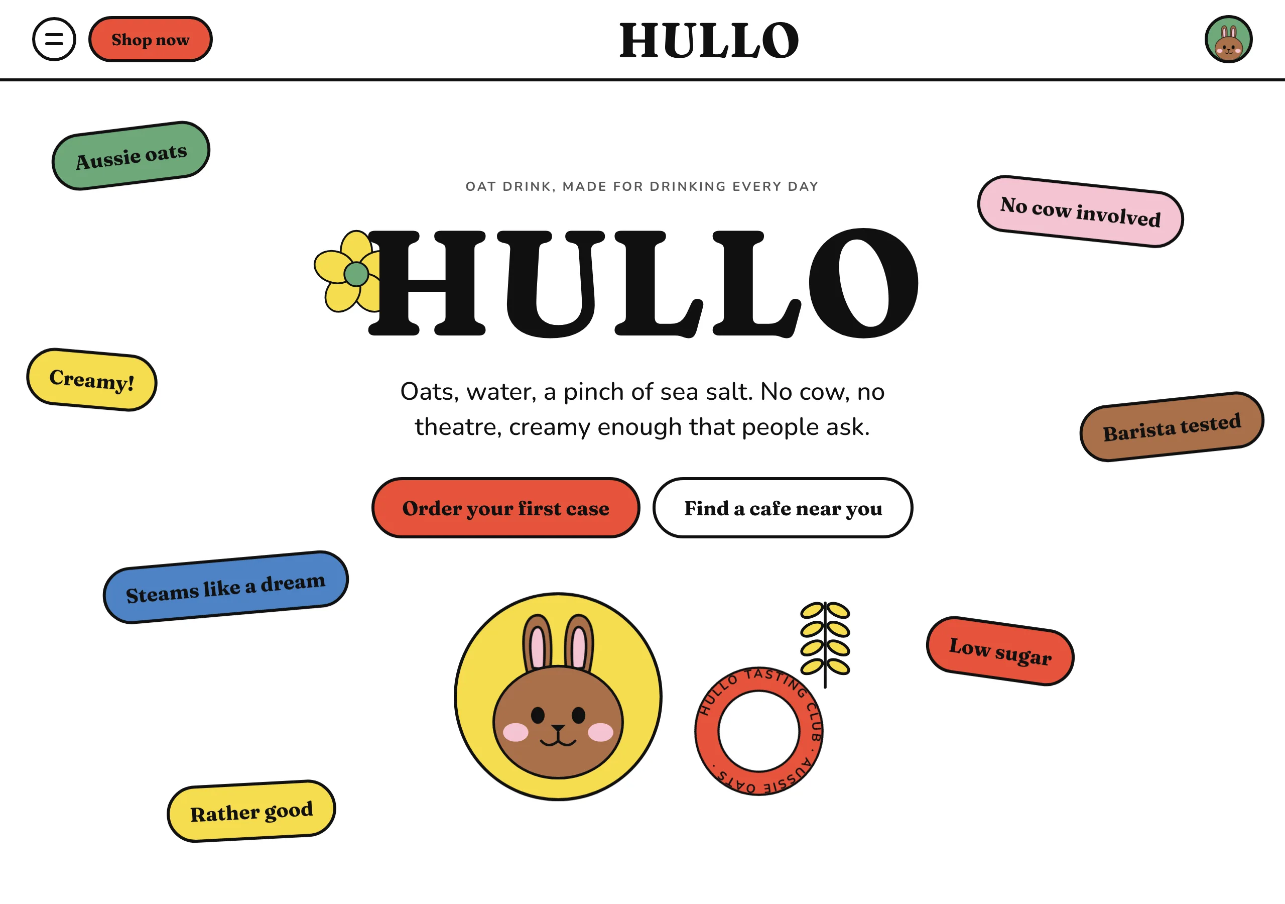
a bulletin board at recess, all stickers
White page, 3px black outlines and enormous radii. Everything is a sticker in a flat colour, tilted and overlapping, and depth comes from the outline rather than from a shadow. Type is a heavy rounded serif with normal tracking.
Install
npx styles-md add recess-bulletin Palette
Type
Aa Bb Cc 0123 The quick brown fox
"Nunito", "Helvetica Neue", Arial, sans-serif Aa Bb Cc 0123 The quick brown fox
"Fraunces", Georgia, "Times New Roman", serif const total = 1 + lI0O;
"DM Mono", ui-monospace, "SFMono-Regular", Menlo, monospace 16px base · 1.25 ratio · body 500 / heading 700 · heading tracking 0em. Fonts are not bundled. Install the first family in each stack, or the specimens below fall back to the next one your device has.
The quick brown fox jumps
The quick brown fox jumps
The quick brown fox jumps
The quick brown fox jumps
The quick brown fox jumps
The quick brown fox jumps
The quick brown fox jumps
The quick brown fox jumps
Licensing
No font files are redistributed here. Every family this style asks for by name is free for commercial use, and CI rejects a style that names one which is not.
- Fraunces display SIL Open Font License 1.1 Variable, with a soft axis. At 900 with SOFT up it gets the round heavy serif this style runs on.
- Nunito sans SIL Open Font License 1.1 Rounded terminals, so 14px UI text belongs to the same drawing as the headline.
- DM Mono mono SIL Open Font License 1.1 Prices, sizes and nutrition figures.
Fallbacks: Helvetica Neue, Arial, sans-serif, ui-monospace, SFMono-Regular, Menlo, monospace, Georgia, Times New Roman, serif. These are CSS generics and fonts the reader's OS already ships, referenced by name only, so nothing is licensed or downloaded.
The spec itself, and everything generated from it, is CC-BY-4.0. Attribution is the comment at the top of each generated file; keep it and you have complied.
Shape, space & motion
- stroke
- 3px
- radius
- 20px · 50px · 140px
- spacing unit
- 4px
- gutter
- 24px
- section gap
- 120px
- max width
- 1440px
- motion
- 400ms cubic-bezier(0, 0, 0.1, 1.02)
Recess Bulletin
A white wall covered in stickers. Every shape is drawn in the same 3px black line, filled flat, rounded past the point of comfort and tilted a few degrees off square. The page is loud, but it is loud in one voice, because nothing on it is drawn any other way.
Principles
- Everything is outlined. 3px black on every sticker, button, card and picture, with no exceptions.
- Fills are flat. No gradient and no shadow exists in this style; the outline carries the depth.
- Corners are enormous.
radius-lgon panels,radius-mdon cards,radius-smon chips. - Stickers tilt 1 to 8 degrees and overlap. A grid of squares is the failure mode.
- Labels on a colour are always black, never white, so the palette can stay this bright.
- Motion overshoots. Controls settle past their end point, marquees run linear and never stop.
Typography
Two faces, both round. The display serif carries anything above 30px at weight 700, with tracking
left at normal: the letters are already wide, and tightening them turns a headline into a logo. The
rounded sans handles 14 to 20px UI at weight 500, and its terminals match the serif’s, so a nav
label and a 72px headline read as the same hand. There is no light weight anywhere. If something
needs to recede it gets muted, not a thinner face.
Colour
White is the page and black is the ink, and neither is ever tinted. Five sticker hues do the rest:
leaf #6fa87b, sky #4d82c4, sun #f6dc4f, blush #f4c3d1 and cocoa #a9704b. Each clears AA
against black text, which is what lets the rule about black labels hold everywhere. accent poppy
is the sixth colour and belongs to controls only, so a button never gets confused with a sticker.
surface cream is for a panel that needs to sit off the white without becoming a sticker.
Components
- Sticker: flat hue fill, 3px
border,radius-smtoradius-full, rotated 1 to 8 degrees. - Button (primary):
accentfill, black label,radius-full, 3pxborder, 12px/28px padding. - Button (secondary):
surfaceor white fill, black label, same outline and metrics. - Panel:
radius-lg, flat hue or cream, 3pxborder, 32px padding, often overlapping its neighbour. - Product card: an arch,
radius-lgon the top two corners only, 3pxborder, picture inside. - Round badge: a circle with text on a circular path, 3px
border, turning slowly. - Marquee: one strip per section, black on a hue, 20 to 40 seconds linear, never paused on hover.
- Nav: white bar, black wordmark centred, pill button left, mascot badge right.
- Focus ring: 3px
accentoutline at 3px offset.
Do / Don’t
- Do outline every shape in the same 3px black, pictures included.
- Do tilt and overlap the stickers. Nothing decorative sits square to the page.
- Do keep every fill flat, and let the outline do the separating.
- Do put black on colour, and reserve
accentfor things that can be clicked. - Do let controls overshoot on the way in. The bounce is the personality.
- Don’t add a shadow or a gradient. There is no token for either.
- Don’t square a corner. The smallest radius on a panel is
radius-md. - Don’t set white text on a sticker hue, or grey text on any of them.
- Don’t run more than one marquee in a section, or two hues into a gradient band.
- Don’t thicken the outline on hover. Scale and rotate instead.
When to use
Food and drink, kids and family, merch, festivals, anything sold with a character. A poor fit for finance, health records and dense tools, where a 140px radius and a 3px outline eat the space that data needs.
# Recess Bulletin

a bulletin board at recess, all stickers. White page, 3px black outlines and enormous radii. Everything is a sticker in a flat colour, tilted and overlapping, and depth comes from the outline rather than from a shadow. Type is a heavy rounded serif with normal tracking.

## Tokens

```yaml
color:  { bg: "#ffffff", surface: "#fff6e2", fg: "#101010", muted: "#575757",
          accent: "#e6533c", accentFg: "#101010", border: "#101010" }
font:   { sans: "\"Nunito\", \"Helvetica Neue\", Arial, sans-serif",
          mono: "\"DM Mono\", ui-monospace, \"SFMono-Regular\", Menlo, monospace",
          base: "16px", scale: 1.25,
          weightBody: 500, weightHeading: 700,
          headingTracking: "0em" }
type:   { xs: "10.24px", sm: "12.8px", base: "16px", lg: "20px", xl: "25px", 2xl: "31.25px", 3xl: "39.06px", 4xl: "48.83px" }
space:  { unit: "4px", gutter: "24px",
          section: "120px", maxWidth: "1440px" }
shape:  { strokeWidth: "3px", radiusSm: "20px",
          radiusMd: "50px", radiusLg: "140px" }
motion: { duration: "400ms", easing: "cubic-bezier(0, 0, 0.1, 1.02)" }
```

## Principles

- Everything is outlined. 3px black on every sticker, button, card and picture, with no exceptions.
- Fills are flat. No gradient and no shadow exists in this style; the outline carries the depth.
- Corners are enormous. `radius-lg` on panels, `radius-md` on cards, `radius-sm` on chips.
- Stickers tilt 1 to 8 degrees and overlap. A grid of squares is the failure mode.
- Labels on a colour are always black, never white, so the palette can stay this bright.
- Motion overshoots. Controls settle past their end point, marquees run linear and never stop.

## Components

- Sticker: flat hue fill, 3px `border`, `radius-sm` to `radius-full`, rotated 1 to 8 degrees.
- Button (primary): `accent` fill, black label, `radius-full`, 3px `border`, 12px/28px padding.
- Button (secondary): `surface` or white fill, black label, same outline and metrics.
- Panel: `radius-lg`, flat hue or cream, 3px `border`, 32px padding, often overlapping its neighbour.
- Product card: an arch, `radius-lg` on the top two corners only, 3px `border`, picture inside.
- Round badge: a circle with text on a circular path, 3px `border`, turning slowly.
- Marquee: one strip per section, black on a hue, 20 to 40 seconds linear, never paused on hover.
- Nav: white bar, black wordmark centred, pill button left, mascot badge right.
- Focus ring: 3px `accent` outline at 3px offset.

## Do / Don't

- Do outline every shape in the same 3px black, pictures included.
- Do tilt and overlap the stickers. Nothing decorative sits square to the page.
- Do keep every fill flat, and let the outline do the separating.
- Do put black on colour, and reserve `accent` for things that can be clicked.
- Do let controls overshoot on the way in. The bounce is the personality.
- Don't add a shadow or a gradient. There is no token for either.
- Don't square a corner. The smallest radius on a panel is `radius-md`.
- Don't set white text on a sticker hue, or grey text on any of them.
- Don't run more than one marquee in a section, or two hues into a gradient band.
- Don't thicken the outline on hover. Scale and rotate instead.

<!-- styles-md/recess-bulletin@1.0.0, CC-BY-4.0. Full spec: DESIGN.md -->
/* Recess Bulletin: Tailwind v4 theme. Import after `@import "tailwindcss";` */
@theme {
--color-bg: #ffffff;
--color-surface: #fff6e2;
--color-fg: #101010;
--color-muted: #575757;
--color-accent: #e6533c;
--color-accent-fg: #101010;
--color-border: #101010;
--color-success: #3f7d4f;
--color-danger: #c3372a;
--font-sans: "Nunito", "Helvetica Neue", Arial, sans-serif;
--font-mono: "DM Mono", ui-monospace, "SFMono-Regular", Menlo, monospace;
--font-display: "Fraunces", Georgia, "Times New Roman", serif;
--text-xs: 10.24px;
--text-sm: 12.8px;
--text-base: 16px;
--text-lg: 20px;
--text-xl: 25px;
--text-2xl: 31.25px;
--text-3xl: 39.06px;
--text-4xl: 48.83px;
--radius-sm: 20px;
--radius-md: 50px;
--radius-lg: 140px;
--radius-full: 9999px;
--spacing: 4px;
--ease-default: cubic-bezier(0, 0, 0.1, 1.02);
}/* Recess Bulletin: a bulletin board at recess, all stickers
styles-md style "recess-bulletin" v1.0.0, CC-BY-4.0 */
:root {
--sm-color-bg: #ffffff;
--sm-color-surface: #fff6e2;
--sm-color-fg: #101010;
--sm-color-muted: #575757;
--sm-color-accent: #e6533c;
--sm-color-accent-fg: #101010;
--sm-color-border: #101010;
--sm-color-success: #3f7d4f;
--sm-color-danger: #c3372a;
--sm-font-sans: "Nunito", "Helvetica Neue", Arial, sans-serif;
--sm-font-mono: "DM Mono", ui-monospace, "SFMono-Regular", Menlo, monospace;
--sm-font-display: "Fraunces", Georgia, "Times New Roman", serif;
--sm-font-weight-body: 500;
--sm-font-weight-heading: 700;
--sm-heading-tracking: 0em;
--sm-text-xs: 10.24px;
--sm-text-sm: 12.8px;
--sm-text-base: 16px;
--sm-text-lg: 20px;
--sm-text-xl: 25px;
--sm-text-2xl: 31.25px;
--sm-text-3xl: 39.06px;
--sm-text-4xl: 48.83px;
--sm-space-1: 4px;
--sm-space-2: 8px;
--sm-space-3: 12px;
--sm-space-4: 16px;
--sm-space-6: 24px;
--sm-space-8: 32px;
--sm-space-12: 48px;
--sm-space-16: 64px;
--sm-space-24: 96px;
--sm-gutter: 24px;
--sm-section: 120px;
--sm-max-width: 1440px;
--sm-stroke-width: 3px;
--sm-radius-sm: 20px;
--sm-radius-md: 50px;
--sm-radius-lg: 140px;
--sm-radius-full: 9999px;
--sm-duration: 400ms;
--sm-easing: cubic-bezier(0, 0, 0.1, 1.02);
}{
"id": "recess-bulletin",
"name": "Recess Bulletin",
"version": "1.0.0",
"license": "CC-BY-4.0",
"mood": "a bulletin board at recess, all stickers",
"tags": [
"light",
"playful",
"bold",
"outline",
"food",
"marketing",
"retro"
],
"fonts": [
{
"family": "Fraunces",
"role": "display",
"license": "OFL-1.1",
"url": "https://fonts.google.com/specimen/Fraunces",
"note": "Variable, with a soft axis. At 900 with SOFT up it gets the round heavy serif this style runs on."
},
{
"family": "Nunito",
"role": "sans",
"license": "OFL-1.1",
"url": "https://fonts.google.com/specimen/Nunito",
"note": "Rounded terminals, so 14px UI text belongs to the same drawing as the headline."
},
{
"family": "DM Mono",
"role": "mono",
"license": "OFL-1.1",
"url": "https://fonts.google.com/specimen/DM+Mono",
"note": "Prices, sizes and nutrition figures."
}
],
"tokens": {
"color": {
"bg": "#ffffff",
"surface": "#fff6e2",
"fg": "#101010",
"muted": "#575757",
"accent": "#e6533c",
"accentFg": "#101010",
"border": "#101010",
"success": "#3f7d4f",
"danger": "#c3372a"
},
"font": {
"sans": "\"Nunito\", \"Helvetica Neue\", Arial, sans-serif",
"mono": "\"DM Mono\", ui-monospace, \"SFMono-Regular\", Menlo, monospace",
"display": "\"Fraunces\", Georgia, \"Times New Roman\", serif",
"scale": 1.25,
"baseSize": "16px",
"weightBody": 500,
"weightHeading": 700,
"headingTracking": 0
},
"space": {
"unit": "4px",
"gutter": "24px",
"section": "120px",
"maxWidth": "1440px"
},
"stroke": {
"width": "3px"
},
"radius": {
"sm": "20px",
"md": "50px",
"lg": "140px",
"full": "9999px"
},
"motion": {
"duration": "400ms",
"easing": "cubic-bezier(0, 0, 0.1, 1.02)"
}
},
"derived": {
"type": [
{
"name": "xs",
"size": "10.24px"
},
{
"name": "sm",
"size": "12.8px"
},
{
"name": "base",
"size": "16px"
},
{
"name": "lg",
"size": "20px"
},
{
"name": "xl",
"size": "25px"
},
{
"name": "2xl",
"size": "31.25px"
},
{
"name": "3xl",
"size": "39.06px"
},
{
"name": "4xl",
"size": "48.83px"
}
],
"space": [
{
"step": 1,
"size": "4px"
},
{
"step": 2,
"size": "8px"
},
{
"step": 3,
"size": "12px"
},
{
"step": 4,
"size": "16px"
},
{
"step": 6,
"size": "24px"
},
{
"step": 8,
"size": "32px"
},
{
"step": 12,
"size": "48px"
},
{
"step": 16,
"size": "64px"
},
{
"step": 24,
"size": "96px"
}
]
},
"variables": {
"color-bg": "#ffffff",
"color-surface": "#fff6e2",
"color-fg": "#101010",
"color-muted": "#575757",
"color-accent": "#e6533c",
"color-accent-fg": "#101010",
"color-border": "#101010",
"color-success": "#3f7d4f",
"color-danger": "#c3372a",
"font-sans": "\"Nunito\", \"Helvetica Neue\", Arial, sans-serif",
"font-mono": "\"DM Mono\", ui-monospace, \"SFMono-Regular\", Menlo, monospace",
"font-display": "\"Fraunces\", Georgia, \"Times New Roman\", serif",
"font-weight-body": "500",
"font-weight-heading": "700",
"heading-tracking": "0em",
"text-xs": "10.24px",
"text-sm": "12.8px",
"text-base": "16px",
"text-lg": "20px",
"text-xl": "25px",
"text-2xl": "31.25px",
"text-3xl": "39.06px",
"text-4xl": "48.83px",
"space-1": "4px",
"space-2": "8px",
"space-3": "12px",
"space-4": "16px",
"space-6": "24px",
"space-8": "32px",
"space-12": "48px",
"space-16": "64px",
"space-24": "96px",
"gutter": "24px",
"section": "120px",
"max-width": "1440px",
"stroke-width": "3px",
"radius-sm": "20px",
"radius-md": "50px",
"radius-lg": "140px",
"radius-full": "9999px",
"duration": "400ms",
"easing": "cubic-bezier(0, 0, 0.1, 1.02)"
}
}