
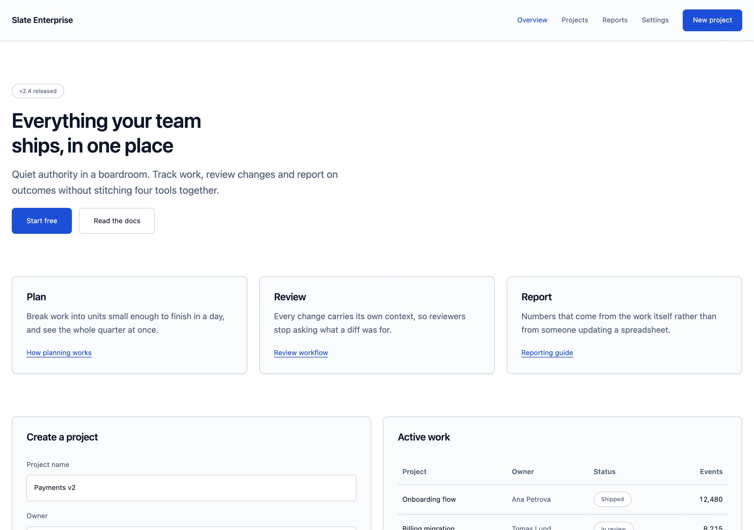
Slate Enterprise
quiet authority in a boardroom
Cool slate neutrals, a serious blue, small radii and high density. The default for business software that has to look credible before it looks nice.
Install
npx styles-md add slate-enterprise Palette
Type
14px base · 1.2 ratio · weight 400/600. Fonts are not bundled — specimens fall back to what you have installed.
The quick brown fox jumps
The quick brown fox jumps
The quick brown fox jumps
The quick brown fox jumps
The quick brown fox jumps
The quick brown fox jumps
The quick brown fox jumps
The quick brown fox jumps
Shape, space & motion
- stroke
- 1px
- radius
- 4px · 6px · 8px
- spacing unit
- 4px
- gutter
- 20px
- section gap
- 72px
- max width
- 1280px
- motion
- 140ms cubic-bezier(0.4, 0, 0.2, 1)
Slate Enterprise
Credible, dense and unremarkable in the best way. This is the style that gets through a procurement review.
Principles
- Density first. 14px base, 32px table rows, 20px gutters.
- Blue signals action and nothing else. Status uses green, amber and red.
- Small radii throughout — 6px is the default and 8px is the ceiling.
- Every destructive action needs a confirmation step and red is reserved for it.
- Tables are the primary interface. Design them before you design anything else.
Typography
Inter at 14px with a 1.2 ratio. The ramp is intentionally shallow because most screens are tables and forms, not headlines. Line height 1.55 body, 1.3 headings. Numeric columns use tabular figures, right aligned, always.
Colour
Pure white page with a cool slate surface for panels, headers and hover rows. border is a
neutral blue-grey used everywhere structure is needed. Status colours are muted, never bright.
Components
- Button (primary): accent fill, white label,
radius-md, 8px/16px padding,text-sm. - Button (secondary): white fill, 1px border,
fglabel, same metrics. - Card: white fill, 1px border,
radius-lg, 20px padding,shadow-sm. - Input: white fill, 1px border,
radius-md, 7px/10px padding,text-sm; focus adds a 2px accent ring. - Nav: 56px tall, white, 1px bottom border; sidebar 240px on
surface. - Table: 1px horizontal rules, 32px rows,
surfacesticky header,text-sm, hover row tint. - Badge: tinted status fill, matching dark text,
radius-sm,text-xs, 2px/8px padding. - Toolbar: 48px tall,
surfacefill, 1px bottom border, search left, actions right.
Do / Don’t
- Do use
text-smfor table content, form labels and secondary actions. - Do keep forms in a single column with labels above fields.
- Do show counts, timestamps and owners — enterprise users want metadata.
- Don’t use large radii or playful motion; both undermine credibility here.
- Don’t put more than one primary button in a view.
- Don’t use saturated colour for anything except status and the accent.
- Don’t exceed 72px between sections; the density should feel deliberate.
- Don’t hide bulk actions behind hover — keep them in a persistent toolbar.
When to use
B2B dashboards, admin panels, CRMs, internal tooling, compliance products. Wrong for consumer apps or anything that needs to feel distinctive.
# Slate Enterprise

quiet authority in a boardroom. Cool slate neutrals, a serious blue, small radii and high density. The default for business software that has to look credible before it looks nice.

## Tokens

```yaml
color:  { bg: "#ffffff", surface: "#f8fafc", fg: "#0f172a", muted: "#52607a",
          accent: "#1d4ed8", accentFg: "#ffffff", border: "#cdd5e0" }
font:   { sans: "\"Inter\", system-ui, -apple-system, \"Segoe UI\", sans-serif",
          mono: "\"JetBrains Mono\", ui-monospace, \"SFMono-Regular\", Menlo, monospace",
          base: "14px", scale: 1.2,
          weightBody: 400, weightHeading: 600,
          headingTracking: "-0.018em" }
type:   { xs: "9.72px", sm: "11.67px", base: "14px", lg: "16.8px", xl: "20.16px", 2xl: "24.19px", 3xl: "29.03px", 4xl: "34.84px" }
space:  { unit: "4px", gutter: "20px",
          section: "72px", maxWidth: "1280px" }
shape:  { strokeWidth: "1px", radiusSm: "4px",
          radiusMd: "6px", radiusLg: "8px" }
motion: { duration: "140ms", easing: "cubic-bezier(0.4, 0, 0.2, 1)" }
```

## Principles

- Density first. 14px base, 32px table rows, 20px gutters.
- Blue signals action and nothing else. Status uses green, amber and red.
- Small radii throughout — 6px is the default and 8px is the ceiling.
- Every destructive action needs a confirmation step and red is reserved for it.
- Tables are the primary interface. Design them before you design anything else.

## Components

- Button (primary): accent fill, white label, `radius-md`, 8px/16px padding, `text-sm`.
- Button (secondary): white fill, 1px border, `fg` label, same metrics.
- Card: white fill, 1px border, `radius-lg`, 20px padding, `shadow-sm`.
- Input: white fill, 1px border, `radius-md`, 7px/10px padding, `text-sm`; focus adds a 2px accent ring.
- Nav: 56px tall, white, 1px bottom border; sidebar 240px on `surface`.
- Table: 1px horizontal rules, 32px rows, `surface` sticky header, `text-sm`, hover row tint.
- Badge: tinted status fill, matching dark text, `radius-sm`, `text-xs`, 2px/8px padding.
- Toolbar: 48px tall, `surface` fill, 1px bottom border, search left, actions right.

## Do / Don't

- Do use `text-sm` for table content, form labels and secondary actions.
- Do keep forms in a single column with labels above fields.
- Do show counts, timestamps and owners — enterprise users want metadata.
- Don't use large radii or playful motion; both undermine credibility here.
- Don't put more than one primary button in a view.
- Don't use saturated colour for anything except status and the accent.
- Don't exceed 72px between sections; the density should feel deliberate.
- Don't hide bulk actions behind hover — keep them in a persistent toolbar.

<!-- styles-md/slate-enterprise@1.0.0 — CC-BY-4.0. Full spec: DESIGN.md -->
/* Slate Enterprise — Tailwind v4 theme. Import after `@import "tailwindcss";` */
@theme {
--color-bg: #ffffff;
--color-surface: #f8fafc;
--color-fg: #0f172a;
--color-muted: #52607a;
--color-accent: #1d4ed8;
--color-accent-fg: #ffffff;
--color-border: #cdd5e0;
--color-success: #15803d;
--color-danger: #b91c1c;
--font-sans: "Inter", system-ui, -apple-system, "Segoe UI", sans-serif;
--font-mono: "JetBrains Mono", ui-monospace, "SFMono-Regular", Menlo, monospace;
--text-xs: 9.72px;
--text-sm: 11.67px;
--text-base: 14px;
--text-lg: 16.8px;
--text-xl: 20.16px;
--text-2xl: 24.19px;
--text-3xl: 29.03px;
--text-4xl: 34.84px;
--radius-sm: 4px;
--radius-md: 6px;
--radius-lg: 8px;
--radius-full: 9999px;
--spacing: 4px;
--ease-default: cubic-bezier(0.4, 0, 0.2, 1);
}/* Slate Enterprise — quiet authority in a boardroom
styles-md style "slate-enterprise" v1.0.0, CC-BY-4.0 */
:root {
--sm-color-bg: #ffffff;
--sm-color-surface: #f8fafc;
--sm-color-fg: #0f172a;
--sm-color-muted: #52607a;
--sm-color-accent: #1d4ed8;
--sm-color-accent-fg: #ffffff;
--sm-color-border: #cdd5e0;
--sm-color-success: #15803d;
--sm-color-danger: #b91c1c;
--sm-font-sans: "Inter", system-ui, -apple-system, "Segoe UI", sans-serif;
--sm-font-mono: "JetBrains Mono", ui-monospace, "SFMono-Regular", Menlo, monospace;
--sm-font-weight-body: 400;
--sm-font-weight-heading: 600;
--sm-heading-tracking: -0.018em;
--sm-text-xs: 9.72px;
--sm-text-sm: 11.67px;
--sm-text-base: 14px;
--sm-text-lg: 16.8px;
--sm-text-xl: 20.16px;
--sm-text-2xl: 24.19px;
--sm-text-3xl: 29.03px;
--sm-text-4xl: 34.84px;
--sm-space-1: 4px;
--sm-space-2: 8px;
--sm-space-3: 12px;
--sm-space-4: 16px;
--sm-space-6: 24px;
--sm-space-8: 32px;
--sm-space-12: 48px;
--sm-space-16: 64px;
--sm-space-24: 96px;
--sm-gutter: 20px;
--sm-section: 72px;
--sm-max-width: 1280px;
--sm-stroke-width: 1px;
--sm-radius-sm: 4px;
--sm-radius-md: 6px;
--sm-radius-lg: 8px;
--sm-radius-full: 9999px;
--sm-duration: 140ms;
--sm-easing: cubic-bezier(0.4, 0, 0.2, 1);
--sm-shadow-sm: 0 1px 2px rgba(15,23,42,0.06);
--sm-shadow-md: 0 4px 12px rgba(15,23,42,0.08);
--sm-shadow-lg: 0 12px 32px rgba(15,23,42,0.12);
}{
"id": "slate-enterprise",
"name": "Slate Enterprise",
"version": "1.0.0",
"license": "CC-BY-4.0",
"mood": "quiet authority in a boardroom",
"tags": [
"light",
"enterprise",
"saas",
"dense",
"professional",
"neutral"
],
"tokens": {
"color": {
"bg": "#ffffff",
"surface": "#f8fafc",
"fg": "#0f172a",
"muted": "#52607a",
"accent": "#1d4ed8",
"accentFg": "#ffffff",
"border": "#cdd5e0",
"success": "#15803d",
"danger": "#b91c1c"
},
"font": {
"sans": "\"Inter\", system-ui, -apple-system, \"Segoe UI\", sans-serif",
"mono": "\"JetBrains Mono\", ui-monospace, \"SFMono-Regular\", Menlo, monospace",
"scale": 1.2,
"baseSize": "14px",
"weightBody": 400,
"weightHeading": 600,
"headingTracking": -0.018
},
"space": {
"unit": "4px",
"gutter": "20px",
"section": "72px",
"maxWidth": "1280px"
},
"stroke": {
"width": "1px"
},
"radius": {
"sm": "4px",
"md": "6px",
"lg": "8px",
"full": "9999px"
},
"motion": {
"duration": "140ms",
"easing": "cubic-bezier(0.4, 0, 0.2, 1)"
},
"shadow": {
"sm": "0 1px 2px rgba(15,23,42,0.06)",
"md": "0 4px 12px rgba(15,23,42,0.08)",
"lg": "0 12px 32px rgba(15,23,42,0.12)"
}
},
"derived": {
"type": [
{
"name": "xs",
"size": "9.72px"
},
{
"name": "sm",
"size": "11.67px"
},
{
"name": "base",
"size": "14px"
},
{
"name": "lg",
"size": "16.8px"
},
{
"name": "xl",
"size": "20.16px"
},
{
"name": "2xl",
"size": "24.19px"
},
{
"name": "3xl",
"size": "29.03px"
},
{
"name": "4xl",
"size": "34.84px"
}
],
"space": [
{
"step": 1,
"size": "4px"
},
{
"step": 2,
"size": "8px"
},
{
"step": 3,
"size": "12px"
},
{
"step": 4,
"size": "16px"
},
{
"step": 6,
"size": "24px"
},
{
"step": 8,
"size": "32px"
},
{
"step": 12,
"size": "48px"
},
{
"step": 16,
"size": "64px"
},
{
"step": 24,
"size": "96px"
}
]
},
"variables": {
"color-bg": "#ffffff",
"color-surface": "#f8fafc",
"color-fg": "#0f172a",
"color-muted": "#52607a",
"color-accent": "#1d4ed8",
"color-accent-fg": "#ffffff",
"color-border": "#cdd5e0",
"color-success": "#15803d",
"color-danger": "#b91c1c",
"font-sans": "\"Inter\", system-ui, -apple-system, \"Segoe UI\", sans-serif",
"font-mono": "\"JetBrains Mono\", ui-monospace, \"SFMono-Regular\", Menlo, monospace",
"font-weight-body": "400",
"font-weight-heading": "600",
"heading-tracking": "-0.018em",
"text-xs": "9.72px",
"text-sm": "11.67px",
"text-base": "14px",
"text-lg": "16.8px",
"text-xl": "20.16px",
"text-2xl": "24.19px",
"text-3xl": "29.03px",
"text-4xl": "34.84px",
"space-1": "4px",
"space-2": "8px",
"space-3": "12px",
"space-4": "16px",
"space-6": "24px",
"space-8": "32px",
"space-12": "48px",
"space-16": "64px",
"space-24": "96px",
"gutter": "20px",
"section": "72px",
"max-width": "1280px",
"stroke-width": "1px",
"radius-sm": "4px",
"radius-md": "6px",
"radius-lg": "8px",
"radius-full": "9999px",
"duration": "140ms",
"easing": "cubic-bezier(0.4, 0, 0.2, 1)",
"shadow-sm": "0 1px 2px rgba(15,23,42,0.06)",
"shadow-md": "0 4px 12px rgba(15,23,42,0.08)",
"shadow-lg": "0 12px 32px rgba(15,23,42,0.12)"
}
}