
Soft Clinic
calm competence, clean light and teal
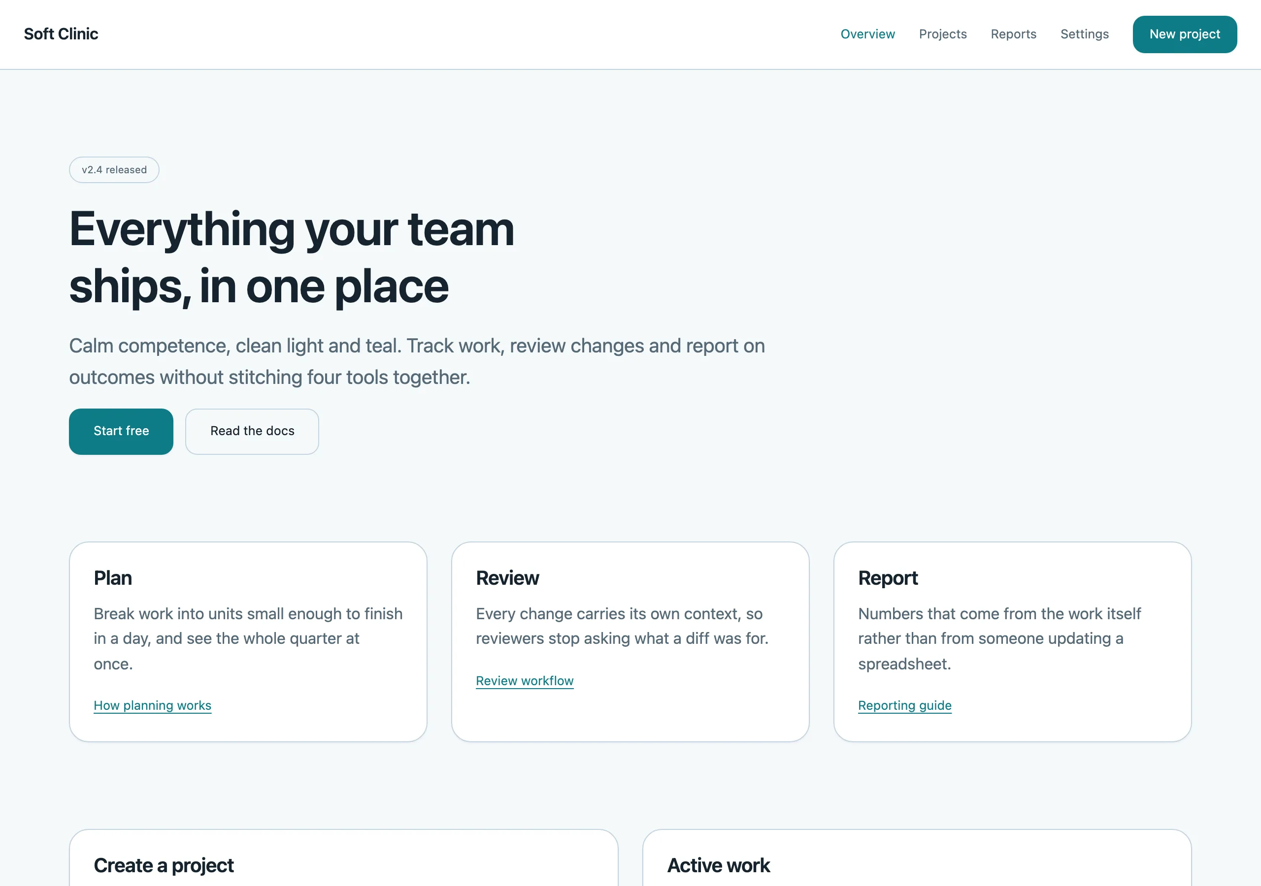
Airy light surfaces, generous radius and a measured teal accent. Trustworthy without being cold — built for products that handle something people care about.
Install
npx styles-md add soft-clinic Palette
Type
16px base · 1.25 ratio · weight 400/620. Fonts are not bundled — specimens fall back to what you have installed.
The quick brown fox jumps
The quick brown fox jumps
The quick brown fox jumps
The quick brown fox jumps
The quick brown fox jumps
The quick brown fox jumps
The quick brown fox jumps
The quick brown fox jumps
Shape, space & motion
- stroke
- 1px
- radius
- 8px · 12px · 20px
- spacing unit
- 4px
- gutter
- 24px
- section gap
- 88px
- max width
- 1140px
- motion
- 220ms cubic-bezier(0.34, 1.2, 0.64, 1)
Soft Clinic
Soft edges and a lot of light. The style says the product is careful with your information without saying anything at all.
Principles
- Cards float on tinted background —
surfaceis always lighter thanbg, never the reverse. - Radius is large and consistent: 12px is the default for anything interactive.
- Shadows are wide and very faint. If you can see the shadow, it is too strong.
- Teal is a calm accent; use it for primary actions and active states only.
- Nothing is dense. Padding is generous even when the data is not.
Typography
Inter at 16px with a gentle 1.25 ratio. Headings at weight 620 read as confident rather than shouty. Line height is 1.6 for body and 1.25 for headings. Numbers in metrics use tabular figures so dashboards do not jitter.
Colour
The page is a cool off-white and every panel is pure white. That single step does all the layering
work, so shadows can stay almost invisible. border is a soft blue-grey used on inputs and table
rules.
Components
- Button (primary): accent fill, white label,
radius-md, 12px/20px padding,shadow-sm. - Button (ghost): transparent, accent label, same metrics, tinted accent background on hover.
- Card: white fill, 1px border,
radius-lg, 28px padding,shadow-sm. - Input: white fill, 1px border,
radius-md, 12px/14px padding; focus adds a 3px accent-tinted ring. - Nav: 64px tall, white fill, 1px bottom border,
mutedlinks, accent pill behind the active item. - Table: 1px horizontal rules, no vertical rules, 14px/16px cells,
bg-tinted header row. - Badge: tinted accent background, accent text,
radius-full,text-xs, 4px/12px padding. - Empty state: centred,
text-lgheading,mutedbody, one primary button.
Do / Don’t
- Do keep 24px of padding inside every card, minimum.
- Do use
mutedfor supporting copy and labels above inputs. - Do pair the accent with plenty of white space so it stays calm.
- Don’t use hard 1px shadows or dark borders — the whole style collapses.
- Don’t mix radii; picking 12px means 12px everywhere except cards at 20px.
- Don’t put more than three metrics in a row.
- Don’t use red except for genuine destructive actions.
- Don’t set body text below 15px anywhere in the product.
When to use
Healthcare, fintech onboarding, scheduling, anything consumer-facing that needs to feel safe. Wrong for developer tools, where the softness reads as slow.
# Soft Clinic

calm competence, clean light and teal. Airy light surfaces, generous radius and a measured teal accent. Trustworthy without being cold — built for products that handle something people care about.

## Tokens

```yaml
color:  { bg: "#f6f9fb", surface: "#ffffff", fg: "#16242e", muted: "#566a77",
          accent: "#0e7c86", accentFg: "#ffffff", border: "#c3d4e0" }
font:   { sans: "\"Inter\", system-ui, -apple-system, \"Segoe UI\", sans-serif",
          mono: "\"JetBrains Mono\", ui-monospace, \"SFMono-Regular\", Menlo, monospace",
          base: "16px", scale: 1.25,
          weightBody: 400, weightHeading: 620,
          headingTracking: "-0.015em" }
type:   { xs: "10.24px", sm: "12.8px", base: "16px", lg: "20px", xl: "25px", 2xl: "31.25px", 3xl: "39.06px", 4xl: "48.83px" }
space:  { unit: "4px", gutter: "24px",
          section: "88px", maxWidth: "1140px" }
shape:  { strokeWidth: "1px", radiusSm: "8px",
          radiusMd: "12px", radiusLg: "20px" }
motion: { duration: "220ms", easing: "cubic-bezier(0.34, 1.2, 0.64, 1)" }
```

## Principles

- Cards float on tinted background — `surface` is always lighter than `bg`, never the reverse.
- Radius is large and consistent: 12px is the default for anything interactive.
- Shadows are wide and very faint. If you can see the shadow, it is too strong.
- Teal is a calm accent; use it for primary actions and active states only.
- Nothing is dense. Padding is generous even when the data is not.

## Components

- Button (primary): accent fill, white label, `radius-md`, 12px/20px padding, `shadow-sm`.
- Button (ghost): transparent, accent label, same metrics, tinted accent background on hover.
- Card: white fill, 1px border, `radius-lg`, 28px padding, `shadow-sm`.
- Input: white fill, 1px border, `radius-md`, 12px/14px padding; focus adds a 3px accent-tinted ring.
- Nav: 64px tall, white fill, 1px bottom border, `muted` links, accent pill behind the active item.
- Table: 1px horizontal rules, no vertical rules, 14px/16px cells, `bg`-tinted header row.
- Badge: tinted accent background, accent text, `radius-full`, `text-xs`, 4px/12px padding.
- Empty state: centred, `text-lg` heading, `muted` body, one primary button.

## Do / Don't

- Do keep 24px of padding inside every card, minimum.
- Do use `muted` for supporting copy and labels above inputs.
- Do pair the accent with plenty of white space so it stays calm.
- Don't use hard 1px shadows or dark borders — the whole style collapses.
- Don't mix radii; picking 12px means 12px everywhere except cards at 20px.
- Don't put more than three metrics in a row.
- Don't use red except for genuine destructive actions.
- Don't set body text below 15px anywhere in the product.

<!-- styles-md/soft-clinic@1.0.0 — CC-BY-4.0. Full spec: DESIGN.md -->
/* Soft Clinic — Tailwind v4 theme. Import after `@import "tailwindcss";` */
@theme {
--color-bg: #f6f9fb;
--color-surface: #ffffff;
--color-fg: #16242e;
--color-muted: #566a77;
--color-accent: #0e7c86;
--color-accent-fg: #ffffff;
--color-border: #c3d4e0;
--color-success: #1f7a4d;
--color-danger: #c0392f;
--font-sans: "Inter", system-ui, -apple-system, "Segoe UI", sans-serif;
--font-mono: "JetBrains Mono", ui-monospace, "SFMono-Regular", Menlo, monospace;
--text-xs: 10.24px;
--text-sm: 12.8px;
--text-base: 16px;
--text-lg: 20px;
--text-xl: 25px;
--text-2xl: 31.25px;
--text-3xl: 39.06px;
--text-4xl: 48.83px;
--radius-sm: 8px;
--radius-md: 12px;
--radius-lg: 20px;
--radius-full: 9999px;
--spacing: 4px;
--ease-default: cubic-bezier(0.34, 1.2, 0.64, 1);
}/* Soft Clinic — calm competence, clean light and teal
styles-md style "soft-clinic" v1.0.0, CC-BY-4.0 */
:root {
--sm-color-bg: #f6f9fb;
--sm-color-surface: #ffffff;
--sm-color-fg: #16242e;
--sm-color-muted: #566a77;
--sm-color-accent: #0e7c86;
--sm-color-accent-fg: #ffffff;
--sm-color-border: #c3d4e0;
--sm-color-success: #1f7a4d;
--sm-color-danger: #c0392f;
--sm-font-sans: "Inter", system-ui, -apple-system, "Segoe UI", sans-serif;
--sm-font-mono: "JetBrains Mono", ui-monospace, "SFMono-Regular", Menlo, monospace;
--sm-font-weight-body: 400;
--sm-font-weight-heading: 620;
--sm-heading-tracking: -0.015em;
--sm-text-xs: 10.24px;
--sm-text-sm: 12.8px;
--sm-text-base: 16px;
--sm-text-lg: 20px;
--sm-text-xl: 25px;
--sm-text-2xl: 31.25px;
--sm-text-3xl: 39.06px;
--sm-text-4xl: 48.83px;
--sm-space-1: 4px;
--sm-space-2: 8px;
--sm-space-3: 12px;
--sm-space-4: 16px;
--sm-space-6: 24px;
--sm-space-8: 32px;
--sm-space-12: 48px;
--sm-space-16: 64px;
--sm-space-24: 96px;
--sm-gutter: 24px;
--sm-section: 88px;
--sm-max-width: 1140px;
--sm-stroke-width: 1px;
--sm-radius-sm: 8px;
--sm-radius-md: 12px;
--sm-radius-lg: 20px;
--sm-radius-full: 9999px;
--sm-duration: 220ms;
--sm-easing: cubic-bezier(0.34, 1.2, 0.64, 1);
--sm-shadow-sm: 0 1px 2px rgba(22,36,46,0.06);
--sm-shadow-md: 0 4px 16px rgba(22,36,46,0.08);
--sm-shadow-lg: 0 20px 48px rgba(22,36,46,0.10);
}{
"id": "soft-clinic",
"name": "Soft Clinic",
"version": "1.0.0",
"license": "CC-BY-4.0",
"mood": "calm competence, clean light and teal",
"tags": [
"light",
"calm",
"saas",
"healthcare",
"rounded",
"trustworthy"
],
"tokens": {
"color": {
"bg": "#f6f9fb",
"surface": "#ffffff",
"fg": "#16242e",
"muted": "#566a77",
"accent": "#0e7c86",
"accentFg": "#ffffff",
"border": "#c3d4e0",
"success": "#1f7a4d",
"danger": "#c0392f"
},
"font": {
"sans": "\"Inter\", system-ui, -apple-system, \"Segoe UI\", sans-serif",
"mono": "\"JetBrains Mono\", ui-monospace, \"SFMono-Regular\", Menlo, monospace",
"scale": 1.25,
"baseSize": "16px",
"weightBody": 400,
"weightHeading": 620,
"headingTracking": -0.015
},
"space": {
"unit": "4px",
"gutter": "24px",
"section": "88px",
"maxWidth": "1140px"
},
"stroke": {
"width": "1px"
},
"radius": {
"sm": "8px",
"md": "12px",
"lg": "20px",
"full": "9999px"
},
"motion": {
"duration": "220ms",
"easing": "cubic-bezier(0.34, 1.2, 0.64, 1)"
},
"shadow": {
"sm": "0 1px 2px rgba(22,36,46,0.06)",
"md": "0 4px 16px rgba(22,36,46,0.08)",
"lg": "0 20px 48px rgba(22,36,46,0.10)"
}
},
"derived": {
"type": [
{
"name": "xs",
"size": "10.24px"
},
{
"name": "sm",
"size": "12.8px"
},
{
"name": "base",
"size": "16px"
},
{
"name": "lg",
"size": "20px"
},
{
"name": "xl",
"size": "25px"
},
{
"name": "2xl",
"size": "31.25px"
},
{
"name": "3xl",
"size": "39.06px"
},
{
"name": "4xl",
"size": "48.83px"
}
],
"space": [
{
"step": 1,
"size": "4px"
},
{
"step": 2,
"size": "8px"
},
{
"step": 3,
"size": "12px"
},
{
"step": 4,
"size": "16px"
},
{
"step": 6,
"size": "24px"
},
{
"step": 8,
"size": "32px"
},
{
"step": 12,
"size": "48px"
},
{
"step": 16,
"size": "64px"
},
{
"step": 24,
"size": "96px"
}
]
},
"variables": {
"color-bg": "#f6f9fb",
"color-surface": "#ffffff",
"color-fg": "#16242e",
"color-muted": "#566a77",
"color-accent": "#0e7c86",
"color-accent-fg": "#ffffff",
"color-border": "#c3d4e0",
"color-success": "#1f7a4d",
"color-danger": "#c0392f",
"font-sans": "\"Inter\", system-ui, -apple-system, \"Segoe UI\", sans-serif",
"font-mono": "\"JetBrains Mono\", ui-monospace, \"SFMono-Regular\", Menlo, monospace",
"font-weight-body": "400",
"font-weight-heading": "620",
"heading-tracking": "-0.015em",
"text-xs": "10.24px",
"text-sm": "12.8px",
"text-base": "16px",
"text-lg": "20px",
"text-xl": "25px",
"text-2xl": "31.25px",
"text-3xl": "39.06px",
"text-4xl": "48.83px",
"space-1": "4px",
"space-2": "8px",
"space-3": "12px",
"space-4": "16px",
"space-6": "24px",
"space-8": "32px",
"space-12": "48px",
"space-16": "64px",
"space-24": "96px",
"gutter": "24px",
"section": "88px",
"max-width": "1140px",
"stroke-width": "1px",
"radius-sm": "8px",
"radius-md": "12px",
"radius-lg": "20px",
"radius-full": "9999px",
"duration": "220ms",
"easing": "cubic-bezier(0.34, 1.2, 0.64, 1)",
"shadow-sm": "0 1px 2px rgba(22,36,46,0.06)",
"shadow-md": "0 4px 16px rgba(22,36,46,0.08)",
"shadow-lg": "0 20px 48px rgba(22,36,46,0.10)"
}
}