
Sticker Diner
a hand-painted burger van at a summer fair
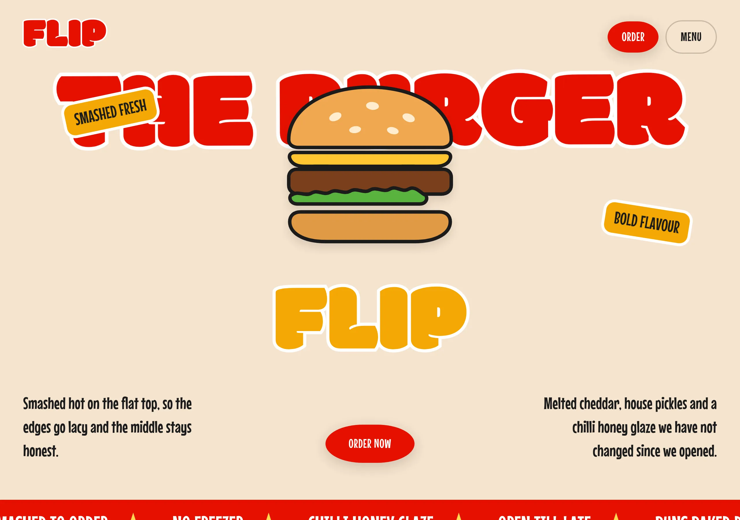
Cream page, enormous fat display type outlined in white, and rotated sticker badges. Sections meet on a wave rather than a straight edge, and every photo is a cut-out that overlaps the headline.
Install
npx styles-md add sticker-diner Palette
Type
Aa Bb Cc 0123 The quick brown fox
"Mouse Memoirs", "Oswald", Impact, sans-serif Aa Bb Cc 0123 The quick brown fox
"Modak", "Bowlby One", "Arial Black", Impact, sans-serif const total = 1 + lI0O;
"IBM Plex Mono", ui-monospace, "SFMono-Regular", Menlo, monospace 16px base · 1.35 ratio · body 400 / heading 400 · heading tracking 0em. Fonts are not bundled. Install the first family in each stack, or the specimens below fall back to the next one your device has.
The quick brown fox jumps
The quick brown fox jumps
The quick brown fox jumps
The quick brown fox jumps
The quick brown fox jumps
The quick brown fox jumps
The quick brown fox jumps
The quick brown fox jumps
Licensing
No font files are redistributed here. Every family this style asks for by name is free for commercial use, and CI rejects a style that names one which is not.
- Modak display SIL Open Font License 1.1 One weight, extremely fat and rounded. It is the whole voice of the style.
- Bowlby One display SIL Open Font License 1.1 Fallback. Same heaviness, less bulbous, so the outline still reads.
- Mouse Memoirs sans SIL Open Font License 1.1 Condensed and single-weight, which is why body copy can run large without crowding.
- Oswald sans SIL Open Font License 1.1 Fallback. Also condensed, slightly wider, so the measure holds.
- IBM Plex Mono mono SIL Open Font License 1.1
Fallbacks: Impact, sans-serif, ui-monospace, SFMono-Regular, Menlo, monospace, Arial Black. These are CSS generics and fonts the reader's OS already ships, referenced by name only, so nothing is licensed or downloaded.
The spec itself, and everything generated from it, is CC-BY-4.0. Attribution is the comment at the top of each generated file; keep it and you have complied.
Shape, space & motion
- stroke
- 2px
- radius
- 14px · 28px · 72px
- spacing unit
- 4px
- gutter
- 24px
- section gap
- 96px
- max width
- 1408px
- motion
- 300ms cubic-bezier(0.4, 0, 0.2, 1)
Sticker Diner
A poster, not a page. One enormous headline in a fat rounded face, outlined in white so it can sit on top of a photograph, with stickers tilted into the gaps. Nothing is quiet and nothing is aligned to a grid you can see.
Principles
- The headline is the layout. It runs to the full width of the page and everything else fits around it.
- Every display line is outlined in white. The stroke scales with the type, roughly 1/15th of the size.
- Photos are cut out, never in a box. They overlap the headline and bleed past their section.
- Badges are stickers: tilted 6 to 12 degrees,
radius-sm, white outline, never square to the page. - Sections meet on a wave. A straight horizontal edge between two colours does not appear.
- Three colours do all the work: cream, red and amber. White is the outline, ink is the text.
Typography
Two single-weight faces with no overlap in their jobs. The display face is used at sizes that look like a mistake in a spec and are correct here: 96px is small for it and 216px is normal. Body is the condensed sans, and because it is condensed it can run at 26px without eating the line. There is no bold anywhere, since neither family has a second weight, so emphasis is size and colour.
Colour
Cream is the page and it is never white. surface white is for cut-out cards and the sticker
outline only. accent red is the loud one: fills for buttons, and set as display type against
cream. Amber #f4a804 and its brighter sibling #ffd750 are the third colour, for stickers and
small fills. The measured red on the source of this palette is #f91814, which is bright enough
that white on it fails AA at 4.07:1, so accent is a shade deeper and clears it at 4.76:1.
Components
- Button (primary):
accentfill, white label attext-lg,radius-fullor a 50%/60% ellipse, 16px/40px padding. - Button (secondary): no fill, 2px
borderat 20% opacity,radius-full, same metrics. - Sticker: amber fill, ink label,
radius-sm, 5px white outline, rotated 6 to 12 degrees. - Display line: display face,
accentorfg, white stroke scaled to the size, line height 0.75 to 0.9. - Photo card:
radius-lg,shadow-md, rotated 2 to 5 degrees, overlapping its neighbour. - Cut-out image: no frame,
drop-shadow(0 9px 7px rgba(0,0,0,0.1)), sitting over the headline. - Wave divider: an SVG path, not a border, at least 80px deep so it reads as a shape.
- Nav: cream, no bar. Wordmark left in the display face, pill buttons right.
- Focus ring: 3px
accentoutline at 3px offset.
Do / Don’t
- Do let the headline overflow. If it fits comfortably it is too small.
- Do outline every display line in white, including on a cream background.
- Do tilt the stickers and the photo cards. Nothing decorative sits square.
- Do overlap: photo over headline, sticker over photo, headline over the wave.
- Do keep display line height under 0.9. At this weight the letters fill the line themselves.
- Don’t set body copy in the display face. It is unreadable past a few words.
- Don’t put a cut-out photo in a rectangle. Cropping it into a box removes the whole effect.
- Don’t divide two colour fields with a straight edge. The wave is the divider.
- Don’t add a fourth hue. Cream, red and amber, and white and ink for outline and text.
- Don’t centre everything. The composition is deliberately off-balance.
When to use
Food, drink, festivals, merch drops, anything sold on appetite. A poor fit for dashboards, forms and long-form reading, where a 216px headline and a white text outline are noise rather than appetite.
# Sticker Diner

a hand-painted burger van at a summer fair. Cream page, enormous fat display type outlined in white, and rotated sticker badges. Sections meet on a wave rather than a straight edge, and every photo is a cut-out that overlaps the headline.

## Tokens

```yaml
color:  { bg: "#f5e3cd", surface: "#ffffff", fg: "#1b1b1b", muted: "#6b4f3a",
          accent: "#e51000", accentFg: "#ffffff", border: "#1b1b1b" }
font:   { sans: "\"Mouse Memoirs\", \"Oswald\", Impact, sans-serif",
          mono: "\"IBM Plex Mono\", ui-monospace, \"SFMono-Regular\", Menlo, monospace",
          base: "16px", scale: 1.35,
          weightBody: 400, weightHeading: 400,
          headingTracking: "0em" }
type:   { xs: "8.78px", sm: "11.85px", base: "16px", lg: "21.6px", xl: "29.16px", 2xl: "39.37px", 3xl: "53.14px", 4xl: "71.74px" }
space:  { unit: "4px", gutter: "24px",
          section: "96px", maxWidth: "1408px" }
shape:  { strokeWidth: "2px", radiusSm: "14px",
          radiusMd: "28px", radiusLg: "72px" }
motion: { duration: "300ms", easing: "cubic-bezier(0.4, 0, 0.2, 1)" }
```

## Principles

- The headline is the layout. It runs to the full width of the page and everything else fits around it.
- Every display line is outlined in white. The stroke scales with the type, roughly 1/15th of the size.
- Photos are cut out, never in a box. They overlap the headline and bleed past their section.
- Badges are stickers: tilted 6 to 12 degrees, `radius-sm`, white outline, never square to the page.
- Sections meet on a wave. A straight horizontal edge between two colours does not appear.
- Three colours do all the work: cream, red and amber. White is the outline, ink is the text.

## Components

- Button (primary): `accent` fill, white label at `text-lg`, `radius-full` or a 50%/60% ellipse, 16px/40px padding.
- Button (secondary): no fill, 2px `border` at 20% opacity, `radius-full`, same metrics.
- Sticker: amber fill, ink label, `radius-sm`, 5px white outline, rotated 6 to 12 degrees.
- Display line: display face, `accent` or `fg`, white stroke scaled to the size, line height 0.75 to 0.9.
- Photo card: `radius-lg`, `shadow-md`, rotated 2 to 5 degrees, overlapping its neighbour.
- Cut-out image: no frame, `drop-shadow(0 9px 7px rgba(0,0,0,0.1))`, sitting over the headline.
- Wave divider: an SVG path, not a border, at least 80px deep so it reads as a shape.
- Nav: cream, no bar. Wordmark left in the display face, pill buttons right.
- Focus ring: 3px `accent` outline at 3px offset.

## Do / Don't

- Do let the headline overflow. If it fits comfortably it is too small.
- Do outline every display line in white, including on a cream background.
- Do tilt the stickers and the photo cards. Nothing decorative sits square.
- Do overlap: photo over headline, sticker over photo, headline over the wave.
- Do keep display line height under 0.9. At this weight the letters fill the line themselves.
- Don't set body copy in the display face. It is unreadable past a few words.
- Don't put a cut-out photo in a rectangle. Cropping it into a box removes the whole effect.
- Don't divide two colour fields with a straight edge. The wave is the divider.
- Don't add a fourth hue. Cream, red and amber, and white and ink for outline and text.
- Don't centre everything. The composition is deliberately off-balance.

<!-- styles-md/sticker-diner@1.0.0, CC-BY-4.0. Full spec: DESIGN.md -->
/* Sticker Diner: Tailwind v4 theme. Import after `@import "tailwindcss";` */
@theme {
--color-bg: #f5e3cd;
--color-surface: #ffffff;
--color-fg: #1b1b1b;
--color-muted: #6b4f3a;
--color-accent: #e51000;
--color-accent-fg: #ffffff;
--color-border: #1b1b1b;
--font-sans: "Mouse Memoirs", "Oswald", Impact, sans-serif;
--font-mono: "IBM Plex Mono", ui-monospace, "SFMono-Regular", Menlo, monospace;
--font-display: "Modak", "Bowlby One", "Arial Black", Impact, sans-serif;
--text-xs: 8.78px;
--text-sm: 11.85px;
--text-base: 16px;
--text-lg: 21.6px;
--text-xl: 29.16px;
--text-2xl: 39.37px;
--text-3xl: 53.14px;
--text-4xl: 71.74px;
--radius-sm: 14px;
--radius-md: 28px;
--radius-lg: 72px;
--radius-full: 9999px;
--spacing: 4px;
--ease-default: cubic-bezier(0.4, 0, 0.2, 1);
}/* Sticker Diner: a hand-painted burger van at a summer fair
styles-md style "sticker-diner" v1.0.0, CC-BY-4.0 */
:root {
--sm-color-bg: #f5e3cd;
--sm-color-surface: #ffffff;
--sm-color-fg: #1b1b1b;
--sm-color-muted: #6b4f3a;
--sm-color-accent: #e51000;
--sm-color-accent-fg: #ffffff;
--sm-color-border: #1b1b1b;
--sm-font-sans: "Mouse Memoirs", "Oswald", Impact, sans-serif;
--sm-font-mono: "IBM Plex Mono", ui-monospace, "SFMono-Regular", Menlo, monospace;
--sm-font-display: "Modak", "Bowlby One", "Arial Black", Impact, sans-serif;
--sm-font-weight-body: 400;
--sm-font-weight-heading: 400;
--sm-heading-tracking: 0em;
--sm-text-xs: 8.78px;
--sm-text-sm: 11.85px;
--sm-text-base: 16px;
--sm-text-lg: 21.6px;
--sm-text-xl: 29.16px;
--sm-text-2xl: 39.37px;
--sm-text-3xl: 53.14px;
--sm-text-4xl: 71.74px;
--sm-space-1: 4px;
--sm-space-2: 8px;
--sm-space-3: 12px;
--sm-space-4: 16px;
--sm-space-6: 24px;
--sm-space-8: 32px;
--sm-space-12: 48px;
--sm-space-16: 64px;
--sm-space-24: 96px;
--sm-gutter: 24px;
--sm-section: 96px;
--sm-max-width: 1408px;
--sm-stroke-width: 2px;
--sm-radius-sm: 14px;
--sm-radius-md: 28px;
--sm-radius-lg: 72px;
--sm-radius-full: 9999px;
--sm-duration: 300ms;
--sm-easing: cubic-bezier(0.4, 0, 0.2, 1);
--sm-shadow-sm: 0 6px 22px rgba(27, 27, 27, 0.18);
--sm-shadow-md: 0 14px 43px rgba(27, 27, 27, 0.25);
--sm-shadow-lg: 0 24px 64px rgba(27, 27, 27, 0.3);
}{
"id": "sticker-diner",
"name": "Sticker Diner",
"version": "1.0.0",
"license": "CC-BY-4.0",
"mood": "a hand-painted burger van at a summer fair",
"tags": [
"light",
"loud",
"playful",
"food",
"retro",
"poster",
"marketing"
],
"fonts": [
{
"family": "Modak",
"role": "display",
"license": "OFL-1.1",
"url": "https://fonts.google.com/specimen/Modak",
"note": "One weight, extremely fat and rounded. It is the whole voice of the style."
},
{
"family": "Bowlby One",
"role": "display",
"license": "OFL-1.1",
"url": "https://fonts.google.com/specimen/Bowlby+One",
"note": "Fallback. Same heaviness, less bulbous, so the outline still reads."
},
{
"family": "Mouse Memoirs",
"role": "sans",
"license": "OFL-1.1",
"url": "https://fonts.google.com/specimen/Mouse+Memoirs",
"note": "Condensed and single-weight, which is why body copy can run large without crowding."
},
{
"family": "Oswald",
"role": "sans",
"license": "OFL-1.1",
"url": "https://fonts.google.com/specimen/Oswald",
"note": "Fallback. Also condensed, slightly wider, so the measure holds."
},
{
"family": "IBM Plex Mono",
"role": "mono",
"license": "OFL-1.1",
"url": "https://github.com/IBM/plex"
}
],
"tokens": {
"color": {
"bg": "#f5e3cd",
"surface": "#ffffff",
"fg": "#1b1b1b",
"muted": "#6b4f3a",
"accent": "#e51000",
"accentFg": "#ffffff",
"border": "#1b1b1b"
},
"font": {
"sans": "\"Mouse Memoirs\", \"Oswald\", Impact, sans-serif",
"mono": "\"IBM Plex Mono\", ui-monospace, \"SFMono-Regular\", Menlo, monospace",
"display": "\"Modak\", \"Bowlby One\", \"Arial Black\", Impact, sans-serif",
"scale": 1.35,
"baseSize": "16px",
"weightBody": 400,
"weightHeading": 400,
"headingTracking": 0
},
"space": {
"unit": "4px",
"gutter": "24px",
"section": "96px",
"maxWidth": "1408px"
},
"stroke": {
"width": "2px"
},
"radius": {
"sm": "14px",
"md": "28px",
"lg": "72px",
"full": "9999px"
},
"motion": {
"duration": "300ms",
"easing": "cubic-bezier(0.4, 0, 0.2, 1)"
},
"shadow": {
"sm": "0 6px 22px rgba(27, 27, 27, 0.18)",
"md": "0 14px 43px rgba(27, 27, 27, 0.25)",
"lg": "0 24px 64px rgba(27, 27, 27, 0.3)"
}
},
"derived": {
"type": [
{
"name": "xs",
"size": "8.78px"
},
{
"name": "sm",
"size": "11.85px"
},
{
"name": "base",
"size": "16px"
},
{
"name": "lg",
"size": "21.6px"
},
{
"name": "xl",
"size": "29.16px"
},
{
"name": "2xl",
"size": "39.37px"
},
{
"name": "3xl",
"size": "53.14px"
},
{
"name": "4xl",
"size": "71.74px"
}
],
"space": [
{
"step": 1,
"size": "4px"
},
{
"step": 2,
"size": "8px"
},
{
"step": 3,
"size": "12px"
},
{
"step": 4,
"size": "16px"
},
{
"step": 6,
"size": "24px"
},
{
"step": 8,
"size": "32px"
},
{
"step": 12,
"size": "48px"
},
{
"step": 16,
"size": "64px"
},
{
"step": 24,
"size": "96px"
}
]
},
"variables": {
"color-bg": "#f5e3cd",
"color-surface": "#ffffff",
"color-fg": "#1b1b1b",
"color-muted": "#6b4f3a",
"color-accent": "#e51000",
"color-accent-fg": "#ffffff",
"color-border": "#1b1b1b",
"font-sans": "\"Mouse Memoirs\", \"Oswald\", Impact, sans-serif",
"font-mono": "\"IBM Plex Mono\", ui-monospace, \"SFMono-Regular\", Menlo, monospace",
"font-display": "\"Modak\", \"Bowlby One\", \"Arial Black\", Impact, sans-serif",
"font-weight-body": "400",
"font-weight-heading": "400",
"heading-tracking": "0em",
"text-xs": "8.78px",
"text-sm": "11.85px",
"text-base": "16px",
"text-lg": "21.6px",
"text-xl": "29.16px",
"text-2xl": "39.37px",
"text-3xl": "53.14px",
"text-4xl": "71.74px",
"space-1": "4px",
"space-2": "8px",
"space-3": "12px",
"space-4": "16px",
"space-6": "24px",
"space-8": "32px",
"space-12": "48px",
"space-16": "64px",
"space-24": "96px",
"gutter": "24px",
"section": "96px",
"max-width": "1408px",
"stroke-width": "2px",
"radius-sm": "14px",
"radius-md": "28px",
"radius-lg": "72px",
"radius-full": "9999px",
"duration": "300ms",
"easing": "cubic-bezier(0.4, 0, 0.2, 1)",
"shadow-sm": "0 6px 22px rgba(27, 27, 27, 0.18)",
"shadow-md": "0 14px 43px rgba(27, 27, 27, 0.25)",
"shadow-lg": "0 24px 64px rgba(27, 27, 27, 0.3)"
}
}