
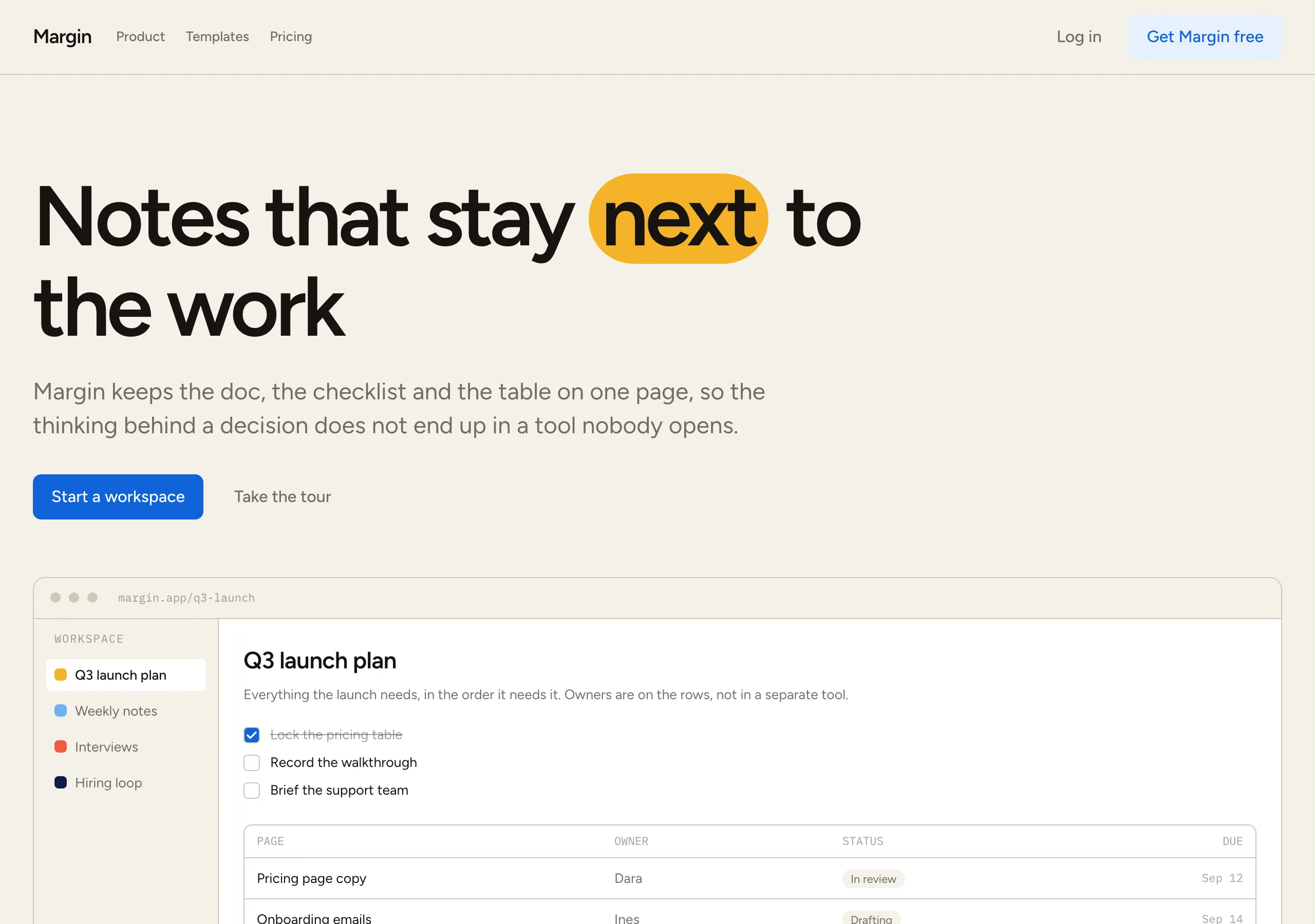
Sunlit Notebook
a warm paper notebook in afternoon light
Warm paper canvas, white cards separated by a hairline rather than a shadow, and one blue reserved for the single filled button. Colour variety lives in the feature card fills, and hierarchy is alpha on the ink before it is a new hue.
Install
npx styles-md add sunlit-notebook Palette
Type
Aa Bb Cc 0123 The quick brown fox
"Figtree", "Inter", "Helvetica Neue", Arial, sans-serif const total = 1 + lI0O;
"IBM Plex Mono", ui-monospace, "SFMono-Regular", Menlo, monospace 16px base · 1.2 ratio · body 400 / heading 600 · heading tracking -0.035em. Fonts are not bundled. Install the first family in each stack, or the specimens below fall back to the next one your device has.
The quick brown fox jumps
The quick brown fox jumps
The quick brown fox jumps
The quick brown fox jumps
The quick brown fox jumps
The quick brown fox jumps
The quick brown fox jumps
The quick brown fox jumps
Licensing
No font files are redistributed here. Every family this style asks for by name is free for commercial use, and CI rejects a style that names one which is not.
- Figtree sans SIL Open Font License 1.1 Humanist geometric with a tall x-height. Holds up at 14px UI and at a tightly tracked 96px.
- Inter sans SIL Open Font License 1.1 Fallback. Same proportions at text sizes, so a missing Figtree does not reflow a card.
- IBM Plex Mono mono SIL Open Font License 1.1 Keyboard shortcuts, counts and table figures only.
Fallbacks: Helvetica Neue, Arial, sans-serif, ui-monospace, SFMono-Regular, Menlo, monospace. These are CSS generics and fonts the reader's OS already ships, referenced by name only, so nothing is licensed or downloaded.
The spec itself, and everything generated from it, is CC-BY-4.0. Attribution is the comment at the top of each generated file; keep it and you have complied.
Shape, space & motion
- stroke
- 1px
- radius
- 4px · 8px · 12px
- spacing unit
- 4px
- gutter
- 24px
- section gap
- 80px
- max width
- 1440px
- motion
- 200ms cubic-bezier(0.25, 0.1, 0.25, 1)
Sunlit Notebook
A working document, not a marketing page. The canvas is warm paper, the cards are white, and the only thing that separates them is a hairline. Colour arrives as whole panels of it, the way a sticky note lands on a page, and then the interface goes quiet again.
Principles
- The page is paper and the cards are white. Inverting that removes the warmth the whole style rests on.
- One filled button per screen, in
accent. Every other action is a tint or plain text. - Separation is a 1px hairline. This style has no shadow token, and cards do not get one.
- Colour variety lives in feature card fills, one hue per card, never in a button.
- Build hierarchy with
fgat 100, 60 and 40 percent opacity before reaching for another colour. - Tracking tightens as type grows, to about -0.035em at display sizes. Body stays at normal.
Typography
One family does headings, UI and body, at a minor third from 16px. Weight is the hierarchy: 400 for copy, 500 for nav and labels, 600 for headings. The negative tracking is the part people miss. It is not applied evenly: at 96px it is close to -0.048em and by 18px it is gone, so a headline reads compact while a paragraph keeps its normal fit. The source studied for this style also runs an editorial serif at a handful of moments per page. That is a house rule rather than a system, so it is not carried here.
Colour
bg is paper and surface is the only white on the page. border is a warm hairline that clears
the required 1.4:1 against the canvas at 1.48:1, which is why it is a tan rather than the near
invisible black at 8 percent the source uses. accent blue is a switch, not decoration: it fills
one button, marks the active nav item and draws the focus ring. The rotating cast for card fills
is marigold #f5b229, coral #ef5b3d, sky #6fb0ef and midnight #101a44. On the first three
the label is fg; on midnight it is surface.
Components
- Button (primary):
accentfill,accentFglabel,radius-md, 10px/18px padding, weight 500. - Button (ghost):
#e7f0fdfill,accentlabel,radius-md, same metrics. - Button (quiet): no fill,
fgat 60 percent, underline on hover. - Card:
surface, 1pxborder,radius-lg, 24px padding, no shadow. - Feature card: one accent hue as a flat fill, no border,
radius-lg, same padding. - Pill:
radius-full, tinted fill, 4px/12px, wrapping one highlighted word inside a headline. - Nav: sticky, paper background, hairline underneath, 14px links at weight 500.
- Input:
surface, 1pxborder,radius-md,accentring on focus. - Table: hairline row rules, mono figures, no zebra fill.
- Focus ring: 2px
accentat 2px offset.
Do / Don’t
- Do keep the canvas paper and the cards white.
- Do carry colour on card fills, one hue per card, and leave the rest of the page neutral.
- Do tighten tracking as the type grows, and leave body copy alone.
- Do use alpha on the ink for secondary text before adding a grey.
- Do keep transitions at 200ms, and save a spring for one element in the hero.
- Don’t use pure white as the page background.
- Don’t put a shadow on a content card. The hairline is the separation.
- Don’t add a second filled button colour to a view.
- Don’t use a gradient anywhere. Every fill is flat.
- Don’t round a rectangle past
radius-lg. Pills are the only other shape.
When to use
Productivity tools, docs and note apps, dashboards that people keep open all day, and marketing pages for them that need to look like the product. A poor fit for luxury goods and nightlife, where warm paper and a hairline read as a spreadsheet.
# Sunlit Notebook

a warm paper notebook in afternoon light. Warm paper canvas, white cards separated by a hairline rather than a shadow, and one blue reserved for the single filled button. Colour variety lives in the feature card fills, and hierarchy is alpha on the ink before it is a new hue.

## Tokens

```yaml
color:  { bg: "#f5f1ea", surface: "#ffffff", fg: "#171310", muted: "#6a6058",
          accent: "#1063d8", accentFg: "#ffffff", border: "#d2c7b7" }
font:   { sans: "\"Figtree\", \"Inter\", \"Helvetica Neue\", Arial, sans-serif",
          mono: "\"IBM Plex Mono\", ui-monospace, \"SFMono-Regular\", Menlo, monospace",
          base: "16px", scale: 1.2,
          weightBody: 400, weightHeading: 600,
          headingTracking: "-0.035em" }
type:   { xs: "11.11px", sm: "13.33px", base: "16px", lg: "19.2px", xl: "23.04px", 2xl: "27.65px", 3xl: "33.18px", 4xl: "39.81px" }
space:  { unit: "4px", gutter: "24px",
          section: "80px", maxWidth: "1440px" }
shape:  { strokeWidth: "1px", radiusSm: "4px",
          radiusMd: "8px", radiusLg: "12px" }
motion: { duration: "200ms", easing: "cubic-bezier(0.25, 0.1, 0.25, 1)" }
```

## Principles

- The page is paper and the cards are white. Inverting that removes the warmth the whole style rests on.
- One filled button per screen, in `accent`. Every other action is a tint or plain text.
- Separation is a 1px hairline. This style has no shadow token, and cards do not get one.
- Colour variety lives in feature card fills, one hue per card, never in a button.
- Build hierarchy with `fg` at 100, 60 and 40 percent opacity before reaching for another colour.
- Tracking tightens as type grows, to about -0.035em at display sizes. Body stays at normal.

## Components

- Button (primary): `accent` fill, `accentFg` label, `radius-md`, 10px/18px padding, weight 500.
- Button (ghost): `#e7f0fd` fill, `accent` label, `radius-md`, same metrics.
- Button (quiet): no fill, `fg` at 60 percent, underline on hover.
- Card: `surface`, 1px `border`, `radius-lg`, 24px padding, no shadow.
- Feature card: one accent hue as a flat fill, no border, `radius-lg`, same padding.
- Pill: `radius-full`, tinted fill, 4px/12px, wrapping one highlighted word inside a headline.
- Nav: sticky, paper background, hairline underneath, 14px links at weight 500.
- Input: `surface`, 1px `border`, `radius-md`, `accent` ring on focus.
- Table: hairline row rules, mono figures, no zebra fill.
- Focus ring: 2px `accent` at 2px offset.

## Do / Don't

- Do keep the canvas paper and the cards white.
- Do carry colour on card fills, one hue per card, and leave the rest of the page neutral.
- Do tighten tracking as the type grows, and leave body copy alone.
- Do use alpha on the ink for secondary text before adding a grey.
- Do keep transitions at 200ms, and save a spring for one element in the hero.
- Don't use pure white as the page background.
- Don't put a shadow on a content card. The hairline is the separation.
- Don't add a second filled button colour to a view.
- Don't use a gradient anywhere. Every fill is flat.
- Don't round a rectangle past `radius-lg`. Pills are the only other shape.

<!-- styles-md/sunlit-notebook@1.0.0, CC-BY-4.0. Full spec: DESIGN.md -->
/* Sunlit Notebook: Tailwind v4 theme. Import after `@import "tailwindcss";` */
@theme {
--color-bg: #f5f1ea;
--color-surface: #ffffff;
--color-fg: #171310;
--color-muted: #6a6058;
--color-accent: #1063d8;
--color-accent-fg: #ffffff;
--color-border: #d2c7b7;
--color-success: #1f7a45;
--color-danger: #c33f27;
--font-sans: "Figtree", "Inter", "Helvetica Neue", Arial, sans-serif;
--font-mono: "IBM Plex Mono", ui-monospace, "SFMono-Regular", Menlo, monospace;
--font-display: "Figtree", "Inter", "Helvetica Neue", Arial, sans-serif;
--text-xs: 11.11px;
--text-sm: 13.33px;
--text-base: 16px;
--text-lg: 19.2px;
--text-xl: 23.04px;
--text-2xl: 27.65px;
--text-3xl: 33.18px;
--text-4xl: 39.81px;
--radius-sm: 4px;
--radius-md: 8px;
--radius-lg: 12px;
--radius-full: 9999px;
--spacing: 4px;
--ease-default: cubic-bezier(0.25, 0.1, 0.25, 1);
}/* Sunlit Notebook: a warm paper notebook in afternoon light
styles-md style "sunlit-notebook" v1.0.0, CC-BY-4.0 */
:root {
--sm-color-bg: #f5f1ea;
--sm-color-surface: #ffffff;
--sm-color-fg: #171310;
--sm-color-muted: #6a6058;
--sm-color-accent: #1063d8;
--sm-color-accent-fg: #ffffff;
--sm-color-border: #d2c7b7;
--sm-color-success: #1f7a45;
--sm-color-danger: #c33f27;
--sm-font-sans: "Figtree", "Inter", "Helvetica Neue", Arial, sans-serif;
--sm-font-mono: "IBM Plex Mono", ui-monospace, "SFMono-Regular", Menlo, monospace;
--sm-font-display: "Figtree", "Inter", "Helvetica Neue", Arial, sans-serif;
--sm-font-weight-body: 400;
--sm-font-weight-heading: 600;
--sm-heading-tracking: -0.035em;
--sm-text-xs: 11.11px;
--sm-text-sm: 13.33px;
--sm-text-base: 16px;
--sm-text-lg: 19.2px;
--sm-text-xl: 23.04px;
--sm-text-2xl: 27.65px;
--sm-text-3xl: 33.18px;
--sm-text-4xl: 39.81px;
--sm-space-1: 4px;
--sm-space-2: 8px;
--sm-space-3: 12px;
--sm-space-4: 16px;
--sm-space-6: 24px;
--sm-space-8: 32px;
--sm-space-12: 48px;
--sm-space-16: 64px;
--sm-space-24: 96px;
--sm-gutter: 24px;
--sm-section: 80px;
--sm-max-width: 1440px;
--sm-stroke-width: 1px;
--sm-radius-sm: 4px;
--sm-radius-md: 8px;
--sm-radius-lg: 12px;
--sm-radius-full: 9999px;
--sm-duration: 200ms;
--sm-easing: cubic-bezier(0.25, 0.1, 0.25, 1);
}{
"id": "sunlit-notebook",
"name": "Sunlit Notebook",
"version": "1.0.0",
"license": "CC-BY-4.0",
"mood": "a warm paper notebook in afternoon light",
"tags": [
"light",
"warm",
"paper",
"productivity",
"saas",
"editorial",
"calm"
],
"fonts": [
{
"family": "Figtree",
"role": "sans",
"license": "OFL-1.1",
"url": "https://fonts.google.com/specimen/Figtree",
"note": "Humanist geometric with a tall x-height. Holds up at 14px UI and at a tightly tracked 96px."
},
{
"family": "Inter",
"role": "sans",
"license": "OFL-1.1",
"url": "https://fonts.google.com/specimen/Inter",
"note": "Fallback. Same proportions at text sizes, so a missing Figtree does not reflow a card."
},
{
"family": "IBM Plex Mono",
"role": "mono",
"license": "OFL-1.1",
"url": "https://github.com/IBM/plex",
"note": "Keyboard shortcuts, counts and table figures only."
}
],
"tokens": {
"color": {
"bg": "#f5f1ea",
"surface": "#ffffff",
"fg": "#171310",
"muted": "#6a6058",
"accent": "#1063d8",
"accentFg": "#ffffff",
"border": "#d2c7b7",
"success": "#1f7a45",
"danger": "#c33f27"
},
"font": {
"sans": "\"Figtree\", \"Inter\", \"Helvetica Neue\", Arial, sans-serif",
"mono": "\"IBM Plex Mono\", ui-monospace, \"SFMono-Regular\", Menlo, monospace",
"display": "\"Figtree\", \"Inter\", \"Helvetica Neue\", Arial, sans-serif",
"scale": 1.2,
"baseSize": "16px",
"weightBody": 400,
"weightHeading": 600,
"headingTracking": -0.035
},
"space": {
"unit": "4px",
"gutter": "24px",
"section": "80px",
"maxWidth": "1440px"
},
"stroke": {
"width": "1px"
},
"radius": {
"sm": "4px",
"md": "8px",
"lg": "12px",
"full": "9999px"
},
"motion": {
"duration": "200ms",
"easing": "cubic-bezier(0.25, 0.1, 0.25, 1)"
}
},
"derived": {
"type": [
{
"name": "xs",
"size": "11.11px"
},
{
"name": "sm",
"size": "13.33px"
},
{
"name": "base",
"size": "16px"
},
{
"name": "lg",
"size": "19.2px"
},
{
"name": "xl",
"size": "23.04px"
},
{
"name": "2xl",
"size": "27.65px"
},
{
"name": "3xl",
"size": "33.18px"
},
{
"name": "4xl",
"size": "39.81px"
}
],
"space": [
{
"step": 1,
"size": "4px"
},
{
"step": 2,
"size": "8px"
},
{
"step": 3,
"size": "12px"
},
{
"step": 4,
"size": "16px"
},
{
"step": 6,
"size": "24px"
},
{
"step": 8,
"size": "32px"
},
{
"step": 12,
"size": "48px"
},
{
"step": 16,
"size": "64px"
},
{
"step": 24,
"size": "96px"
}
]
},
"variables": {
"color-bg": "#f5f1ea",
"color-surface": "#ffffff",
"color-fg": "#171310",
"color-muted": "#6a6058",
"color-accent": "#1063d8",
"color-accent-fg": "#ffffff",
"color-border": "#d2c7b7",
"color-success": "#1f7a45",
"color-danger": "#c33f27",
"font-sans": "\"Figtree\", \"Inter\", \"Helvetica Neue\", Arial, sans-serif",
"font-mono": "\"IBM Plex Mono\", ui-monospace, \"SFMono-Regular\", Menlo, monospace",
"font-display": "\"Figtree\", \"Inter\", \"Helvetica Neue\", Arial, sans-serif",
"font-weight-body": "400",
"font-weight-heading": "600",
"heading-tracking": "-0.035em",
"text-xs": "11.11px",
"text-sm": "13.33px",
"text-base": "16px",
"text-lg": "19.2px",
"text-xl": "23.04px",
"text-2xl": "27.65px",
"text-3xl": "33.18px",
"text-4xl": "39.81px",
"space-1": "4px",
"space-2": "8px",
"space-3": "12px",
"space-4": "16px",
"space-6": "24px",
"space-8": "32px",
"space-12": "48px",
"space-16": "64px",
"space-24": "96px",
"gutter": "24px",
"section": "80px",
"max-width": "1440px",
"stroke-width": "1px",
"radius-sm": "4px",
"radius-md": "8px",
"radius-lg": "12px",
"radius-full": "9999px",
"duration": "200ms",
"easing": "cubic-bezier(0.25, 0.1, 0.25, 1)"
}
}