
Warm Editorial
a printed essay that happens to be a website
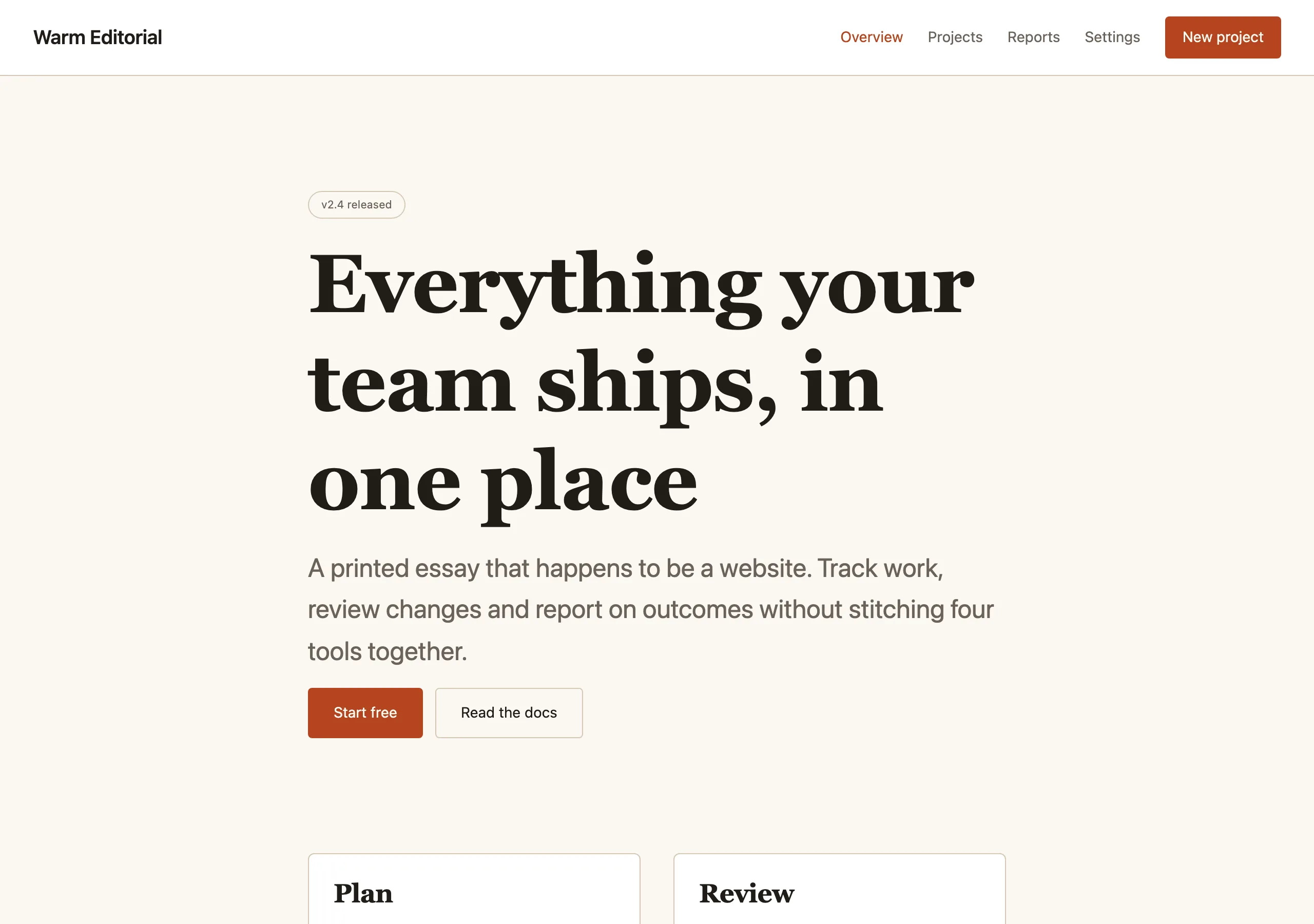
Cream paper, ink-dark serif headlines and long measured columns. Built for reading, with a rust accent used sparingly for links and pull quotes.
Install
npx styles-md add warm-editorial Palette
Type
19px base · 1.333 ratio · weight 400/600. Fonts are not bundled — specimens fall back to what you have installed.
The quick brown fox jumps
The quick brown fox jumps
The quick brown fox jumps
The quick brown fox jumps
The quick brown fox jumps
The quick brown fox jumps
The quick brown fox jumps
The quick brown fox jumps
Shape, space & motion
- stroke
- 1px
- radius
- 2px · 4px · 6px
- spacing unit
- 4px
- gutter
- 32px
- section gap
- 112px
- max width
- 680px
- motion
- 200ms cubic-bezier(0.33, 1, 0.68, 1)
Warm Editorial
For words first. The layout gets out of the way and the reading column stays narrow enough that nobody loses their line.
Principles
- The measure is 680px and does not stretch. Wide text is unreadable text.
- Headings use the display serif; everything functional uses the sans.
- Line height is 1.7 for body copy. This is not negotiable in a reading style.
- Accent appears on links, pull quotes and nothing else.
- Paper is warm, never white. Pure white pages read as unfinished here.
Typography
A 1.333 ratio on a 19px base makes a dramatic ramp — that contrast is the point. Body copy sits at base, headings jump hard, and there is no intermediate step to soften it. Set links in accent with a 1px underline offset 3px, never with a colour change alone.
Colour
Two paper tones, bg for the page and surface for cards or code blocks. border is a hairline
rule the colour of aged paper edge, used for separators far more often than for boxes.
Components
- Link: accent colour, 1px underline, 3px offset, thickens on hover.
- Button (primary): accent fill,
accentFglabel,radius-md, 12px/20px padding. - Pull quote:
text-2xldisplay serif, no quote marks, 3px accent left rule, 24px inset. - Card:
surfacefill, 1px border,radius-lg, 28px padding, no shadow. - Rule: 1px
border, full measure width, 48px of space above and below. - Figure caption:
text-smsans atmuted, 8px under the image, left aligned. - Code block:
surfacefill, 1px border,radius-md, mono attext-sm, 20px padding. - Byline:
text-smsans atmuted, above the headline, letter-spaced 0.06em uppercase.
Do / Don’t
- Do let sections breathe at 112px. Editorial pacing is mostly whitespace.
- Do use the sans for UI chrome — nav, buttons, captions, metadata.
- Do keep images full-measure or full-bleed, never floated beside text.
- Don’t justify text. Ragged right is correct on screen.
- Don’t set body copy below 19px; this style has no small mode.
- Don’t add drop shadows. Paper does not float.
- Don’t use the display serif for anything under
text-lg. - Don’t introduce a second accent. One warm colour is the entire palette story.
When to use
Essays, documentation with personality, magazines, newsletters, personal sites. Wrong for dense dashboards or anything with tables.
# Warm Editorial

a printed essay that happens to be a website. Cream paper, ink-dark serif headlines and long measured columns. Built for reading, with a rust accent used sparingly for links and pull quotes.

## Tokens

```yaml
color:  { bg: "#fbf8f3", surface: "#ffffff", fg: "#211d18", muted: "#6b6259",
          accent: "#b4451f", accentFg: "#fffaf3", border: "#d5c8b5" }
font:   { sans: "\"Inter\", system-ui, -apple-system, \"Segoe UI\", sans-serif",
          mono: "\"IBM Plex Mono\", ui-monospace, \"SFMono-Regular\", Menlo, monospace",
          base: "19px", scale: 1.333,
          weightBody: 400, weightHeading: 600,
          headingTracking: "-0.012em" }
type:   { xs: "10.69px", sm: "14.25px", base: "19px", lg: "25.33px", xl: "33.76px", 2xl: "45px", 3xl: "59.99px", 4xl: "79.97px" }
space:  { unit: "4px", gutter: "32px",
          section: "112px", maxWidth: "680px" }
shape:  { strokeWidth: "1px", radiusSm: "2px",
          radiusMd: "4px", radiusLg: "6px" }
motion: { duration: "200ms", easing: "cubic-bezier(0.33, 1, 0.68, 1)" }
```

## Principles

- The measure is 680px and does not stretch. Wide text is unreadable text.
- Headings use the display serif; everything functional uses the sans.
- Line height is 1.7 for body copy. This is not negotiable in a reading style.
- Accent appears on links, pull quotes and nothing else.
- Paper is warm, never white. Pure white pages read as unfinished here.

## Components

- Link: accent colour, 1px underline, 3px offset, thickens on hover.
- Button (primary): accent fill, `accentFg` label, `radius-md`, 12px/20px padding.
- Pull quote: `text-2xl` display serif, no quote marks, 3px accent left rule, 24px inset.
- Card: `surface` fill, 1px border, `radius-lg`, 28px padding, no shadow.
- Rule: 1px `border`, full measure width, 48px of space above and below.
- Figure caption: `text-sm` sans at `muted`, 8px under the image, left aligned.
- Code block: `surface` fill, 1px border, `radius-md`, mono at `text-sm`, 20px padding.
- Byline: `text-sm` sans at `muted`, above the headline, letter-spaced 0.06em uppercase.

## Do / Don't

- Do let sections breathe at 112px. Editorial pacing is mostly whitespace.
- Do use the sans for UI chrome — nav, buttons, captions, metadata.
- Do keep images full-measure or full-bleed, never floated beside text.
- Don't justify text. Ragged right is correct on screen.
- Don't set body copy below 19px; this style has no small mode.
- Don't add drop shadows. Paper does not float.
- Don't use the display serif for anything under `text-lg`.
- Don't introduce a second accent. One warm colour is the entire palette story.

<!-- styles-md/warm-editorial@1.0.0 — CC-BY-4.0. Full spec: DESIGN.md -->
/* Warm Editorial — Tailwind v4 theme. Import after `@import "tailwindcss";` */
@theme {
--color-bg: #fbf8f3;
--color-surface: #ffffff;
--color-fg: #211d18;
--color-muted: #6b6259;
--color-accent: #b4451f;
--color-accent-fg: #fffaf3;
--color-border: #d5c8b5;
--color-success: #4a7c3f;
--color-danger: #b02f2f;
--font-sans: "Inter", system-ui, -apple-system, "Segoe UI", sans-serif;
--font-mono: "IBM Plex Mono", ui-monospace, "SFMono-Regular", Menlo, monospace;
--font-display: "Source Serif 4", "Source Serif Pro", Georgia, "Times New Roman", serif;
--text-xs: 10.69px;
--text-sm: 14.25px;
--text-base: 19px;
--text-lg: 25.33px;
--text-xl: 33.76px;
--text-2xl: 45px;
--text-3xl: 59.99px;
--text-4xl: 79.97px;
--radius-sm: 2px;
--radius-md: 4px;
--radius-lg: 6px;
--radius-full: 9999px;
--spacing: 4px;
--ease-default: cubic-bezier(0.33, 1, 0.68, 1);
}/* Warm Editorial — a printed essay that happens to be a website
styles-md style "warm-editorial" v1.0.0, CC-BY-4.0 */
:root {
--sm-color-bg: #fbf8f3;
--sm-color-surface: #ffffff;
--sm-color-fg: #211d18;
--sm-color-muted: #6b6259;
--sm-color-accent: #b4451f;
--sm-color-accent-fg: #fffaf3;
--sm-color-border: #d5c8b5;
--sm-color-success: #4a7c3f;
--sm-color-danger: #b02f2f;
--sm-font-sans: "Inter", system-ui, -apple-system, "Segoe UI", sans-serif;
--sm-font-mono: "IBM Plex Mono", ui-monospace, "SFMono-Regular", Menlo, monospace;
--sm-font-display: "Source Serif 4", "Source Serif Pro", Georgia, "Times New Roman", serif;
--sm-font-weight-body: 400;
--sm-font-weight-heading: 600;
--sm-heading-tracking: -0.012em;
--sm-text-xs: 10.69px;
--sm-text-sm: 14.25px;
--sm-text-base: 19px;
--sm-text-lg: 25.33px;
--sm-text-xl: 33.76px;
--sm-text-2xl: 45px;
--sm-text-3xl: 59.99px;
--sm-text-4xl: 79.97px;
--sm-space-1: 4px;
--sm-space-2: 8px;
--sm-space-3: 12px;
--sm-space-4: 16px;
--sm-space-6: 24px;
--sm-space-8: 32px;
--sm-space-12: 48px;
--sm-space-16: 64px;
--sm-space-24: 96px;
--sm-gutter: 32px;
--sm-section: 112px;
--sm-max-width: 680px;
--sm-stroke-width: 1px;
--sm-radius-sm: 2px;
--sm-radius-md: 4px;
--sm-radius-lg: 6px;
--sm-radius-full: 9999px;
--sm-duration: 200ms;
--sm-easing: cubic-bezier(0.33, 1, 0.68, 1);
}{
"id": "warm-editorial",
"name": "Warm Editorial",
"version": "1.0.0",
"license": "CC-BY-4.0",
"mood": "a printed essay that happens to be a website",
"tags": [
"light",
"editorial",
"serif",
"blog",
"warm",
"content"
],
"tokens": {
"color": {
"bg": "#fbf8f3",
"surface": "#ffffff",
"fg": "#211d18",
"muted": "#6b6259",
"accent": "#b4451f",
"accentFg": "#fffaf3",
"border": "#d5c8b5",
"success": "#4a7c3f",
"danger": "#b02f2f"
},
"font": {
"sans": "\"Inter\", system-ui, -apple-system, \"Segoe UI\", sans-serif",
"mono": "\"IBM Plex Mono\", ui-monospace, \"SFMono-Regular\", Menlo, monospace",
"display": "\"Source Serif 4\", \"Source Serif Pro\", Georgia, \"Times New Roman\", serif",
"scale": 1.333,
"baseSize": "19px",
"weightBody": 400,
"weightHeading": 600,
"headingTracking": -0.012
},
"space": {
"unit": "4px",
"gutter": "32px",
"section": "112px",
"maxWidth": "680px"
},
"stroke": {
"width": "1px"
},
"radius": {
"sm": "2px",
"md": "4px",
"lg": "6px",
"full": "9999px"
},
"motion": {
"duration": "200ms",
"easing": "cubic-bezier(0.33, 1, 0.68, 1)"
}
},
"derived": {
"type": [
{
"name": "xs",
"size": "10.69px"
},
{
"name": "sm",
"size": "14.25px"
},
{
"name": "base",
"size": "19px"
},
{
"name": "lg",
"size": "25.33px"
},
{
"name": "xl",
"size": "33.76px"
},
{
"name": "2xl",
"size": "45px"
},
{
"name": "3xl",
"size": "59.99px"
},
{
"name": "4xl",
"size": "79.97px"
}
],
"space": [
{
"step": 1,
"size": "4px"
},
{
"step": 2,
"size": "8px"
},
{
"step": 3,
"size": "12px"
},
{
"step": 4,
"size": "16px"
},
{
"step": 6,
"size": "24px"
},
{
"step": 8,
"size": "32px"
},
{
"step": 12,
"size": "48px"
},
{
"step": 16,
"size": "64px"
},
{
"step": 24,
"size": "96px"
}
]
},
"variables": {
"color-bg": "#fbf8f3",
"color-surface": "#ffffff",
"color-fg": "#211d18",
"color-muted": "#6b6259",
"color-accent": "#b4451f",
"color-accent-fg": "#fffaf3",
"color-border": "#d5c8b5",
"color-success": "#4a7c3f",
"color-danger": "#b02f2f",
"font-sans": "\"Inter\", system-ui, -apple-system, \"Segoe UI\", sans-serif",
"font-mono": "\"IBM Plex Mono\", ui-monospace, \"SFMono-Regular\", Menlo, monospace",
"font-display": "\"Source Serif 4\", \"Source Serif Pro\", Georgia, \"Times New Roman\", serif",
"font-weight-body": "400",
"font-weight-heading": "600",
"heading-tracking": "-0.012em",
"text-xs": "10.69px",
"text-sm": "14.25px",
"text-base": "19px",
"text-lg": "25.33px",
"text-xl": "33.76px",
"text-2xl": "45px",
"text-3xl": "59.99px",
"text-4xl": "79.97px",
"space-1": "4px",
"space-2": "8px",
"space-3": "12px",
"space-4": "16px",
"space-6": "24px",
"space-8": "32px",
"space-12": "48px",
"space-16": "64px",
"space-24": "96px",
"gutter": "32px",
"section": "112px",
"max-width": "680px",
"stroke-width": "1px",
"radius-sm": "2px",
"radius-md": "4px",
"radius-lg": "6px",
"radius-full": "9999px",
"duration": "200ms",
"easing": "cubic-bezier(0.33, 1, 0.68, 1)"
}
}